DxScheduler.AppointmentTooltipTemplate Property
Specifies the template for an appointment tooltip.
Namespace: DevExpress.Blazor
Assembly: DevExpress.Blazor.v23.1.dll
NuGet Package: DevExpress.Blazor
Declaration
[Parameter]
public RenderFragment<SchedulerAppointmentTooltipInfo> AppointmentTooltipTemplate { get; set; }
Property Value
| Type | Description |
|---|---|
| RenderFragment<SchedulerAppointmentTooltipInfo> | The template content. |
Remarks
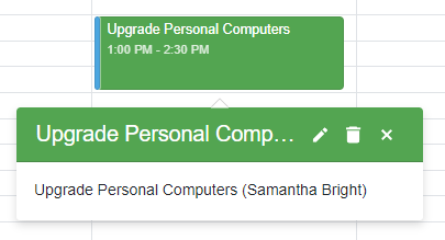
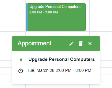
The DxScheduler shows a tooltip when a user clicks an appointment. The tooltip displays the appointment subject, start date, end date, and resource (if specified).
You can use the AppointmentTooltipTemplate and AppointmentTooltipHeaderTemplate properties to customize the tooltip’s layout and appearance. These properties accept a SchedulerAppointmentTooltipInfo object as the context parameter. Use the context parameter to access appointment data.
The code below creates a custom tooltip. The tooltip header displays the appointment’s subject (context.Appointment.Subject), the accepted status if it’s true, and predefined buttons. The tooltip body displays the appointment’s subject (context.Appointment.Subject) and resource (context.Resource.Caption).
@using Data

<DxScheduler StartDate="@DateTime.Today"
             DataStorage="@DataStorage"
             GroupType="SchedulerGroupType.Date"
             ShowAppointmentTooltip = "true">
    <Views>
        <DxSchedulerDayView DayCount="2" ShowWorkTimeOnly="true"/>
    </Views>
    <AppointmentTooltipHeaderTemplate>
        <div class="tooltip-text-header">@context.Appointment.Subject</div>
        @if (IsAccepted(context))
        {
            <div style="margin-right: .3em;">(Accepted)</div>
        }
        <DxSchedulerShowAppointmentCompactFormButton></DxSchedulerShowAppointmentCompactFormButton>
        <DxSchedulerDeleteAppointmentButton></DxSchedulerDeleteAppointmentButton>
        <DxSchedulerCloseAppointmentButton></DxSchedulerCloseAppointmentButton>
    </AppointmentTooltipHeaderTemplate>
    <AppointmentTooltipTemplate>
        <span style="vertical-align: middle;">
            @context.Appointment.Subject
        </span>
        @if (context.Resource != null)
        {
            <span style="vertical-align: middle;">
                (@context.Resource.Caption)
            </span>
        }
    </AppointmentTooltipTemplate>
</DxScheduler>

@code {
    DxSchedulerDataStorage DataStorage = new DxSchedulerDataStorage() {
            AppointmentsSource = ResourceAppointmentCollection.GetAppointments(),
            AppointmentMappings = new DxSchedulerAppointmentMappings() {
                Type = "AppointmentType",
                Start = "StartDate",
                End = "EndDate",
                Subject = "Caption",
                AllDay = "AllDay",
                Location = "Location",
                Description = "Description",
                LabelId = "Label",
                StatusId = "Status",
                RecurrenceInfo = "Recurrence",
                ResourceId = "ResourceId",
                CustomFieldMappings = new List<DxSchedulerCustomFieldMapping> {
                new DxSchedulerCustomFieldMapping{ Name = "Accepted", Mapping = "Accepted" }
            }
            },
            ResourcesSource = ResourceAppointmentCollection.GetResourcesForGrouping(),
            ResourceMappings = new DxSchedulerResourceMappings() {
                Id = "Id",
                Caption = "Name",
                BackgroundCssClass = "BackgroundCss",
                TextCssClass = "TextCss"
            }
        };
    bool IsAccepted(SchedulerAppointmentTooltipInfo tooltipInfo) =>
        (bool)tooltipInfo.CustomFields["Accepted"];
}

<style>
    .tooltip-text-header {
        margin-right: auto;
        text-overflow: ellipsis;
        overflow: hidden;
        white-space: nowrap;
    }
</style>