DxGrid.CustomizeElement Event
Allows you to customize grid cells and rows according to their values.
Namespace: DevExpress.Blazor
Assembly: DevExpress.Blazor.v23.1.dll
NuGet Package: DevExpress.Blazor
Declaration
[Parameter]
public Action<GridCustomizeElementEventArgs> CustomizeElement { get; set; }
Parameters
| Type | Description |
|---|---|
| GridCustomizeElementEventArgs | An object that defines data for this event. |
Remarks
Use the following arguments of the CustomizeElement event to customize a grid element style:
- ElementType - The element type.
- CssClass - The name of a CSS class applied to a grid element.
- Style - A standard HTML style attribute applied to a grid element.
- Attributes - A collection of standard HTML attributes applied to a grid element.
- VisibleIndex - The visible index of the processed row or row that contains the processed cell.
- Column - The column that corresponds to the processed cell or group row.
- Grid - An object that provides access to grid properties.
If you specify the CssClass property and class attribute in the Attributes collection at the same time, the Grid uses the CssClass property value. This idea also applies for the Style property and style attribute.
The CustomizeElement event allows you to solve various tasks. Refer to sections below for more information.
Customize Appearance
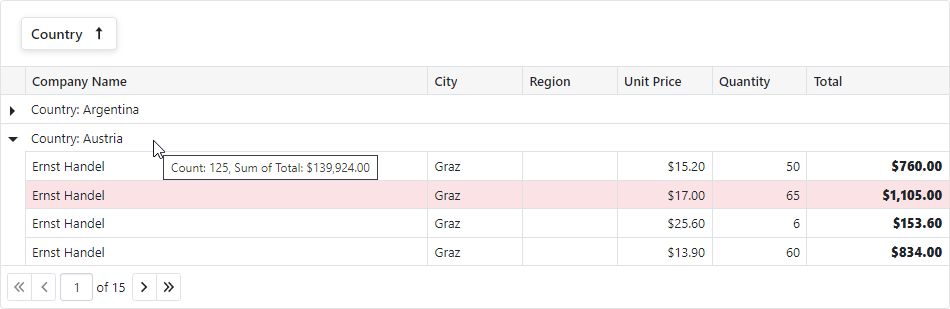
The code below customizes the appearance of grid elements that meet the following criteria:
- Data rows with Total > 1000 are highlighted.
- All Total values are bold.
- If the grid rows are grouped by Country, the group row’s tooltip displays group summary values.
    @implements IDisposable
    @inject NwindDataService NwindDataService

    <style>
        .highlighted-item > td {
            background-color: rgba(245, 198, 203, 0.5);
        }
    </style>

    <DxGrid @ref="Grid"
            Data="@Data"
            ShowGroupPanel="true"
            CustomizeElement="Grid_CustomizeElement"
            SizeMode="Params.SizeMode" KeyboardNavigationEnabled="Params.KeyboardNavigationEnabled">
        <Columns>
            <DxGridDataColumn FieldName="CompanyName" MinWidth="100" />
            <DxGridDataColumn FieldName="City" Width="10%" />
            <DxGridDataColumn FieldName="Region" Width="10%" />
            <DxGridDataColumn FieldName="Country" Name="Country" Width="10%" GroupIndex="0" />
            <DxGridDataColumn FieldName="UnitPrice" DisplayFormat="c" Width="10%" />
            <DxGridDataColumn FieldName="Quantity" MinWidth="80" Width="10%" />
            <DxGridDataColumn FieldName="Total"
                              Name="Total"
                              UnboundType="GridUnboundColumnType.Decimal"
                              UnboundExpression="[UnitPrice] * [Quantity]"
                              DisplayFormat="c"
                              MinWidth="100"
                              Width="15%" />
        </Columns>
        <GroupSummary>
            <DxGridSummaryItem SummaryType="GridSummaryItemType.Count" FieldName="Country" Visible="false" />
            <DxGridSummaryItem SummaryType="GridSummaryItemType.Sum" FieldName="Total" Visible="false" />
        </GroupSummary>
    </DxGrid>

@code {
    object Data { get; set; }
    IGrid Grid { get; set; }
    readonly TaskCompletionSource<bool> dataLoadedTcs = new(TaskCreationOptions.RunContinuationsAsynchronously);

    protected override async Task OnInitializedAsync() {
        var invoices = await NwindDataService.GetInvoicesAsync();
        var customers = await NwindDataService.GetCustomersAsync();
        Data = invoices.OrderBy(i => i.OrderDate).Join(customers, i => i.CustomerId, c => c.CustomerId, (i, c) => {
            return new {
                CompanyName = c.CompanyName,
                City = i.City,
                Region = i.Region,
                Country = i.Country,
                UnitPrice = i.UnitPrice,
                Quantity = i.Quantity
            };
        });
        dataLoadedTcs.TrySetResult(true);
    }
    protected override async Task OnAfterRenderAsync(bool firstRender) {
        if(firstRender) {
            await dataLoadedTcs.Task;
            Grid.ExpandGroupRow(1);
        }
    }
    void Grid_CustomizeElement(GridCustomizeElementEventArgs e) {
        if(e.ElementType == GridElementType.DataRow && (System.Decimal)e.Grid.GetRowValue(e.VisibleIndex, "Total") > 1000) {
            e.CssClass = "highlighted-item";
        }
        if(e.ElementType == GridElementType.DataCell && e.Column.Name == "Total") {
            e.Style = "font-weight: 800";
        }
        if(e.ElementType == GridElementType.GroupRow && e.Column.Name == "Country") {
            var summaryItems = e.Grid.GetGroupSummaryItems().Select(i => e.Grid.GetGroupSummaryDisplayText(i, e.VisibleIndex));
            e.Attributes["title"] = string.Join(", ", summaryItems);
        }
    }
    public void Dispose() {
        dataLoadedTcs.TrySetCanceled();
    }
}
Show the Context Menu
You can display a Context Menu when you right-click any Blazor Grid element. In this example, a click on a column header or row invokes the Context Menu. The oncontextmenu:preventDefault attribute disables the standard browser context menu. In the Grid’s CustomizeElement event handler, subscribe to the contextmenu event that displays custom Context Menu.
<DxGrid @ref="Grid"
        Data="GridData"
        EditMode="GridEditMode.EditRow"
        CssClass="mw-1100"
        CustomizeElement="Grid_CustomizeElement"
        @oncontextmenu:preventDefault
        EditModelSaving="Grid_EditModelSaving"
        DataItemDeleting="Grid_DataItemDeleting">
    <Columns>
        <DxGridDataColumn FieldName="Date" SortIndex="0" />
        <DxGridDataColumn FieldName="TemperatureC" />
        <DxGridDataColumn FieldName="TemperatureF" />
        <DxGridDataColumn FieldName="Summary" />
    </Columns>
    <TotalSummary>
        <DxGridSummaryItem SummaryType="GridSummaryItemType.Avg" FieldName="TemperatureC" />
    </TotalSummary>
</DxGrid>

@* ... *@
@code {
    IGrid Grid { get; set; }
    GridContextMenuContainer ContextMenuContainer { get; set; }
    object GridData { get; set; }

@* ... *@
    void Grid_CustomizeElement(GridCustomizeElementEventArgs e) {
        if(GridContextMenuHelper.IsContextMenuElement(e.ElementType)) {
            e.Attributes["oncontextmenu"] = EventCallback.Factory.Create<MouseEventArgs>(
                this,
                async mArgs => await ContextMenuContainer.Grid_ContextMenu(e, mArgs)
            );
        }
    }
    @* ... *@
}
Implement Row Drag and Drop Functionality
If your DxGrid uses an ObservableCollection data source, you can incorporate row drag and drop support for the following usage scenarios:
- Drag rows in a single grid (reorder rows)
- Drag rows between two grids
- Drag rows between two grids and drop them at a specified position
Our drag-and-drop implementation uses three jQuery widgets: (draggable, droppable, and sortable).