DxContextMenu.SizeMode Property
Specifies the size of the component’s inner elements. Also affects the component’s size.
Namespace: DevExpress.Blazor
Assembly: DevExpress.Blazor.v23.1.dll
NuGet Package: DevExpress.Blazor
Declaration
[DefaultValue(null)]
[Parameter]
public SizeMode? SizeMode { get; set; }
Property Value
| Type | Default | Description |
|---|---|---|
| Nullable<SizeMode> | null | The size mode. If the property is not specified (the value is |
Available values:
| Name | Description |
|---|---|
| Small | Small size. |
| Medium | Medium size. |
| Large | Large size. |
Remarks
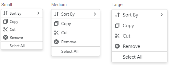
Use the SizeMode property to specify the size mode for the Context Menu. The example below applies the Large mode:
<DxContextMenu @ref="@ContextMenu" SizeMode="SizeMode.Large">
    <Items>
        <DxContextMenuItem Text="Sort By" IconCssClass="menu-icon-sort-by menu-icon">
            <Items>
                <DxContextMenuItem Text="Name"></DxContextMenuItem>
                <DxContextMenuItem Text="Size"></DxContextMenuItem>
                <DxContextMenuItem Text="Type"></DxContextMenuItem>
            </Items>
        </DxContextMenuItem>
        <DxContextMenuItem Text="Copy" IconCssClass="menu-icon-copy menu-icon" BeginGroup="true" />
        <DxContextMenuItem Text="Cut" IconCssClass="menu-icon-cut menu-icon" />
        <DxContextMenuItem Text="Remove" IconCssClass="menu-icon-clear menu-icon" />
        <DxContextMenuItem Text="Select All" BeginGroup="true" />
    </Items>
</DxContextMenu>
The following image shows the same Context Menu component in different size modes:
For more information, refer to Size Modes.
See Also