ComboBox - Appearance Customization
- 2 minutes to read
The DevExpress Blazor ComboBox component allows you to customize its appearance: the size, the appearance of the edit box, items, and column cells. This topic lists available options.
Size Modes
Use the SizeMode property to specify the size of a ComboBox. The following code snippet applies different sizes to ComboBox components.
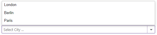
<DxComboBox Data="@Cities"
            NullText="Select City ..."
            @bind-Value="@Value"
            SizeMode="SizeMode.Small">
</DxComboBox>

<DxComboBox Data="@Cities"
            NullText="Select City ..."
            @bind-Value="@Value"
            SizeMode="SizeMode.Medium">
</DxComboBox>

<DxComboBox Data="@Cities"
            NullText="Select City ..."
            @bind-Value="@Value"
            SizeMode="SizeMode.Large">
</DxComboBox>

@code {
    IEnumerable<string> Cities = new List<string>() {
        "London",
        "Berlin",
        "Paris",
    };

    string Value { get; set; }
}

To customize ComboBox input, use the InputCssClass property. The following code snippet applies a custom style to input borders:
<style>
    .my-style {
        border: 2px dotted orange;
    }
</style>

<DxComboBox Data="@Cities"
            NullText="Select City ..."
            @bind-Value="@Value"
            InputCssClass="my-style">
</DxComboBox>

@code {
    IEnumerable<string> Cities = new List<string> () {
        "London",
        "Berlin",
        "Paris",
    };

    string Value { get; set; }
}

For more information, refer to the following help topics:
Drop-Down List Width
Use the DropDownWidthMode property to specify the width of the drop-down list. The following values are available:
ContentOrEditorWidth(Default) - The list displays item text completely. The minimum list width matches the editor.ContentWidth- The list width is equal to the width of the longest list item.EditorWidth- The list width matches the editor. If item text does not fit the editor width, item text is displayed across multiple lines.
Drop-Down Window Direction
Use the DropDownDirection property to specify the direction in which the ComboBox’s drop-down window is displayed relative to the input element. The default value is Down. The following code changes the direction to Up:
<DxComboBox Data="@Cities"
            @bind-Value="@Value"
            NullText="Select City ..."
            DropDownDirection="DropDownDirection.Up">
</DxComboBox>

@code {
    IEnumerable<string> Cities = new List<string>() {
        "London",
        "Berlin",
        "Paris",
    };

    string Value { get; set; }
}
Note
If the editor is close to a browser window’s edge and there is not enough space to display the drop-down window in the specified direction, the drop-down window is displayed in the opposite direction.
Templates
ComboBox templates are RenderFragment<TValue> properties. They replace default content area rendering and allow you to arrange custom content in various ComboBox elements. For more information, see the following topic: ComboBox - Templates.