ComboBox - Bind to Data
- 5 minutes to read
This topic describes how to bind the Blazor ComboBox to data in different scenarios.
Strongly Typed Collection
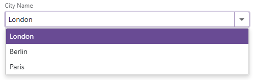
Use the Data property to bind the ComboBox to a strongly typed collection or enumeration. Initialize this object in the OnInitialized lifecycle method or before this method is invoked. Use the DataAsync property instead of the Data property if a strongly typed collection is loaded asynchronously (for instance, from an HTTP request).
Use the Value property to specify the component’s selected value or item. You can use the @bind attribute to bind the Value property to a data field. For more information, refer to the following help topic: Two-Way Data Binding.
<DxComboBox Data="@Cities" @bind-Value="@Value" ></DxComboBox>

@code {
  IEnumerable<string> Cities = new List<string>() {
    "London",
    "Berlin",
    "Paris",
  };

  string Value { get; set; }
}
The ComboBox can detect IQueryable collections and use benefits of the corresponding LINQ query providers (such as Entity Framework).
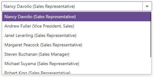
Custom Object Collection
Use the Data property to bind the ComboBox to a data collection that stores custom objects (IEnumerable<CustomType>).
Use the Value property to specify the component’s selected value or item. If this property also contains a custom object, you need to override the following methods for your custom object:
GetHashCode(). The ComboBox uses hash codes to compare items. Override this method to make sure that compared objects have the same hash code.
Equals. The default
Equalsmethod determines whether two object instances are equal. The compared items are not equal if they are different instances (even if they have identical properties). As a result, the component does not display the selected items.
You also need to set the TextFieldName property. It specifies the custom object’s field name that returns strings to be shown in the ComboBox drop-down window. If the TextFieldName property is not specified, the ComboBox component searches for a Text field in the data source and uses this field as a text field. Otherwise, the ComboBox is populated with CustomType.ToString() values.
As an alternative, you can use KeyFieldName and KeyFieldNames properties to specify which field the ComboBox should use as an identifier to compare items.
@using BlazorApp.Data

<DxComboBox Data="@Staff.DataSource"
            TextFieldName="@nameof(Person.Text)"
            @bind-Value="@Value">
</DxComboBox>

@code {
  Person Value { get; set; } = Staff.DataSource[0];
}
Load Custom Data
When you bind an editor to data from a Web API service, assign the data type to the component’s T parameter and use the CustomData property to implement custom data load logic.
You can also enable Virtual Scrolling to improve client-side performance.
Virtual Scrolling
When virtual scrolling is activated (ListRenderMode is set to Virtual), the ComboBox renders data on demand when a user scrolls its items.
<DxComboBox ListRenderMode="ListRenderMode.Virtual"
            Data="@Strings"
            @bind-Value="@Value" >
</DxComboBox>
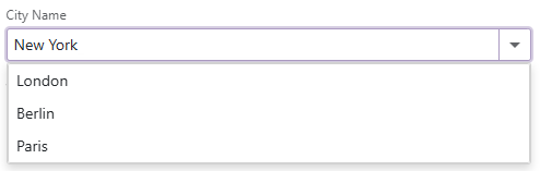
Allow Custom Values
The Blazor ComboBox supports custom values that are not stored in a bound data source. Set the AllowUserInput property to true to allow users to type values into the ComboBox’s edit box. Use the Text property to specify an editor value in code. To respond to an editor’s text change, handle the TextChanged event.
<DxComboBox Data="@Cities"
            AllowUserInput="true"
            NullText="Select City ..."
            @bind-Value="@Value"
            @bind-Text="@Text">
</DxComboBox>

@code {
  IEnumerable<string> Cities = new List<string>() {
    "London",
    "Berlin",
    "Paris",
  };

  string Text { get; set; } = "New York";
  string Value { get; set; }
}