Header Filter
- 4 minutes to read
This topic illustrates how to filter ASPxTreeList data nodes using a column’s header filter.
Column headers can display filter buttons. Clicking a filter button invokes a filter dropdown, which lists unique values within a column, and enables you to apply filter criteria against this column. These buttons are hidden by default. To show filter buttons, set the TreeListSettings.ShowHeaderFilterButton property to true. You can control filter button visibility for individual columns using a column’s TreeListDataColumn.AllowHeaderFilter property.
Note that if a filter is applied to a column, other column header filters display unique values of the sorted nodes. To show the full list of values (include values of rows hidden by sorting), hold down SHIFT and click a header filter button.
In accessibility mode (the control’s ASPxTreeList.AccessibilityCompliant property is set to true), the Header Filter supports keyboard navigation as shown below.
Invoke a header filter.
- Tab - focuses a column’s header filter button.
- Enter - invokes a header filter dropdown.
Navigate through the filter list.
- Up/Down - navigates through the filter items list.
- Tab - navigates the filter items list (in CheckedList mode).
Apply a filter criteria.
- Enter - applies filter criteria and closes a header filter dropdown.
- Esc - closes the dropdown without saving changes in the filter criteria.
Header Filter Modes
A Header filter can operate in the four modes listed below. To specify a specific filter mode for individual columns, use a column’s GridDataColumnHeaderFilterSettings.Mode property.
The following two list modes are available for all tree list columns.
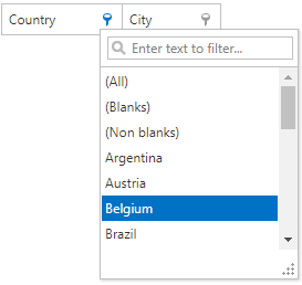
List. The header filter’s filter items are displayed as a regular list. Clicking an item invokes a corresponding action and automatically closes the dropdown.
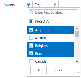
CheckedList. The header filter’s filter items are displayed as a checked list. In this mode, an end-user can select multiple items simultaneously. When the drop-down window is closed by clicking the OK button, the grid will display those records that contain checked values.
The following two list modes are available for date columns only.
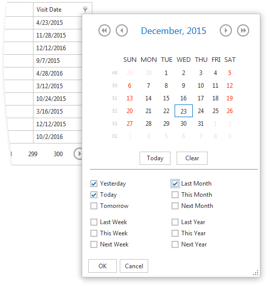
DateRangeCalendar. The header filter displays a calendar and a set of predefined items. To customize the calendar settings, use the TreeListColumnSettingsHeaderFilter.DateRangeCalendarSettings property.
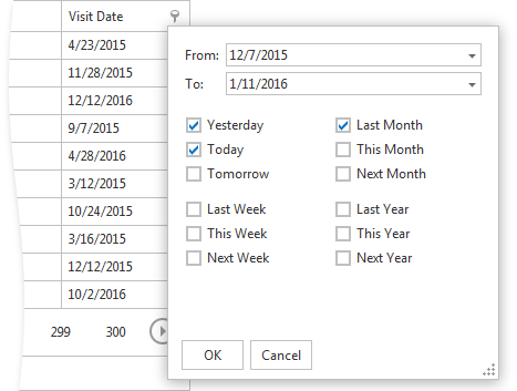
DateRangePicker. The header filter displays a date range picker and a set of predefined items. To customize the editors’ settings, use the TreeListColumnSettingsHeaderFilter.DateRangePickerSettings property.
Custom Header Filter Items
The ASPxTreeList allows you to create custom filter values, define filter criteria for them and display these values within a column’s filter dropdown using the ASPxTreeList.HeaderFilterFillItems event. Within the event, you can access the filter default values using the ASPxGridHeaderFilterEventArgs.Values event parameter, and clear them if you so require. To add a new filter item, use the ASPxGridHeaderFilterEventArgs.AddValue method. In List mode, use the ASPxGridHeaderFilterEventArgs.AddShowAll method to add a ShowAll button to the list.
The FilterValue.CreateShowAllValue, FilterValue.CreateShowBlanksValue, and FilterValue.CreateShowNonBlanksValue methods can be used to create the corresponding filter items.
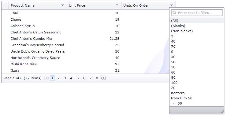
This example shows how to create custom filter items and display them within the Units On Order column’s filter dropdown.
The image below shows the result.
protected void ASPxTreeList1_HeaderFilterFillItems(object sender, ASPxTreeListHeaderFilterEventArgs e)
{
    if (e.Column.FieldName != "UnitsOnOrder") return;
    e.AddValue("nonzero", string.Empty, "[UnitsOnOrder] != 0");
    e.AddValue(String.Format("from {0} to {1}", 0, 50), string.Empty, String.Format("[UnitsOnOrder] > {0} and [UnitsOnOrder] < {1}", 0, 50));
    e.AddValue(String.Format(">= {0}", 50), string.Empty, String.Format("[UnitsOnOrder] >= {0}", 50));
}
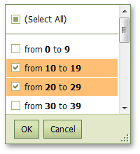
Using HTML tags in an item text
The ASPxTreeList header filter allows using HTML tags in an item text. This example demonstrates how to set numbers in bold by using HTML tags within an item’s format pattern. The image below shows the result.
protected void treelist_HeaderFilterFillItems(object sender, ASPxGridViewHeaderFilterEventArgs e) {
     if(e.Column.FieldName == "Quantity")
          PrepareQuantityFilterItems(e);
     ...
}

protected virtual void PrepareQuantityFilterItems(ASPxGridViewHeaderFilterEventArgs e) {
     int max = 0;
     for(int i = 0; i < e.Values.Count; i++) {
          int value;
          if(!int.TryParse(e.Values[i].Value, out value)) continue;
          if(value > max) max = value;
     }
     e.Values.Clear();
     int step = 10;
     for(int i = 0; i < max / step + 1; i++) {
          int start = step * i;
          int end = start + step - 1;
          e.AddValue(string.Format("from <b>{0}</b> to <b>{1}</b>", start, end), "", string.Format("[Quantity] >= {0} and [Quantity] <= {1}", start, end));
     }
}
Online Demos
- ASPxTreeList - Header Filter (Web Forms)
- TreeList - Header Filter (MVC)
- ASPxTreeList - Date Range Header Filter (Web Forms)
- TreeList - Date Range Header Filter (MVC)