Arrange Dynamic Report Contents
- 6 minutes to read
You can use Print Preview to see what the resulting document looks like because data-aware controls’ contents are not available at design time. This document describes how to maintain report elements’ correct location in a published document.
Maintain Page Breaks
Use the XRPageBreak control to insert a page break at the required location in a report.
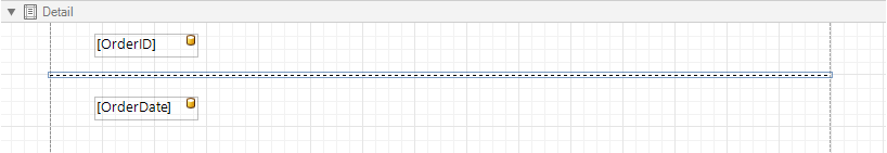
You can use the Band.PageBreak property to add a page break before or after printing a specific band.
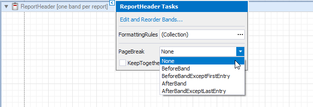
The following bands support this feature:
- detail band
- detail report band
- report header and footer
- group headers and footers
Maintain the Band Location on a Page
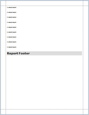
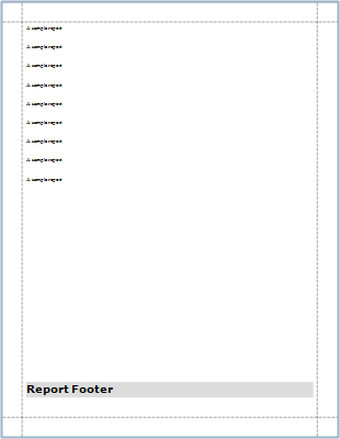
Use the GroupFooterBand.PrintAtBottom and ReportFooterBand.PrintAtBottom properties to choose whether group and report footers should appear at the bottom of a page or immediately after the previous band.
| ReportFooterBand.PrintAtBottom = false | ReportFooterBand.PrintAtBottom = true |
|---|---|
 |
 |
Use the PageBand.PrintOn property to avoid printing page headers and footers on the same page with a report header and/or footer.
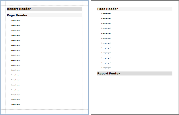
PageHeaderBand.PrintOn = AllPages
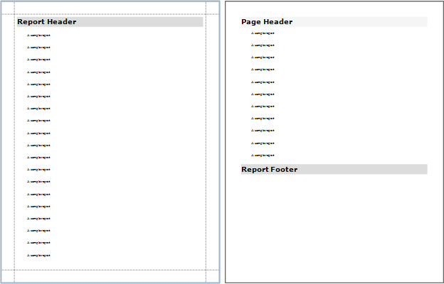
PageHeaderBand.PrintOn = NotWithReportHeader
Use the GroupBand.RepeatEveryPage property to repeat group footers and headers on every page.
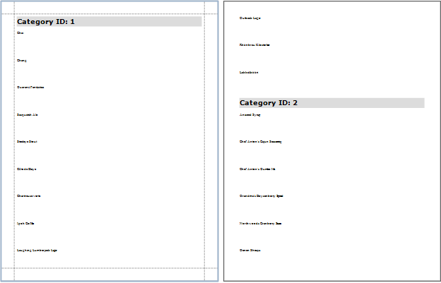
GroupHeaderBand.RepeatEveryPage = false
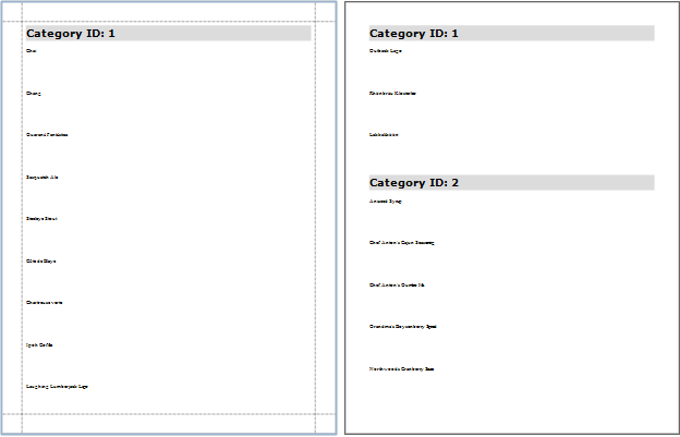
GroupHeaderBand.RepeatEveryPage = true
Keeping Content Together
You can choose whether a control’s content can be split across several pages using its XRControl.KeepTogether property.
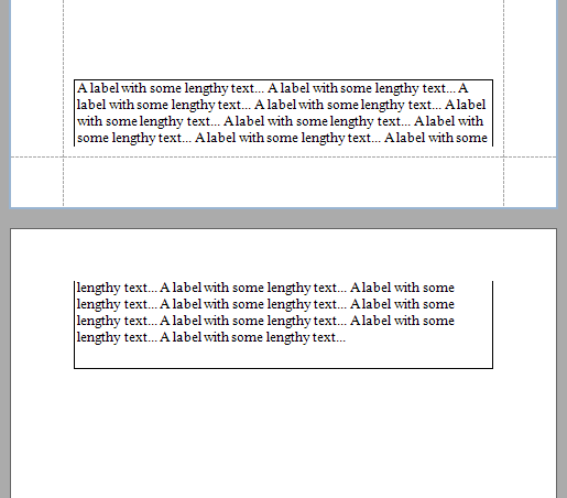
KeepTogether = false
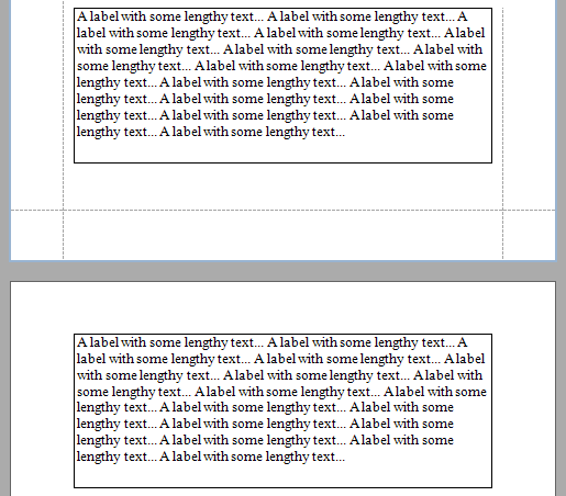
KeepTogether = true
Enabling this property for a single control makes the same band’s controls behave like this option is enabled.
Use the Band.KeepTogether property to enable this feature for all controls within a specific band.
Note
This feature is not available for the XRChart, XRSparkline and XRSubreport controls.
In a master-detail report, you can print the detail band on the same page as the detail report band using the DetailBand.KeepTogetherWithDetailReports property.
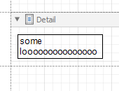
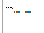
Adjust a Control’s Height and Width to Its Content Size
Adjust the Height
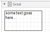
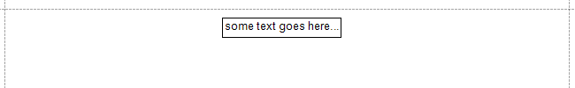
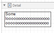
You can specify the CanGrow and CanShrink properties for the XRLabel, XRTableCell, XRCharacterComb, and XRRichText controls to adjust a control’s height to its content size.
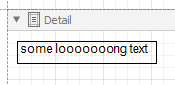
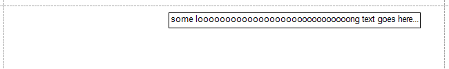
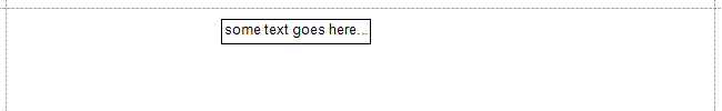
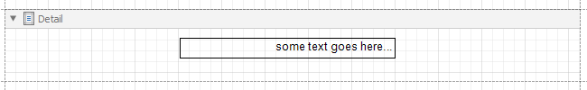
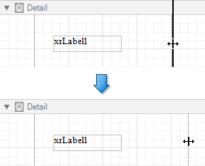
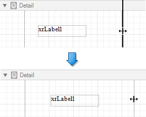
The following images illustrate how the CanGrow property affects the height of a label whose content size is larger than its width.
| Designer | Preview (CanGrow = false) | Preview (CanGrow = true) |
|---|---|---|
 |
 |
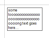 |
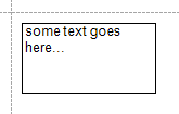
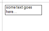
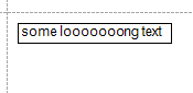
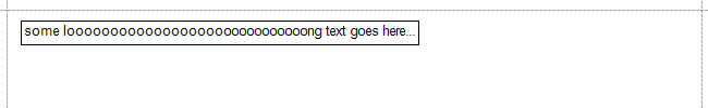
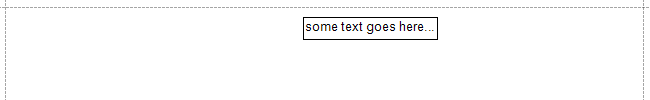
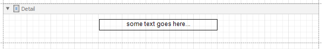
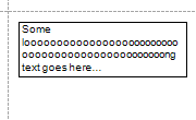
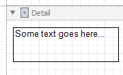
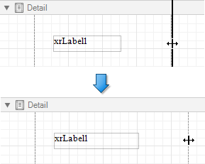
The images below show how the CanShrink property affects the height of a label whose content size does not occupy the entire control height.
| Designer | Preview (CanShrink = false) | Preview (CanShrink = true) |
|---|---|---|
 |
 |
 |
The CanGrow and CanShrink properties have no effect for a control in the following cases:
- You set the control’s AnchorVertical property to Both or Bottom.
- The control is a label that displays summary function results.
The WordWrap property allows you to specify whether to split a control’s content into multiple lines if the content does not fit the control’s width.
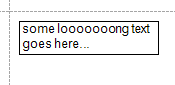
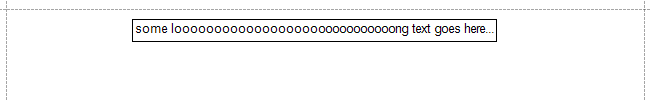
The following example shows a label whose content size is larger than its width. The label’s CanGrow property is enabled. The images demonstrate how the WordWrap property affects the label’s size.
| Designer | Preview (WordWrap = false) | Preview (WordWrap = true) |
|---|---|---|
 |
 |
 |
Adjust the Width
If you want to increase or decrease a control’s width based on its content size, enable the control’s AutoWidth property. The behavior of this property depends on the following properties:
- TextAlignment – if a control’s text alignment is set to Left, the control grows to the right or shrinks from the right, and when the alignment is Right, it grows or shrinks on the left side. If the control’s text alignment is set to Center, the control grows or shrinks in both directions.
- WordWrap – if the property is enabled, the control can only decrease its width. Otherwise, the control can both increase and decrease its width.
The following example shows a label whose content size is greater than its width. The label’s AutoWidth property is enabled. The images illustrate how the label’s width changes on Preview depending on the control’s text alignment.
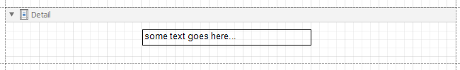
Designer
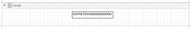
Preview, TextAlignment = TopLeft. The label grows to the right.
Preview, TextAlignment = TopRight. The label grows to the left.
Preview, TextAlignment = TopCenter. The label grows in both directions.
The following examples show a label whose content size is smaller than its width. The label’s AutoWidth property is enabled. The images illustrate how the label’s width changes on Preview depending on the control’s text alignment.
Designer, TextAlignment = TopLeft.
Preview. The label’s right border shrinks.
Designer, TextAlignment = TopRight.
Preview. The label’s left border shrinks.
Designer. TextAlignment = TopCenter.
Preview. Both label borders shrink.
Fit a Content Font Size to the Size of a Control’s Bounds
You can also fit the font size for the content of the XRLabel and XRTableCell controls to the size of their bounds. For this, specify a control’s TextFitMode property.
The following images demonstrate how the TextFitMode property affects the font size of label content when the size of this content is greater than label bounds.
| Designer | Preview (TextFitMode = GrowAndShrink) |
|---|---|
 |
 |
The below images show how the property affect the font size of label content when the size of this content is smaller than label bounds.
| Designer | Preview (TextFitMode = GrowAndShrink) |
|---|---|
 |
 |
The TextFitMode property has no effect in the following cases:
- A control’s CanGrow, CanShrink, or AutoWidth property is enabled.
- A label’s Angle property is specified.
- A control’s AnchorHorizontal or AnchorVertical property is set to Both.
Anchoring Controls
You can anchor a control to the top, bottom, or both edges of its parent container using the XRControl.AnchorHorizontal and XRControl.AnchorVertical properties.
| AnchorHorizontal = None | AnchorHorizontal = Right | AnchorHorizontal = Both |
|---|---|---|
 |
 |
 |
Suppressing Controls
Avoid Duplicated and Empty Values
When identical or null values appear in a report’s data source, you can suppress these values in a report using the following properties:
XRControl.ProcessDuplicatesMode
Specifies how to process report controls with identical values (leave them as is, merge, suppress, or suppress and shrink).
-
Specifies how to process report controls receiving null values from a data source (leave them as is, suppress, or suppress and shrink).
XRControl.ProcessDuplicatesTarget
Specifies whether to process duplicate the XRControl.Text or XRControl.Tag property values.
These properties are available for the following controls:
Conditionally Suppress a Control
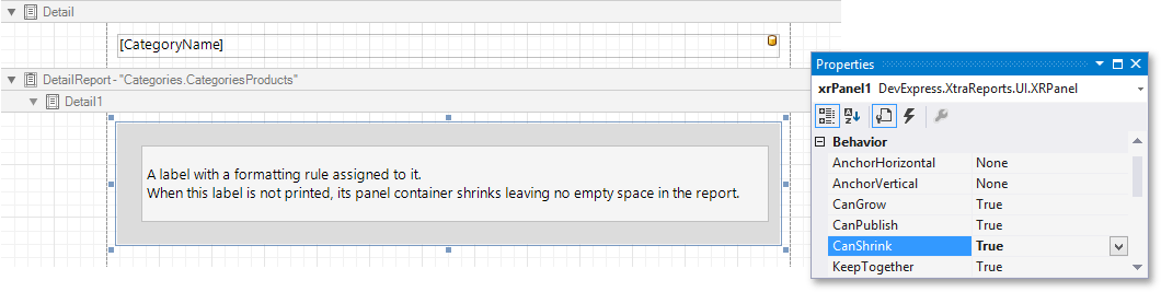
You can suppress a control when a specified logical condition is met by specifying the required XRControl.Visible property expressions as described in the Conditionally Suppress Controls topic.
In this case, a space remains in the band at the control’s location. You can avoid this by placing these controls onto an XRPanel and setting its XRPanel.CanShrink property to true.
For this feature to work correctly, consider the following:
- Specify the XRControl.Visible property’s expression to the controls in the panel (and not to the panel itself).
- Do not assign borders to the panel container. Otherwise, they are printed when the panel’s content is suppressed.