Create a Custom Control Inherited From XRControl
- 10 minutes to read
Follow the steps below to create a custom Progress Bar control.
Create a New Class
Create a new class that defines a custom control. Derive the class from the base XRControl class. Implement properties, methods, events, and other members:
using DevExpress.XtraPrinting;
using DevExpress.XtraReports;
using DevExpress.XtraReports.UI;
using System.ComponentModel;
using System.Drawing;
using DevExpress.Utils.Serializing;
using DevExpress.XtraReports.Expressions;
// ...
    [ToolboxItem(true)]
    [DefaultBindableProperty("Position")]
    public class ProgressBar : XRControl {
        // Implement a static constructor as shown below to add the
        // "Position" property to the property grid's "Expressions" tab.
        static ProgressBar() {
            // Specify an array of events in which the property should be available.
            string[] eventNames = new string[] { "BeforePrint" };

            // Specify the property position in the property grid's "Expressions" tab.
            // 0 - first, 1000 - last.
            int position = 0;

            // Specify an array of the property's inner properties.
            string[] nestedBindableProperties = null;

            // Specify the property's category in the property grid's "Expressions" tab.
            // The empty string corresponds to the root category.
            string scopeName = "";

            // Create and set a description for the "Position" property.
            ExpressionBindingDescription description = new ExpressionBindingDescription(
                eventNames, position, nestedBindableProperties, scopeName
            );

            ExpressionBindingDescriptor.SetPropertyDescription(
                typeof(ProgressBar), nameof(Position), description
            );
        }

        private float position = 0;
        private float maxValue = 100;

        public ProgressBar() {
            this.ForeColor = SystemColors.Highlight;
        }

        [DefaultValue(100)]
        [Description("The maximum value of the bar position.")]
        [DisplayName("Max Value")]
        [Category("Parameters")]
        [XtraSerializableProperty]
        public float MaxValue {
            get { return this.maxValue; }
            set {
                if (value <= 0) return;
                this.maxValue = value;
            }
        }

        [DefaultValue(0)]
        [Description("The current bar position.")]
        [DisplayName("Position")]
        [Category("Parameters")]
        [XtraSerializableProperty]
        public float Position {
            get { return this.position; }
            set {
                if (value < 0 || value > maxValue)
                    return;
                this.position = value;
            }
        }

// ...
    }
Implement Methods to Render the Control
Bricks are a document’s basic elements. When you open a Preview window, report controls are rendered into bricks. For more information, review the following help topic: Bricks.
In a custom control, override the CreateBrick, PutStateToBrick, and GetStateFromBrick (optional) methods.
CreateBrick
protected override VisualBrick CreateBrick(VisualBrick[] childrenBricks) {
    // Create and return a panel brick.
    return new PanelBrick(this);
}
Use this method to create and return a new brick. Refer to the following article for information on different brick types: Classes Hierarchy: Bricks.
If the control is a container for other controls, the bricks for the contained controls are generated before calling the CreateBrick method for the container. Use the childrenBricks array to access bricks of the contained controls.
PutStateToBrick
protected override void PutStateToBrick(VisualBrick brick, PrintingSystemBase ps) {
    base.PutStateToBrick(brick, ps);

    // Cast the "brick" variable to the "PanelBrick" type (the type of a brick
    // created in the "CreateBrick" method).
    PanelBrick panel = (PanelBrick)brick;

    // Create a new visual brick to represent a bar.
    VisualBrick progressBar = new VisualBrick(this);

    // Hide the brick's borders.
    progressBar.Sides = BorderSide.None;

    // Set the foreground color for the bar.
    progressBar.BackColor = panel.Style.ForeColor;

    // Calculate the width of the progress bar's filled area.
    float filledAreaWidth = panel.Rect.Width * (Position / MaxValue);

    // Create a rectangle to be filled by the foreground color.
    progressBar.Rect = new RectangleF(0, 0, filledAreaWidth, panel.Rect.Height);

    // Add the visual brick to the panel brick.
    panel.Bricks.Add(progressBar);
}
The method takes a brick created in the CreateBrick method as the first argument. Use this method to set up brick properties.
GetStateFromBrick (Optional)
protected override void GetStateFromBrick(VisualBrick brick) {
    base.GetStateFromBrick(brick);

    // Copy the current brick state to the control.
    // ...
}
The method takes a brick modified in the PutStateToBrick method as an argument. Use this method to copy the current brick state to the control before you access control properties in the PrintOnPage event.
Serialization
Both the custom control and the brick require serialization. The brick only uses XML serialization, and the control implements XML serialization and supports CodeDom serialization - which is mandatory for the Visual Studio Designer.
Make Properties Serializable
Use the XtraSerializableProperty attribute to serialize custom properties.
The XtraSerializableProperty attribute is responsible for serializing the property in XML. The attribute should be specified to serialize a property that returns a simple type. Complex types require a constructor with the XtraSerializationVisibility argument type (the most commonly used values are Hidden, Collection, Reference, Content).
The DesignerSerializationVisibility attribute is responsible for serializing the CodeDOM in Visual Studio Designer. It has three options - Hidden, Visible, and Content. You should apply Visible to collections or references.
The DefaultValue attribute determines whether the property value is serialized.
Refer to the following help topic for more information: XML Serialization.
Serialize Collection Properties
To ensure proper serialization of collection properties, apply the XtraSerializableProperty attribute with the XtraSerializationVisibility.Collection parameter, as in the following code snippet:
[XtraSerializableProperty(XtraSerializationVisibility.Collection)]
public List<CustomParameter> CustomParameters { get; set; }
You should implement the IXtraSupportDeserializeCollectionItem interface to define how new elements of the collection are created. All required properties of the CustomParameter class must also be marked with the XtraSerializableProperty attribute.
For more information, review the following article: K18435 - How to serialize a custom property of the DevExpress control’s descendant.
Brick Serialization
Only XML serialization is necessary. For correct deserialization, map the brick’s text type (the overridden BrickType property at the Brick level) to the real type.
If the CreateBrick method of your custom control returns a known VisualBrick descendant, no action is necessary. An example is the Progress Bar custom control described in this help topic.
If the CreateBrick method returns a custom brick type, you should handle the BrickFactory.BrickResolve event to map the custom control type. The following code snippet maps the RoundLabelBrick and RoundPanelBrick custom bricks:
using DevExpress.XtraPrinting;
using DevExpress.XtraPrinting.Native;
using CustomControls.RoundBordersControls;

namespace DevExpress.XtraReports.CustomControls {
    public static class RoundedCustomControl {
        public static void EnsureCustomBrick() {
            BrickFactory.BrickResolve += OnBrickResolve;
        }

        private static void OnBrickResolve(object sender, BrickResolveEventArgs args) {
            if(args.Brick != null)
                return;
            CreateBrick<RoundLabelBrick>(args);
            CreateBrick<RoundPanelBrick>(args);
        }

        static void CreateBrick<T>(DevExpress.XtraPrinting.BrickResolveEventArgs args) where T : class, new() {
            if(args.Name == typeof(T).Name) {
                args.Brick = new T() as Brick;
            }
        }
    }
}
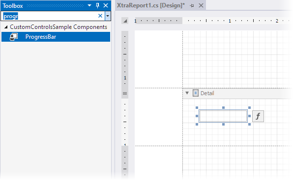
Add the Custom Control to the Toolbox
Visual Studio Toolbox
Add the ToolboxItem attribute and set it to true. Rebuild the project.
Report Designer for WinForms
Handle the XRDesignMdiController.DesignPanelLoaded event to add a custom control to the toolbox:
    designForm.DesignMdiController.DesignPanelLoaded +=
    // ...
}

void DesignMdiController_DesignPanelLoaded(object sender, DesignerLoadedEventArgs e) {
    // Get the Toolbox service from the Designer host.
    IToolboxService ts =
        (IToolboxService)e.DesignerHost.GetService(typeof(IToolboxService));

    // Add a new category to the Toolbox,
    // and place a custom control into it.
    ToolboxItem item = new ToolboxItem(typeof(ProgressBar));
    ts.AddToolboxItem(item, "New Category");
}
Build the solution. The ProgressBar control appears in the toolbox and you can drop the control onto the report band:
Specify Default Property for Data Binding
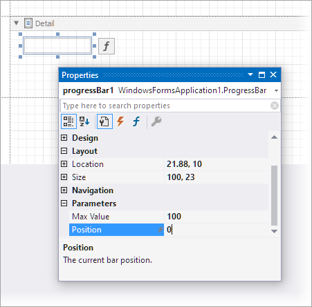
The DefaultBindableProperty attribute for the Position property specifies that when you drop a field from the Field List onto the control, the Position property is bound to that field. For more information on data binding, review the following help topic: Bind Report Controls to Data.
using DevExpress.XtraReports;

[DefaultBindableProperty("Position")]
public class ProgressBar : XRControl {
    //...
}
After you add the DefaultBindableProperty attribute, rebuild the solution. The Position property appears in the Properties window:
Use the Progress Bar Control
Follow the steps below to create a report with a custom ProgressBar control:
Create a new project in Visual Studio.
Add a blank report to the project. For more information, review the following help topic: Create a Report in Visual Studio.
Add the
ProgressBarclass (defined above) to the project.Bind the report to the JSON data source defined in the code snippet below. For more information, review the following help topic: Bind a Report to JSON Data.
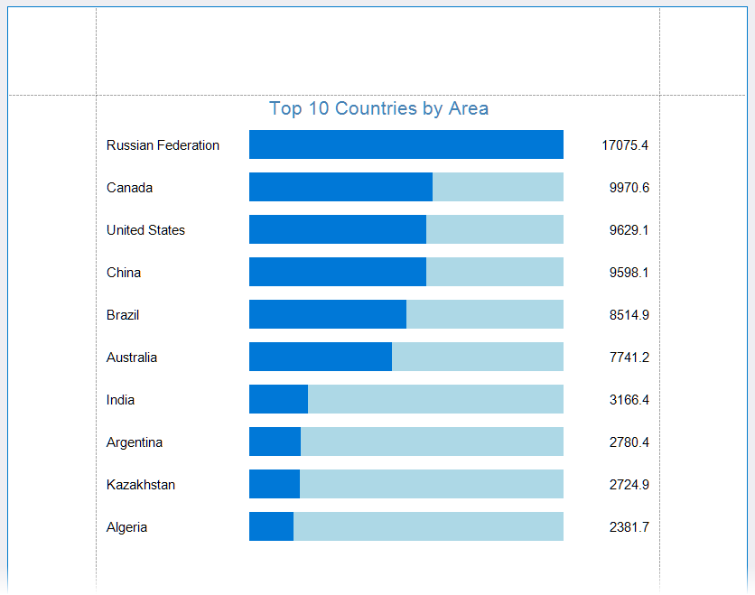
Show JSON Data Source[ { "Country": "Russian Federation", "Area": 17075.4 }, { "Country": "Canada", "Area": 9970.6 }, { "Country": "United States", "Area": 9629.1 }, { "Country": "China", "Area": 9598.1 }, { "Country": "Brazil", "Area": 8514.9 }, { "Country": "Australia", "Area": 7741.2 }, { "Country": "India", "Area": 3166.4 }, { "Country": "Argentina", "Area": 2780.4 }, { "Country": "Kazakhstan", "Area": 2724.9 }, { "Country": "Algeria", "Area": 2381.7 } ]Design the report layout as shown in the image that follows. Use the XRLabel control to display countries and areas. Set the BackColor property to LightBlue. Set the MaxValue property to 17100:
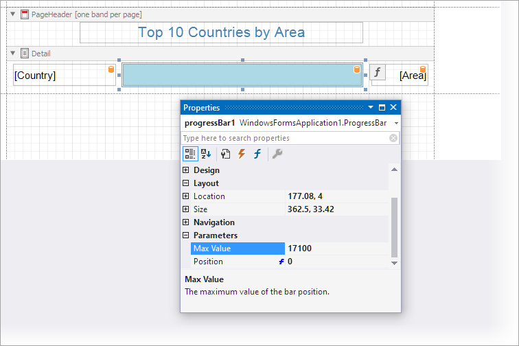
Click the f-button next to the control to invoke the Expression Editor and bind the
Positionproperty to the data field: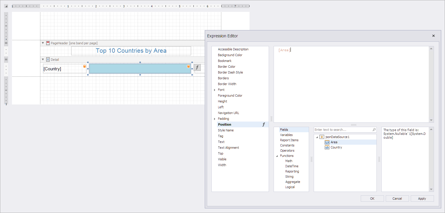
Switch to Preview to display the document generated from the report layout: