BaseRepositoryItemCheckEdit.BorderStyle Property
Gets or sets the style used to draw the check editor’s border.
Namespace: DevExpress.XtraEditors.Repository
Assembly: DevExpress.XtraEditors.v19.2.dll
Declaration
[DXCategory("Appearance")]
[DefaultValue(BorderStyles.NoBorder)]
public override BorderStyles BorderStyle { get; set; }Property Value
| Type | Default | Description |
|---|---|---|
| BorderStyles | **NoBorder** | A BorderStyles enumeration value identifying the style used to draw the check editor’s border. |
Available values:
| Name | Description |
|---|---|
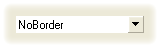
| NoBorder | There are no borders. The image below demonstrates the NoBorder style applied to the ButtonEdit control.
|
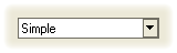
| Simple | Borders are flat. The image below demonstrates the Simple style applied to the ButtonEdit control.
|
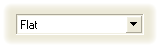
| Flat | Borders are flat. The image below demonstrates the Flat style applied to the ButtonEdit control.
|
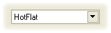
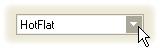
| HotFlat | Borders are flat. Borders and the client area are highlighted when the mouse pointer is positioned over them. The image below demonstrates the HotFlat style applied to the ButtonEdit control.
|
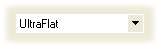
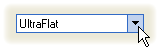
| UltraFlat | Borders have an Office XP style. Borders and the client area are highlighted when the mouse pointer is positioned over them or they are focused. Otherwise, there are no borders. The image below demonstrates the UltraFlat style applied to the ButtonEdit control.
|
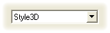
| Style3D | Borders are three-dimensional. The image below demonstrates the Style3D style applied to the ButtonEdit control.
|
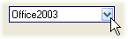
| Office2003 | Borders have an Office 2003 style. The image below demonstrates the Office2003 style applied to a ButtonEdit control.
|
| Default | The border style is determined by the current Look-and-Feel settings. For example, text editors’ borders are painted according to the RepositoryItem.LookAndFeel object’s settings. |
Remarks
Use the BorderStyle property to specify how the check editor’s border should be drawn. You can select one of the predefined styles (NoBorder, Simple, Flat, HotFlat, UltraFlat, Style3D and Default). If the property is set to the BorderStyles.Default value, the border’s look and feel depends on the editor’s RepositoryItem.LookAndFeel object settings.
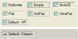
The following image displays check edit controls with different border styles applied:
Assigning a new value for the BorderStyle property at runtime generates the RepositoryItem.PropertiesChanged event.