DockPanel.AllowCustomHeaderButtonsGlyphSkinning Property
Gets or sets whether Custom Header Button icons should be painted according to the currently applied skin.
Namespace: DevExpress.XtraBars.Docking
Assembly: DevExpress.XtraBars.v21.2.dll
NuGet Packages: DevExpress.Win.Design, DevExpress.Win.Navigation
Declaration
[Browsable(false)]
[DefaultValue(DefaultBoolean.Default)]
[EditorBrowsable(EditorBrowsableState.Never)]
[XtraSerializableProperty]
public DefaultBoolean AllowCustomHeaderButtonsGlyphSkinning { get; set; }Property Value
| Type | Default | Description |
|---|---|---|
| DefaultBoolean | Default | true if Custom Header Button icons should be painted according to the currently applied skin; otherwise, false. |
Available values:
| Name | Description |
|---|---|
| True |
|
| False |
|
| Default | The default behavior determined by the control’s logic. |
Remarks
The DockPanel.AllowGlyphSkinning property allows you to paint panel icons in this panel’s foreground color. This property affects icons within panel caption, the tab header and auto-hide header. To apply the Glyph Skinning to the Custom Header Button icons, use the AllowCustomHeaderButtonsGlyphSkinning property instead.
The AllowCustomHeaderButtonsGlyphSkinning property’s main objective is to paint Custom Header Button icons in an application Skin‘s colors. Use it to implement your own custom buttons that look exactly like default buttons (close, auto-hide, maximize). However, you can use it to paint monochrome icons in your own custom colors. To do this, access the IButtonProperties.Appearance section of the desired items within the DockPanel.CustomHeaderButtons collection.
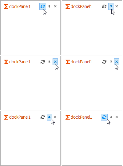
The animation below illustrates a DockPanel with two default and one custom header button. All three buttons are painted in the same pattern according to the currently applied skin (Office 2013).

See the Glyph Skinning topic to see all controls that support the Glyph Skinning Feature.