Popup Menus Overview
- 6 minutes to read
This topic gives you general information on popup menus in Data Grid. There are default context menus for column headers, group panel and footer cells. It is possible to customize these menus via events. Additionally, you can provide custom menus for any of the grid’s elements.
Standard Menus
Grid Views provide several context menus to end-users. These popup menus provide the ability to perform actions linked to particular visual elements. A context menu can be invoked by right-clicking on any of the visual elements listed below.
-
This context menu enables end-users to manipulate a column (apply sorting, grouping, calculate the best column width, etc.).
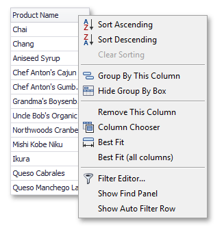
The three upper items control a column’s sort mode. The Group By This Column item enables grouping by this column. If data is already grouped by a column, the Group By This Column item is changed to UnGroup. This context menu allows end-users to show/hide the Group Panel, invoke the Customization Form, and resize the columns for best fit and clear filtering (if applied).
-
Using this menu, end-users can specify or change the type of summary calculated for a column.

These menu items specify the summary type. If a column’s data is not numeric, the Sum and Average items are disabled.
-
This menu provides grouping related options.

Here you can collapse or expand all group rows or clear a grouping. When grouping is not applied within a current view, all menu items are inaccessible.
The GridView.OptionsMenu property provides a set of Boolean flags specifying the availability of context menus to end-users. The GridOptionsMenu.EnableColumnMenu, GridOptionsMenu.EnableGroupPanelMenu and GridOptionsMenu.EnableColumnMenu properties affect the availability of the column, group panel and footer menus, respectively.
For greater control over context menus, you can use the GridView.PopupMenuShowing event. If the GridView.OptionsMenu property allows menus to be invoked, the GridView.PopupMenuShowing event fires each time a user attempts to invoke a context menu. This event’s parameters allow you to identify which menu is about to be displayed, customize a menu or prevent it from being invoked.
The GridView.GridMenuItemClick event is fired in response to a menu item being clicked. It enables you to cancel the default actions performed when a particular menu item is clicked and to provide your own handling instead. You can also perform actions in addition to default processing. For instance, you may update a summary item’s formatting when an end-user changes the summary type. To learn more about advanced menu customization, refer to the Implementing Custom Behavior for Popup Menus topic.
Menu Appearance
By default, menu items in Grid Control are painted by the control itself according to the system’s settings. In this case, changing a control’s look and feel settings doesn’t result in the appearance of menus being changed.
If however you assign a BarManager component to the control’s EditorContainer.MenuManager property, you will be able to control the appearance of its menus. The menus will be painted using the look and feel settings exposed by the bar manager. The following image shows a column header menu painted using the Office2003 scheme.
Note that the BarManager is a part of the DevExpress Ribbon, Menu and Docking Library and is not included in the Grid Control Suite.
Menu Objects
This subsection gives you information on the object structure used to implement the control’s menus. This is useful when customizing the standard menus and when creating new ones.
All the grid’s menus are declared in the DevExpress.XtraGrid.Menu namespace. The following image shows the class hierarchy of the menus.

The base class for the grid’s menus is ViewMenu. The GridViewMenu represents the base class for menus in Grid Views. ViewMenu and GridViewMenu objects do not contain any menu items, the menu items are added by their descendants listed in the following table.
| Menu Class | Description |
|---|---|
| GridViewColumnMenu | Represents a standard menu for column headers. |
| GridViewGroupPanelMenu | Represents a standard menu for a View’s group panel. |
| GridViewFooterMenu | Represents a standard menu for a footer cell. |
If you need to customize standard menus, handle the GridView.PopupMenuShowing event. This occurs when a menu is about to be invoked. The event’s Menu parameter refers to the menu being displayed.
Each menu object has an Items property that represents its collection of menu items. You can freely modify this collection depending on your particular needs. Menu items are described below.
To provide a custom menu for a specific grid’s element (a row, indicator cell, etc.), you need to handle the BaseView.MouseDown event (or the grid control’s MouseDown event) in which a new menu will be created and displayed.
A custom menu can be implemented as a separate class derived from the ViewMenu or any of its descendants. Alternatively, you can create instances of the menus provided directly in code (without inheritance). For Grid Views, custom menus should be based on the GridViewMenu class or any of its descendants. For Card Views, use the ViewMenu class. To display the created menu, call its Show method.
Items in XtraGrid’s menus are represented by DXMenuItem objects or its descendants. All the menu items are declared in the DevExpress.Utils.Menu namespace.
The menu items support the described painting mechanism, i.e. these are painted using the system’s settings or bar manager’s settings depending on whether the control’s EditorContainer.MenuManager property is assigned or not.
A hierarchal diagram is shown below.

| Menu Item Class | Description |
|---|---|
| DXMenuItem | Represents a regular item. Clicking such an item invokes an associated delegate that performs required actions. |
| DXMenuCheckItem | Represents an item that can have two states (checked and unchecked). Clicking such an item toggles its state and then calls the associated delegate. |
| DXSubMenuItem | Represents an item containing other items, i.e. a submenu. To add sub-items to a DXSubMenuItem item, use its Items collection. A DXSubMenuItem item can be associated with a delegate that will be called before its sub-items are displayed. This allows you, for instance, to populate the Items collection dynamically. |
Each menu item provides a number of customization properties.
| Menu Item Property | Description |
|---|---|
| Caption | Specifies an item’s caption. |
| Image | Specifies an image displayed before an item’s caption |
| Shortcut | Specifies the shortcut used to activate an item. |
| Tag | Allows you to associate custom data with an item. |
| Enabled | Specifies whether or not an item is accessible. |
| Visible | Determines the item’s visibility status. |
| BeginGroup | Determines whether the item starts a logical group. Groups are separated from each other using horizontal lines. |
For examples on customizing a grid’s standard menus, refer to the Implementing Custom Behavior for Popup Menus topic. The Creating Custom Context Menus topic provides an example on how to create a new menu for XtraGrid.