Adorner UI Manager
- 5 minutes to read
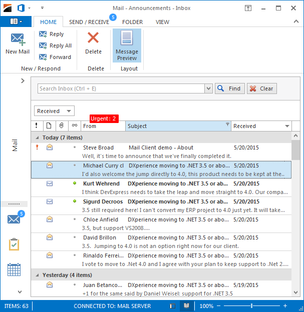
The adorner manager (AdornerUIManager) provides a custom adorner layer - a transparent layer drawn above all UI elements. This layer can be used to draw custom items and visual effects. The following figure illustrates an example. Here, the adorner layer contains the red rectangular element that displays the number of urgent messages above the ‘From’ column, and circular blue elements above the ‘Mail’ button and ‘Send\Receive’ page, which show the total number of new messages.

Add Adorner Elements
Click the “Edit Elements” link within the manager’s smart-tag and utilize the element type selector in the designer that pops up.

You can add adorner elements of three types:
All Adorner elements are bound to the specific control using the AdornerElement.TargetElement property. When the parent UI element for the adorner element is set, you can use the Location property to align the adorner element relative to its parent. Use the Offset property to move the adorner element from this initial position.
To set a container control above the items on which the adorner manager will be able to draw its elements, use the AdornerUIManager.Owner property.
Tip
If you want to show adorner elements for a child form in an MDI application, we recommend that you use the Application UI Manager. This manager automatically hides adorner elements when the child form is hidden or overlapped. If the application uses native MDI forms, you should manually show/hide adorner elements. See AdornerUIManager for an example.
Badges
Badges (Badge) display ‘simple’ static information.

If the BadgeDefaultProperties.ImageOptions.Image property is not specified, a Badge has a circle shape that can be colorized by modifying the BadgeDefaultProperties.PaintStyle property.
Note
An image assigned to the ImageOptions.Image property is converted to a “GlyphSkin” image (by default). Turn off the ImageOptions.AllowGlyphSkinning option to disable glyph skinning.
The following code snippet displays a badge to highlight the “Inbox” Accordion item:

using System.Drawing;
using DevExpress.Utils.VisualEffects;
// ...
Badge badgeInbox;
public Form1() {
    InitializeComponent();
    badgeInbox = new Badge();
    // Assign the badge to the 'Inbox' accordion item
    badgeInbox.TargetElement = accordionItemInbox;
    // Specify badge text
    badgeInbox.Properties.Text = "17";
    // Specify badge location and offset
    badgeInbox.Properties.Location = ContentAlignment.TopLeft;
    badgeInbox.Properties.Offset = new Point(85, 6);
    // Customize badge appearance
    badgeInbox.Appearance.BackColor = Color.Gray;
    badgeInbox.Appearance.BorderColor = Color.Gray;
    badgeInbox.Appearance.ForeColor = Color.White;
    badgeInbox.Appearance.Font = new Font("Tahoma", 8.25F, FontStyle.Bold);

    // Add the badge to the AdornerUIManager
    adornerUIManager1.Elements.Add(badgeInbox);
}
Validation Hints
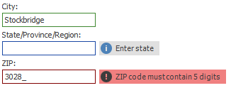
Validation hints are objects of the ValidationHint class that apply specific visual effects to their target controls depending on these controls’ validation states. Not only a validation hint can be hooked up to a DevExpress control, but to any standard or 3rd party control that supports validation (see the Control.Validating MSDN topic). The figure below illustrates an example.

Controls that support validation have three possible validation states: indeterminate, validated and invalid. For each of these states a validation hint can apply two visual effects for its target control:
- a border, drawn around the element;
- a hint with image, text and background.
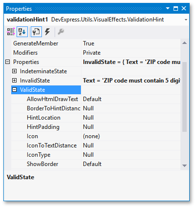
Expand the ValidationHint.Properties group of a validation hint to access three property sub-groups named after related control validation states (the figure below). Each sub-groups stores a ValidationHintBaseDefaultProperties object that provides access to properties that manage this hint’s behavior for this specific validation state. For instance, you can use the ValidationHintBaseDefaultProperties.ShowBorder and ValidationHintBaseDefaultProperties.ShowHint properties to choose whether you want to display a validation border, a hint or none of them (by default, both effects are shown). At the figure above, a validation hint for the “City” data field shows only a border for the valid state, while indeterminate “State” and invalid “ZIP” editors display both a border and a hint.

Same approach is used for visual hint appearances. The ValidationHint.Appearances property provides access to three AppearanceObjects that allow you to customize effects for each control validation state separately.A hint paints blue borders for indeterminate controls, green for validated, and red for invalid ones.
The background color set in a hint’s Appearances group is ignored by default. Use ValidationHintBaseProperties.ShowBackgroundMode and ValidationHintBaseDefaultProperties.ShowBackgroundMode properties to specify whether this color should be applied to a hint, a target UI element, or to both of them. The following figure illustrates different appearances you can get by setting these properties to different values. Note that in case you choose to apply the background color to the target UI element, utilize semi-transparent ARGB colors instead of solid RGB colors.

To apply same behavior and appearance settings for all validation hints simultaneously, utilize the component’s AdornerUIManager.ValidationHintProperties and AdornerUIManager.ValidationHintAppearances properties. These global settings have lower priority than corresponding settings of individual validation hints.
You can also utilize the ValidationHintDefaultProperties.State property to explicitly switch a validation hint to a desired validation state.
Guides
Guides are adorner elements designed to highlight and emphasize specific spots or regions within a parent form and give an optional description for these areas. Refer to the following help topic for additional information: Adorner Guides.
