TextEdit Class
A text editor.
Namespace: DevExpress.WinUI.Editors
Assembly: DevExpress.WinUI.Editors.v23.2.dll
NuGet Package: DevExpress.WinUI
#Declaration
#Remarks
The DevExpress WinUI TextEdit is a field that allows you to enter and edit text.
#Add a TextEdit to a Project
Follow the steps below to add a TextEdit control to an application:
- Reference the
DevExpress.WinUINuGet package. Refer to the Get Started topic for more information. - Add the following markup to a XAML page:
<dxe:TextEdit>…</dxe:TextEdit>. - Configure the component (see the sections below).
#Edit Value
Use the EditValue property to set or data-bind the edit value.
If a user changes the edit value, the EditValue property accepts the change only if Input Validation is successful. If validation fails, the control keeps its previous value and prompts the user to enter a different value.
<Window ...
    xmlns:dxe="using:DevExpress.WinUI.Editors">

    <StackPanel Orientation="Horizontal">
        <dxe:TextEdit Name="textEdit" EditValue="Some text"/>
        <dxe:TextEdit Name="boundtextEdit" EditValue="{x:Bind TextValue}"/>
    </StackPanel>
</Window>
public sealed partial class MainWindow : Page {
    public string TextValue { get; set; } = "Some bound text";

    public MainWindow() {
        this.InitializeComponent(); }
}
You can handle the BaseEdit.EditValueChanged event to respond to changes made in the editor.
#Mouse Wheel Spin
If the TextEdit displays Numeric or DateTime data, users can scroll the mouse wheel to increment/decrement values. To enable this behavior, set the AllowSpinOnMouseWheel property to true.
#Display Value
The text displayed in the editor depends on the EditValue and EditValueType properties. You can also use the DisplayFormatString property to apply a custom format (for example, currency display).
<Window ...
    xmlns:dxe="http://schemas.devexpress.com/winfx/2008/xaml/editors"
    xmlns:x="http://schemas.microsoft.com/winfx/2006/xaml">
    <Grid>
        <dxe:TextEdit DisplayFormatString="c">
            <dxe:TextEdit.EditValue>
                <x:Double>1232</x:Double>
            </dxe:TextEdit.EditValue>
        </dxe:TextEdit>
    </Grid>
</Window>

You can handle the CustomDisplayText event to convert values to text based on custom logic.
The DisplayText property returns the string displayed in the editor.
#Masked Input
A TextEdit supports masked input. Refer to the following help topic for more information: Masked Input.
#Input Validation
Refer to the following documentation topic for more information: Input Validation
The following code sample hadles the Validate event to check whether the TextEdit EditValue ends with @hotmail.com:
<dxe:TextEdit Name="textEdit" Text="sample_email@gmail.com" Validate="textEdit_Validate"/>
void TextEdit_Validate(object sender, DevExpress.WinUI.Editors.ValidationEventArgs e) {
    string value = (string)e.Value;
    if (string.IsNullOrEmpty(value) {
        e.IsValid = false;
        e.Handled = true;
        e.ErrorContent = "The value is empty!";
        e.ErrorType = DevExpress.WinUI.Editors.ErrorType.Critical;
    }
    else if (!value.EndsWith("@hotmail.com")) {
        e.IsValid = false;
        e.Handled = true;
        e.ErrorContent = "The value is not valid!";
        e.ErrorType = DevExpress.WinUI.Editors.ErrorType.Warning;
    }
}
#Read-Only Mode
Set the BaseEdit.IsReadOnly property to true to make the TextEdit read-only.
#Multi-Line Input
You can use any of the following properties to specify whether a TextEdit displays text on multiple lines:
- Set the AcceptsReturn property to
trueto let a TextEdit display the newline or return characters. - Set the TextWrapping property to Wrap to enable text wrapping.
#TextEdit Header
You can use the Header property to add a Header to a TextEdit. Use the HeaderTemplate property to customize the header appearance.
#Touch Keyboard
Users can utilize the on-screen touch keyboard to interact with the editor. You can set the following properties to enhance user experience:
| Property | Description |
|---|---|
| Input |
Matches the kind of data the user is expected to enter. |
| Is |
Gets or sets whether the text prediction feature (“autocomplete”) is enabled. |
| Is |
Gets or sets whether the Text |
#Null Text
The following properties specify NullText behavior and appearance:
| Property | Description |
|---|---|
| Null |
Gets or sets the text displayed within the edit box when the editor’s value is null. This is a dependency property. |
| Null |
Gets or sets a null value for the editor. This is a dependency property. |
| Allow |
Gets or sets whether end-users can set the editor’s value to a null reference. This is a dependency property. |
| Show |
Gets or sets whether to display the null text. This is a dependency property. |
| Show |
Gets or sets whether to display the null text for the Empty value. This is a dependency property. |
<dxe:TextEdit NullText="Last Name" NullTextForeground="#ACACAC" ShowNullText="True" AllowNullInput="False"/>
#Customize Appearance
You can use the following properties to customize a TextEdit appearance:

- Foreground, NullTextForeground, SelectionHighlightBrush, TextAlignment.
- Background, Padding, Margin.
- CornerRadius, BorderBrush, BorderThickness.
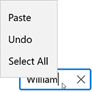
<dxe:TextEdit NullText="Input a Name" Text="William" Foreground="#FF505050" Background="#FFE9EBEC"
              CornerRadius="14" BorderBrush="#FF0D3A50" BorderThickness="2" Width="150" SelectionHighlightBrush="#FF0D3A50" />
#Format Text
You can use the following properties to adjust font settings in a TextEdit: