SpinEdit Class
A SpinEdit control.
Namespace: DevExpress.WinUI.Editors
Assembly: DevExpress.WinUI.Editors.v23.2.dll
NuGet Package: DevExpress.WinUI
#Declaration
[ToolboxTabName("DX.23.2: Common Controls")]
public class SpinEdit :
    TextEdit,
ISupportTextEditable#Remarks
SpinEdit is an editor with up/down buttons that increment/decrement the editor’s value.
#Add a SpinEdit to a Project
Follow the steps below to add a SpinEdit control to an application:
- Reference the
DevExpress.WinUINuGet package. Refer to the Get Started topic for more information. - Add the following markup to a XAML page:
<dxe:SpinEdit>…</dxe:SpinEdit>. - Configure the component (see the sections below).
#Edit Value
Use the Value property to set or data-bind the edit value.
If a user changes the edit value, the Value property accepts the change only if Input Validation is successful. If validation fails, the control keeps its previous value and prompts the user to enter a different value.
Use the SpinEdit.Increment property to specify the SpinEdit value step. This property value is added to/subtracted from the Value property value each time a user clicks increment/decrement spin buttons.
<Window ...
xmlns:dxe="using:DevExpress.WinUI.Editors">
<StackPanel Orientation="Horizontal">
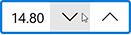
<dxe:SpinEdit Name="spinEdit" Value="14.8" Increment="0.2"/>
<dxe:SpinEdit Name="boundspinEdit" Value="{x:Bind NumericValue}" Increment="2"/>
</StackPanel>
</Window>
public sealed partial class MainWindow : Page {
    public string NumericValue { get; set; } = "18";

    public MainWindow() {
        this.InitializeComponent(); }
}
If AllowRoundOutOfRangeValue is true and a user enters a value outside the allowed range, the editor corrects user input to either MaxValue or MinValue
#Minimum and Maximum Values
Use the MinValue and MaxValue properties to specify the minimum and maximum allowed values.
Use the SetMinimum() or SetMaximum() method to set the editor’s value to the minimum or maximum value.
<Window ...
    xmlns:dxe="using:DevExpress.WinUI.Editors">

    <StackPanel Orientation="Horizontal">
        <dxe:SpinEdit Value="0.8" MinValue="0.01" MaxValue="0.99" Increment="0.01"/>
    </StackPanel>
</Window>
#Mouse Wheel Spin
You can set the TextEdit.AllowSpinOnMouseWheel property to true to allow users to spin the mouse wheel to change an editor value.
#Masked Input
A SpinEdit supports masked input. Refer to the following documentation topic for more information: Masked Input.
#Input Validation
Refer to the following documentation topic for more information: Input Validation.
The following code sample hadles the Validate event restricts a SpinEdit to take an empty or 0 value:
<dxe:SpinEdit Name="spinEdit" Text="2.2" Validate="spinEdit_Validate"/>
private void spinEdit_Validate(object sender, DevExpress.WinUI.Editors.ValidationEventArgs e) {
    if ((e.Value) == null) {
        e.IsValid = false;
        e.Handled = true;
        e.ErrorContent = "The value is empty!";
        e.ErrorType = DevExpress.WinUI.Editors.ErrorType.Critical;
    }
    else if (Convert.ToDouble(e.Value) == 0) {
        e.IsValid = false;
        e.Handled = true;
        e.ErrorContent = "The value is not valid!";
        e.ErrorType = DevExpress.WinUI.Editors.ErrorType.Warning;
    }
}
#Text Input Availability
Set the BaseEdit.IsReadOnly property to true to activate a SpinEdit‘s read-only mode.
#SpinEdit Header
You can use the Header property to add a Header to a SpinEdit. Use the HeaderTemplate property to customize the header appearance.
#Null Text
The following properties specify NullText behavior and appearance:
| Property | Description |
|---|---|
| Text |
Gets or sets the text displayed within the edit box when the editor’s value is null. This is a dependency property. |
| Text |
Gets or sets a null value for the editor. This is a dependency property. |
| Text |
Gets or sets whether end-users can set the editor’s value to a null reference. This is a dependency property. |
| Text |
Gets or sets whether to display the null text. This is a dependency property. |
| Text |
Gets or sets whether to display the null text for the Empty value. This is a dependency property. |
<dxe:SpinEdit NullText="Value" NullTextForeground="#ACACAC" ShowNullText="True" AllowNullInput="False"/>
#Customize Appearance
You can use the following properties to customize a SpinEdit appearance:

- Foreground, NullTextForeground, SelectionHighlightBrush, TextAlignment.
- Background, Padding, Margin.
- CornerRadius, BorderBrush, BorderThickness.
<dxe:SpinEdit NullText="Input a value" Text="0.00" Foreground="#FF505050" Background="#FFE9EBEC"
              CornerRadius="14" BorderBrush="#FF0D3A50" BorderThickness="2" Width="150" SelectionHighlightBrush="#FF0D3A50" >
#Format Text
You can use the following properties to adjust font settings in a SpinEdit: