FunnelChart Class
The Funnel Chart control is used to plot series of data points on a funnel chart area.
Namespace: DevExpress.WinUI.Charts
Assembly: DevExpress.WinUI.Charts.v23.2.dll
NuGet Package: DevExpress.WinUI
#Declaration
[ContentProperty(Name = "Series")]
[ToolboxTabName("DX.23.2: Visualization")]
public class FunnelChart :
    ChartBase,
IChartViewHolder#Remarks
A funnel chart displays a wide area at the top that indicates the total point value, while other areas are proportionally smaller.
For example, a funnel chart can display a sales funnel that indicates sale process stages, including potential loses at each stage. This allows users to identify weak points in an organization’s current sales processes, and indicate possible bottlenecks within the data.

#Get Started
Read the following topic for a step-by-step guide on how to create a chart-based application with a funnel:
#Series and Series Views
The FunnelChart control can display series of the FunnelSeries type. To access series view settings, set a series’ View property to a FunnelSeriesView object. FunnelSeriesView allows you to access series label, appearance, tooltip settings, and so on.
<Window
    xmlns:Charts="using:DevExpress.WinUI.Charts">
    <Grid>
        <Charts:FunnelChart>
            <Charts:FunnelChart.Series>
                <Charts:FunnelSeries>
                    <Charts:FunnelSeries.View>
                        <Charts:FunnelSeriesView>
                            <!--...-->
                        </Charts:FunnelSeriesView>
                    </Charts:FunnelSeries.View>
                </Charts:FunnelSeries>
            </Charts:FunnelChart.Series>
        </Charts:FunnelChart>
    </Grid>
</Window>
For more information about the Point, Series and View terms, refer to the following help topic: Data Points, Series and Series Views.
#Populate the Chart with Data
You can create funnel series and add them to the FunnelChart.Series collection. Then, you can manually populate each series with points, or connect series to a data source and create points based on data source fields. Series can also be generated based on a template from a ViewModel.
For more information on how to populate a chart with data, refer to the following help topic: Load Chart Data.
#Labels
Labels can contain any kind of supplementary information for funnel series points. Enable the SeriesView.ShowLabels property to show labels. To format label text, specify the SeriesView.LabelPattern property. Define the SeriesView.LabelTemplate property to apply a custom appearance to labels.
The following example configures funnel point labels:

<Charts:FunnelSeriesView ShowLabels="True"
                         LabelPattern="{}{A}: {VP:p2}"
                         LabelPosition="LeftColumn"
                         ...>
    <Charts:FunnelSeriesView.LabelTemplate>
        <DataTemplate>
            <Border BorderThickness="1"
                    Opacity="1.0"
                    BorderBrush="{Binding Path=PointColorBrush}">
                <Border.Background>
                    <SolidColorBrush Color="White"/>
                </Border.Background>
                <TextBlock Text="{Binding Path=Text}"
                           Padding="5,1"
                           Foreground="Black"
                           FontFamily="SegoeUI"
                           FontStyle="Normal"
                           FontSize="14"
                           FontWeight="Light"
                           FontStretch="Normal"/>
            </Border>
        </DataTemplate>
    </Charts:FunnelSeriesView.LabelTemplate>
</Charts:FunnelSeriesView>
#Legend
Set the ChartBase.Legend property to a Legend object to add the legend to the chart. To format text displayed in the legend for funnel series points, specify the SeriesView.LegendPointPattern property.
<Charts:FunnelChart>
    <Charts:FunnelChart.Series>
        <Charts:FunnelSeries>
            <!--...-->
            <Charts:FunnelSeries.View>
                <Charts:FunnelSeriesView ...
                                         LegendPointPattern="{}{A}: {V}">
                </Charts:FunnelSeriesView>
            </Charts:FunnelSeries.View>
        </Charts:FunnelSeries>
    </Charts:FunnelChart.Series>
    <Charts:FunnelChart.Legend>
        <Charts:Legend HorizontalPosition="Right"
                       VerticalPosition="Center"
                       Orientation="Vertical"
                       Margin="40,0,0,0"/>
    </Charts:FunnelChart.Legend>
</Charts:FunnelChart>
#Series Title
Each pie series can have an individual title. To add a title, specify the FunnelSeriesView.Title property. Specify the FunnelSeriesView.TitleContentTemplate property to configure title appearance.
<Charts:FunnelSeriesView ...
                         Title="Website Visitors">
    <Charts:FunnelSeriesView.TitleContentTemplate>
        <DataTemplate>
            <TextBlock Text="{Binding}"
                    FontSize="18"
                    Margin="20"/>
        </DataTemplate>
    </Charts:FunnelSeriesView.TitleContentTemplate>
</Charts:FunnelSeriesView>
Use the FunnelSeriesView.ShowTitle property to control title visibility. To specify the title position regarding the funnel series, define the FunnelSeriesView.TitlePosition property.
#Tooltips
Turn on the ChartBase.ToolTipEnabled property to allow users to click funnel series points to show hints. Specify the SeriesView.ToolTipPointPattern property to format tooltip text.

<Charts:FunnelChart ...
                    ToolTipEnabled="True">
    <Charts:FunnelChart.Series>
        <Charts:FunnelSeries>
            <!--...-->
            <Charts:FunnelSeries.View>
                <Charts:FunnelSeriesView ...
                                         ToolTipPointPattern="{}{A}: {VP:p2} ({V})">
                <!--...-->
                </Charts:FunnelSeriesView>
            </Charts:FunnelSeries.View>
        </Charts:FunnelSeries>
    </Charts:FunnelChart.Series>
</Charts:FunnelChart>
#Selection
Users can click funnel series points to select them. To enable selection and choose a selection mode, specify the ChartBase.SelectionMode property. To respond to user selection actions, handle the ChartBase.SelectionChanged event. Use the SeriesView.SelectedItem and SeriesView.SelectedItems properties to access selected funnel points. Specify the SeriesView.SelectedItemBrush property to set the color of selected points.
Learn more: Selection.
#Colorization
The chart uses colors from the palette to color funnel points. If you want to apply an individual palette to a funnel in a multi-funnel chart, use the SeriesView.Palette property for each separate funnel series.
The following example shows how to apply a custom palette to a funnel chart:

<Charts:FunnelChart ...>
    <Charts:FunnelChart.Palette>
        <Charts:CustomPalette>
            <Color>#9AB57E</Color>
            <Color>#E55253</Color>
            <Color>#7E4452</Color>
            <Color>#E8C267</Color>
            <Color>#565077</Color>
        </Charts:CustomPalette>
    </Charts:FunnelChart.Palette>
</Charts:FunnelChart>
#Layout and Size
Use the following properties to specify layout settings of funnel series and points:
- MinIndentBetweenSeries
- Specifies the minimal indent between funnels in pixels.
- HeightToWidthRatio
- Defines the ratio of the funnel’s height to its width. Before you set
HeightToWidthRatio, disable the HeightToWidthRatioAuto property. - PointDistance
- Specifies the distance between funnel points.
- AlignToCenter
- Defines whether to align the funnel in the center of the chart.
#Animations
The Chart can automatically start series animation when the chart is loaded and/or when series data changes. Use the AnimateOnLoading and DataChangingAnimationMode properties to control automatic animation behavior.
Use the FunnelSeriesView.PointAnimation property to select the animation type applied to funnel series points.
You can call the ChartBase.Animate (or SeriesView.Animate) method for an individual series to start animation at a specific time.
The following example shows how to animate funnel series points:
<Charts:FunnelChart AnimateOnLoading="True">
    <Charts:FunnelChart.Series>
        <Charts:FunnelSeries>
            <Charts:FunnelSeries.View>
                <Charts:FunnelSeriesView>
                    <Charts:FunnelSeriesView.PointAnimation>
                        <Charts:FunnelFlyInAnimation BeginTime="00:00:00.50"
                                                     Duration="00:00:01"
                                                     PointOrder="Random">
                            <Charts:FunnelFlyInAnimation.EasingFunction>
                                <CubicEase/>
                            </Charts:FunnelFlyInAnimation.EasingFunction>
                        </Charts:FunnelFlyInAnimation>
                    </Charts:FunnelSeriesView.PointAnimation>
                </Charts:FunnelSeriesView>
            </Charts:FunnelSeries.View>
        </Charts:FunnelSeries>
    </Charts:FunnelChart.Series>
</Charts:FunnelChart>
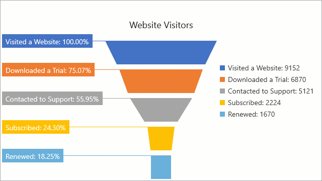
#Example
This example creates a Funnel Chart, and customizes its legend and point label settings:

<Window
    xmlns="http://schemas.microsoft.com/winfx/2006/xaml/presentation"
    xmlns:x="http://schemas.microsoft.com/winfx/2006/xaml"
    xmlns:local="using:FunnelChart"
    xmlns:d="http://schemas.microsoft.com/expression/blend/2008"
    xmlns:mc="http://schemas.openxmlformats.org/markup-compatibility/2006"
    xmlns:Charts="using:DevExpress.WinUI.Charts"
    x:Class="FunnelChart.MainWindow"
    mc:Ignorable="d">

    <Grid Background="{ThemeResource ApplicationPageBackgroundThemeBrush}">
        <Charts:FunnelChart ToolTipEnabled="True" Margin="50,50,50,50">
            <Charts:FunnelChart.Legend>
                <Charts:Legend Orientation="Vertical"/>
            </Charts:FunnelChart.Legend>
            <Charts:FunnelSeries>
                <Charts:FunnelSeries.View>
                    <Charts:FunnelSeriesView PointDistance="5"
                                             ShowLabels="True"
                                             LabelPattern="{}{A}: {VP:p0}"
                                             LabelPosition="Right"/>
                </Charts:FunnelSeries.View>
                <Charts:PointDataCollection>
                    <Charts:PointData Argument="Visited a Web Site" Value="9152" />
                    <Charts:PointData Argument="Downloaded a Trial" Value="6870" />
                    <Charts:PointData Argument="Contacted to Support" Value="5121" />
                    <Charts:PointData Argument="Subscribed" Value="2224" />
                    <Charts:PointData Argument="Renewed" Value="1670" />
                </Charts:PointDataCollection>
            </Charts:FunnelSeries>
        </Charts:FunnelChart>
    </Grid>
</Window>