AxisBase Class
The base class for axes.
Namespace: DevExpress.WinUI.Charts
Assembly: DevExpress.WinUI.Charts.v23.2.dll
NuGet Package: DevExpress.WinUI
#Declaration
public abstract class AxisBase :
ChartPanel#Remarks
The AxisBase class is a base class for the Cartesian Chart’s AxisX and AxisY. The AxisBase class defines properties and methods that implement the base axis functionality and are common to all axes.
Use the following markup to create axes and access their settings:
<Charts:CartesianChart.AxisX>
    <Charts:AxisX ShowLine="True"/>
</Charts:CartesianChart.AxisX>
<Charts:CartesianChart.AxisY>
    <Charts:AxisY ShowLine="True"/>
</Charts:CartesianChart.AxisY>
The following example shows how to create and configure an x-axis at runtime:
<Charts:CartesianChart x:Name="chart">
    <!--...-->
</Charts:CartesianChart>
chart.AxisX = new DevExpress.WinUI.Charts.AxisX {
    ShowLine = true,
    Brush = new Microsoft.UI.Xaml.Media.SolidColorBrush(Microsoft.UI.Colors.Red)
};
#Axis Spacing
Specify the GridSpacing property to set the interval between axis grid lines. Before you set GridSpacing, disable the grid spacing’s automatic calculation. To do this, set the GridSpacingAuto property to false.
The following images show different GridSpacing values set for an x-axis:
| Grid |
Grid |
|---|---|
 |
 |
<Charts:CartesianChart.AxisX>
    <Charts:AxisX GridSpacing="20"
                  GridSpacingAuto="False"/>
</Charts:CartesianChart.AxisX>
#Date-Time Axis Specifics
Define the DateTimeMeasureUnit property to set an interval that is used to aggregate data points. Aggregation allows you to group data source points to series points with a higher measurement unit.
You can also set the DateTimeGridAlignment property to specify what date-time interval is used to align grid lines, for example, day or year, and so on.
#Axis Visibility
The axis line is initially hidden. To show the axis line, enable the ShowLine property.
If you want to hide an axis and all its elements, disable the Visible property.
#Reversed Axis
The Chart labels an x-axis from left to right, and a y-axis from bottom to top. You can reverse an x-axis to label it from right to left, and a y-axis from top to bottom. To do this, set the Reverse property to true.
| Reverse = false | Reverse = true |
|---|---|
 |
 |
<Charts:CartesianChart.AxisY>
    <Charts:AxisY Reverse="True"/>
</Charts:CartesianChart.AxisY>
#Axis Ranges
Whole and visual axis ranges define data displayed by an axis. The whole range specifies the data source values the chart displays at the minimum zoom level. If whole range limits are not set, the whole range is calculated based on the data of all series associated with the axis. The visual range depends on the zoom level and is initially equal to the whole range.
To specify whole and visual range boundaries, specify the following properties:
- Visual range - VisualRangeStartValue and VisualRangeEndValue
- Whole range - WholeRangeStartValue and WholeRangeEndValue
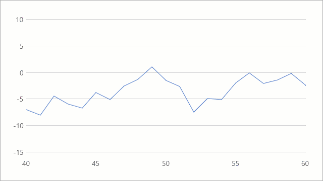
The following image shows a chart with default x-axis range boundaries (from 0 to 100) calculated based on underlying data source values:

The example below specifies the x-axis’ visual and whole ranges for the chart shown above. Before you specify ranges, disable the WholeRangeAutoCorrect property:
<Charts:CartesianChart.AxisX>
    <Charts:AxisX x:Name="axisX"
                  WholeRangeAutoCorrect="False"
                  WholeRangeStartValue="20"
                  WholeRangeEndValue="80"
                  VisualRangeStartValue="40"
                  VisualRangeEndValue="60"/>
</Charts:CartesianChart.AxisX>
You can also call the SetVisualRangeValues and SetWholeRangeValues methods to configure ranges.
The Chart synchronizes the visual range boundaries with the whole range boundaries when the whole range changes. Use the SynchronizeVisualRange property to disable this functionality.
The Chart adds additional margins between the outermost series point and the diagram’s edge. To configure margins, use the SideMargins property.
#Axis Labels
The Chart generates labels based on series data.
Specify the LabelPattern property to format label text. To define appearance of labels and label text, use the LabelTemplate property. To rotate labels at an angle in degrees, set the LabelAngle property.
The following example shows how to configure x-axis labels:

<Charts:CartesianChart.AxisX>
    <Charts:AxisX x:Name="axisX"
                  LabelPattern="{}{V:yyyy, MMM}"
                  LabelAngle="20">
        <Charts:AxisX.LabelTemplate>
            <DataTemplate>
                <TextBlock Text="{Binding Text}"
                           FontSize="16"
                           Foreground="Black" />
            </DataTemplate>
        </Charts:AxisX.LabelTemplate>
    </Charts:AxisX>
</Charts:CartesianChart.AxisX>
Use the ShowLabels property to control label visibility.
#Axis Title
An axis can have a single title. To add a title, use the Title property to specify title content. Configure the TitleContentTemplate property to apply specific appearance settings to the title. Define the TitleAlignment property to specify title alignment along an axis.
To control title visibility, use the ShowTitle property.
The following markup shows the x-axis’ title, and specifies its content and appearance:

<Charts:CartesianChart.AxisX>
    <Charts:AxisX Title="Year"
                  ShowTitle="True"
                  TitleAlignment="Far">
        <Charts:AxisX.TitleContentTemplate>
            <DataTemplate>
                <TextBlock Text="{Binding}"
                           FontSize="16"
                           Foreground="Gray"/>
            </DataTemplate>
        </Charts:AxisX.TitleContentTemplate>
    </Charts:AxisX>
</Charts:CartesianChart.AxisX>
#Axis Strips
You can add multiple strips to each axis. To do so, add Strip objects to an axis’ Strips collection. To define the boundaries of an area that a strip highlights, use the strip’s StartValue and EndValue properties.

<Charts:CartesianChart.AxisX>
    <Charts:AxisX x:Name="axisX">
        <Charts:AxisX.Strips>
            <Charts:Strip StartValue="40"
                          EndValue="70"
                          Brush="#90ec7016"/>
        </Charts:AxisX.Strips>
    </Charts:AxisX>
</Charts:CartesianChart.AxisX>
#Axis Position
You can display an x-axis on the bottom or top of a chart’s plot area, and a y-axis on the left or right. To define the axis position, use the Alignment property.
<Charts:CartesianChart.AxisY>
    <Charts:AxisY Alignment="Far" />
</Charts:CartesianChart.AxisY>
#Axis Appearance
Set the AxisBase.Brush property to change the axis color. Use the AxisBase.Thickness property to control the axis thickness in pixels.
<Charts:CartesianChart.AxisY>
    <Charts:AxisY ShowLine="True"
                  Thickness="2"
                  Brush="Black"/>
</Charts:CartesianChart.AxisY>
#Axis Grid Lines and Tickmarks
Use the following properties to show major and minor tickmarks and gridlines:
The frequency of major grid lines and tickmarks depends on grid spacing. For more information, refer to the following section: Axis Spacing. The number of minor grid lines and tickmarks depends on the MinorCount property.
Use the following properties to define a color used to paint major and minor grid lines:
To customize the appearance of the line used to draw grid lines, specify the following properties:
The following properties allow you to specify length and thickness of major and minor axis tickmarks:
#Chart Interlaced Background
You can display interlaced strip lines on a chart’s diagram for any of its axes. Use the Interlaced property to show a “ribbed” background with two alternating colors. The default interlaced strip color can be changed from the InterlacedBrush property.

<Charts:CartesianChart.AxisY>
    <Charts:AxisY Interlaced="True"
                  InterlacedBrush="#90c5c5c5"/>
</Charts:CartesianChart.AxisY>