LayoutGroup.ItemStyle Property
Gets or sets the style of layout items that belong to the current group and nested groups (provided that the nested group’s ItemStyle property is not set). This is a dependency property.
Namespace: DevExpress.Xpf.LayoutControl
Assembly: DevExpress.Xpf.LayoutControl.v18.2.dll
Declaration
Property Value
| Type | Description |
|---|---|
| Style | A Style object that represents the style of layout items. |
Remarks
Note
This style is intended for the LayoutItem type.
See the Styling and Templating topic in MSDN to learn more.
Example
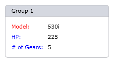
The following code shows how to change the styles of labels for individual layout items, or all of them. The style is changed via the LayoutItem.LabelStyle property. Styles of layout items’ labels can be customized via the LayoutItem.LabelStyle property. This example demonstrates two approaches to changing the LabelStyle property:
- for all layout items belonging to a container - via the container’s LayoutGroup.ItemStyle property. In this example, this style specifies the blue foreground color for labels
- for individual layout items - directly via their LayoutItem.LabelStyle properties. In the example, this style, applied to the first layout item (Model), paints the item’s label in red.
The following image shows the result:
Note
A complete sample project is available at https://github.com/DevExpress-Examples/how-to-change-styles-of-labels-for-individual-layout-items-e2258.
<Window x:Class="LabelStyle.MainWindow" xmlns="http://schemas.microsoft.com/winfx/2006/xaml/presentation" xmlns:x="http://schemas.microsoft.com/winfx/2006/xaml" xmlns:lc="http://schemas.devexpress.com/winfx/2008/xaml/layoutcontrol" Title="MainWindow" Height="350" Width="525">

    <Window.Resources>
        <!--The default style for layout items: labels are painted in blue-->
        <Style x:Key="DefaultLayoutItemStyle" TargetType="lc:LayoutItem">
            <Setter Property="LabelStyle">
                <Setter.Value>
                    <Style TargetType="lc:LayoutItemLabel">
                        <Setter Property="Foreground" Value="#FF0000FF" />
                    </Style>
                </Setter.Value>
            </Setter>
            <Setter Property="ElementSpace" Value="8" />
        </Style>
        <!--A custom style to paint labels in red-->
        <Style x:Key="MyLabelStyle" TargetType="lc:LayoutItemLabel">
            <Setter Property="Foreground" Value="#FFFF0000" />
        </Style>
    </Window.Resources>

    <!--Apply the default style to layout items-->
    <lc:LayoutControl x:Name="LayoutRoot" ItemStyle="{StaticResource DefaultLayoutItemStyle}">

        <!--Apply the custom style to the first layout item-->
        <lc:LayoutGroup Header="Group 1" View="GroupBox" Orientation="Vertical">
            <lc:LayoutItem Label="Model:" LabelStyle="{StaticResource MyLabelStyle}">
                <TextBlock Text="530i" />
            </lc:LayoutItem>
            <lc:LayoutItem Label="HP:">
                <TextBlock Text="225" />
            </lc:LayoutItem>
            <lc:LayoutItem Label="# of Gears:">
                <TextBlock Text="5" />
            </lc:LayoutItem>
        </lc:LayoutGroup>

    </lc:LayoutControl>

</Window>
Related GitHub Examples
The following code snippets (auto-collected from DevExpress Examples) contain references to the ItemStyle property.
Note
The algorithm used to collect these code examples remains a work in progress. Accordingly, the links and snippets below may produce inaccurate results. If you encounter an issue with code examples below, please use the feedback form on this page to report the issue.