GroupBox Class
Represents a control container with a GroupBox-style title, capable of displaying a single child.
Namespace: DevExpress.Xpf.LayoutControl
Assembly: DevExpress.Xpf.LayoutControl.v18.2.dll
Declaration
public class GroupBox :
    MaximizableHeaderedContentControlBase,
    IGroupBox,
    IControl,
IMaximizableElementRemarks
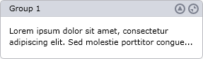
A GroupBox can contain a single child item. It supports a GroupBox-style title, as shown in the image below:
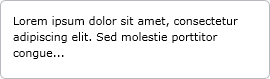
To specify the text to be displayed in the title, use the inherited Header property. A DataTemplate for the title can be specified via the inherited HeaderTemplate property. You can hide the title by setting the GroupBox.TitleVisibility property to Collapsed. In this instance, the GroupBox will be displayed only with a border:
The GroupBox supports the following elements in its header:
Minimize Element
Clicking the Minimize Element collapses the GroupBox, hiding its content. This element is enabled via the GroupBox.MinimizeElementVisibility property.
Maximize Element
This element, which is supported when the GroupBox is used within a FlowLayoutControl, maximizes the GroupBox within the FlowLayoutControl. See GroupBox.MaximizeElementVisibility to learn more.
Example
Example
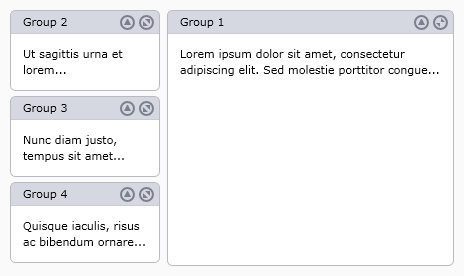
The following example creates a FlowLayoutControl with four GroupBox objects as children. For the GroupBox objects, the Maximize and Minimize elements are enabled via the GroupBox.MaximizeElementVisibility and GroupBox.MinimizeElementVisibility properties. The first group is maximized in XAML by setting the FlowLayoutControl.MaximizedElement property.
The following image shows the result:
Note
A complete sample project is available at https://github.com/DevExpress-Examples/how-to-display-items-in-flowlayoutcontrol-and-enable-maximization-feature-e2260.
<Window x:Class="FlowLayoutControl_GroupBox.MainWindow"
        xmlns="http://schemas.microsoft.com/winfx/2006/xaml/presentation"
        xmlns:x="http://schemas.microsoft.com/winfx/2006/xaml"
        xmlns:lc="http://schemas.devexpress.com/winfx/2008/xaml/layoutcontrol"
        Title="MainWindow" Height="350" Width="525">
    <Window.Resources>
        <Style x:Key="myGroupBoxStyle" TargetType="lc:GroupBox">
            <Setter Property="MaximizeElementVisibility" Value="Visible"/>
            <Setter Property="MinimizeElementVisibility" Value="Visible"/>
            <Setter Property="Width" Value="150"/>
        </Style>
    </Window.Resources>

    <Grid x:Name="LayoutRoot" Background="White">
        <lc:FlowLayoutControl Orientation="Vertical" Background="#FFFAFAFA" BreakFlowToFit="True"
            MaximizedElementPosition="Right" MaximizedElement="{Binding ElementName=groupBox1}">
            <lc:GroupBox x:Name="groupBox1" Header="Group 1" Style="{StaticResource  myGroupBoxStyle}">
                <TextBlock  TextWrapping="Wrap" Text="Lorem ipsum dolor sit amet, consectetur adipiscing elit. Sed molestie porttitor congue..."/>
            </lc:GroupBox>
            <lc:GroupBox  Header="Group 2" Style="{StaticResource  myGroupBoxStyle}">
                <TextBlock  TextWrapping="Wrap" Text="Ut sagittis urna et lorem..."/>
            </lc:GroupBox>
            <lc:GroupBox  Header="Group 3" Style="{StaticResource  myGroupBoxStyle}">
                <TextBlock  TextWrapping="Wrap" Text="Nunc diam justo, tempus sit amet..."/>
            </lc:GroupBox>
            <lc:GroupBox  Header="Group 4" Style="{StaticResource  myGroupBoxStyle}">
                <TextBlock  TextWrapping="Wrap" Text="Quisque iaculis, risus ac bibendum ornare..."/>
            </lc:GroupBox>
        </lc:FlowLayoutControl>
    </Grid>
</Window>
Related GitHub Examples
The following code snippets (auto-collected from DevExpress Examples) contain references to the GroupBox class.
Note
The algorithm used to collect these code examples remains a work in progress. Accordingly, the links and snippets below may produce inaccurate results. If you encounter an issue with code examples below, please use the feedback form on this page to report the issue.