CheckEdit Class
A check box editor.
Namespace: DevExpress.Xpf.Editors
Assembly: DevExpress.Xpf.Core.v21.2.dll
NuGet Package: DevExpress.Wpf.Core
Declaration
public class CheckEdit :
    BaseEdit,
    IBooleanExportSettings,
    IExportSettings,
ICommandSourceRemarks
The CheckEdit class is a check editor that allows end users to edit Boolean values.
Tip
The CheckEdit class inherits its features from the BaseEdit class.
For information on derived features and API, refer to the following class description: BaseEdit.
Create a CheckEdit
<Window ...
    xmlns:dxe="http://schemas.devexpress.com/winfx/2008/xaml/editors">

<!-- Specify a value using the CheckEdit.IsChecked property -->
<dxe:CheckEdit IsChecked="True" />

<!-- Specify a value using the BaseEdit.EditValue property -->
<dxe:CheckEdit EditValue="False" />
Editor Value
Use the CheckEdit.IsChecked property to specify the editor’s state. To set the editor to the indeterminate state (if supported), set the CheckEdit.IsChecked property to null.
After the CheckEdit.IsChecked property’s value has been changed, the check editor fires the corresponding event (CheckEdit.Checked, CheckEdit.Unchecked or CheckEdit.Indeterminate).
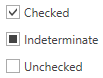
Optional Indeterminate State
If you set the CheckEdit.IsThreeState property to true, the CheckEdit control can hold a null value. This is called the Indeterminate state.
<dxe:CheckEdit Content="Checked" IsThreeState="True" IsChecked="True"/>
<dxe:CheckEdit Content="Indeterminate" IsThreeState="True" IsChecked="{x:Null}"/>
<dxe:CheckEdit Content="Unchecked" IsThreeState="True" IsChecked="False"/>
Appearance Customization
Custom Glyphs
To make the CheckEdit display custom glyphs instead of the standard glyphs, pass the ImageCheckEditStyleSettings object to the CheckEdit‘s StyleSettings property.
Use the CheckedGlyph, IndeterminateGlyph, and UncheckedGlyph properties to specify glyphs for all CheckEdit states.
<dxe:CheckEdit
  Content="CheckEdit"
  CheckedGlyph="TrafficLightGreen.png"
  UncheckedGlyph="TrafficLightRed.png"
  IndeterminateGlyph="TrafficLightYellow.png"
  IsThreeState="True">
  <dxe:CheckEdit.StyleSettings>
      <dxe:ImageCheckEditStyleSettings />
  </dxe:CheckEdit.StyleSettings>
</dxe:CheckEdit>
The CheckEdit control scales the specified glyphs to 16px. To customize the rendered image size, pass a custom data template to the GlyphTemplate property, as in the code sample below.
<dxe:CheckEdit
    Content="CheckEdit"
    CheckedGlyph="TrafficLightGreen.png"
    UncheckedGlyph="TrafficLightRed.png"
    IndeterminateGlyph="TrafficLightYellow.png"
    IsThreeState="True">
    <dxe:CheckEdit.GlyphTemplate>
        <DataTemplate>
            <Image Source="{Binding}" Height="32" Width="72"/>
        </DataTemplate>
    </dxe:CheckEdit.GlyphTemplate>
    <dxe:CheckEdit.StyleSettings>
        <dxe:ImageCheckEditStyleSettings />
    </dxe:CheckEdit.StyleSettings>
</dxe:CheckEdit>
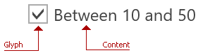
Custom Content
To specify the editor’s content, use the CheckEdit.Content property.
Use the ContentTemplate and ContentTemplateSelector properties to customize the editor’s content appearance.
CheckBox Width/Height
Use the CheckBoxWidth and CheckBoxHeight properties to specify the glyph’s width and height.
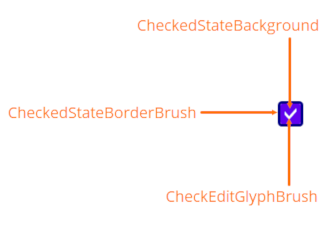
CheckEdit Colors
Use the following properties to specify CheckEdit element colors:
| Element | Property |
|---|---|
| Glyph | CheckEditGlyphBrush |
| Background when the editor is checked | CheckedStateBackground |
| BorderBrush when the editor is checked | CheckedStateBorderBrush |
| BorderBrush when the editor is focused | FocusedBorderBrush |
Standard Appearance Customization Properties
| Property | Description |
|---|---|
| BorderBrush | Gets or sets a brush that describes the border background of a control. |
| BorderThickness | Gets or sets the border thickness of a control. |
| CornerRadius | Gets or sets the editor’s corner radius. This is a dependency property. |
| Foreground | Gets or sets a brush that describes the foreground color. |
Optimized for In-Place Editing
CheckEdit can be used as a standalone or in-place editor nested in a container control. The CheckEditSettings class implements the in-place editing functionality. Refer to the Assign Editors to Cells topic for more information.
Related GitHub Examples
The following code snippets (auto-collected from DevExpress Examples) contain references to the CheckEdit class.
Note
The algorithm used to collect these code examples remains a work in progress. Accordingly, the links and snippets below may produce inaccurate results. If you encounter an issue with code examples below, please use the feedback form on this page to report the issue.