Styling View Content Elements
- 3 minutes to read
The NavBar Control provides dedicated properties for appearance customization of NavBar elements (groups and items).
NavBar Element Appearance
Properties that affect the display of element text and images can be customized at three levels.
View Level
These properties, when specified, are applied by default to all NavBar groups and items in the current View:
- NavBarViewBase.ItemImageSettings and NavBarViewBase.GroupImageSettings - Specify the display regions and stretch modes for element images.
- NavBarViewBase.ItemFontSettings and NavBarViewBase.GroupFontSettings - Specify font settings applied to the element text.
- NavBarViewBase.ItemLayoutSettings and NavBarViewBase.GroupLayoutSettings - Specify the position and alignment of element text and images.
- NavBarViewBase.ItemDisplayMode and NavBarViewBase.GroupDisplayMode - Specify whether image only, text only or both image and text are displayed for NavBar elements.
Group Level
Properties that affect the display of certain group headers:
- NavBarGroup.ImageSettings
- NavBarGroup.FontSettings
- NavBarGroup.LayoutSettings
- NavBarGroup.DisplayMode
Properties that affect the display of items residing in certain groups:
- NavBarGroup.ItemImageSettings
- NavBarGroup.ItemFontSettings
- NavBarGroup.ItemLayoutSettings
- NavBarGroup.ItemDisplayMode
Note that group-level properties override the settings defined at the View level.
Item Level
To customize the appearance of individual items, use the following properties:
- NavBarItem.ImageSettings.
- NavBarItem.FontSettings.
- NavBarItem.LayoutSettings.
- NavBarItem.DisplayMode.
These properties override corresponding the settings defined at the group and View levels.
If you need to modify the style settings of view content elements (such as groups and items), you can perform a centralized style customization by using the following two properties:
Advanced Appearance Customization
NavBarGroups and NavBarItems are logical elements of the NavBarControl. These elements are rendered onscreen using corresponding visual objects. In some cases, you may need to perform direct appearance customization of these visual objects. This can be accomplished using dedicated Visual Styles, which are System.Windows.Style class instances that target certain visual objects.
Visual Styles are provided at the View, group and item levels.
View level
NavBarViewBase.GroupVisualStyle and NavBarViewBase.ItemVisualStyle - Specify default styles applied to all group headers and items in the current View.
Group level
NavBarGroup.VisualStyle - Specifies the style applied to a specified group header. This style overrides the corresponding View-level style.
NavBarGroup.ItemVisualStyle - Specifies the default style applied to items in a specified group. This style overrides the corresponding View-level style.
Item level
NavBarItem.VisualStyle - Specifies the style applied to a certain item. This style overrides the default View-level and group-level styles.
Example
This example demonstrates how the appearance of groups and items can be customized at different levels within the NavBarControl by using specific style properties. To learn more about appearance customization, please refer to Styling View Content Elements.
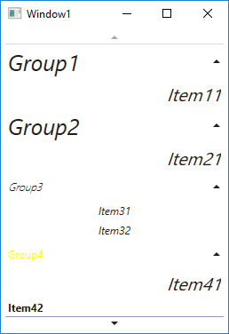
<Window x:Class="VisualStylesOfGroupsAndItems.Window1"
        xmlns="http://schemas.microsoft.com/winfx/2006/xaml/presentation"
        xmlns:x="http://schemas.microsoft.com/winfx/2006/xaml"
        Title="Window1" Height="400" Width="200"
        xmlns:dxn="http://schemas.devexpress.com/winfx/2008/xaml/navbar">

    <Window.Resources>
        <Style x:Key="ViewStyle" TargetType="dxn:NavBarViewBase">
            <Setter Property="GroupLayoutSettings" Value="{dxn:NavBarLayoutSettings TextHorizontalAlignment=Center}" />
            <Setter Property="GroupFontSettings" Value="{dxn:NavBarFontSettings FontStyle=Italic,FontSize=25}"  />
            <Setter Property="ItemFontSettings" Value="{dxn:NavBarFontSettings FontStyle=Oblique,FontSize=20}"  />
            <Setter Property="ItemLayoutSettings" Value="{dxn:NavBarLayoutSettings TextHorizontalAlignment=Right}" />
        </Style>

        <Style x:Key="GroupStyle" TargetType="dxn:NavBarGroup">
            <Setter Property="ItemLayoutSettings" Value="{dxn:NavBarLayoutSettings TextHorizontalAlignment=Center}" />
            <Setter Property="ItemFontSettings" Value="{dxn:NavBarFontSettings FontStyle=Italic}" />
            <Setter Property="LayoutSettings" Value="{dxn:NavBarLayoutSettings TextHorizontalAlignment=Center}"/>
            <Setter Property="FontSettings" Value="{dxn:NavBarFontSettings FontStyle=Oblique,FontWeight=ExtraLight}" />
        </Style>

        <Style x:Key="ItemStyle" TargetType="dxn:NavBarItem">
            <Setter Property="LayoutSettings" Value="{dxn:NavBarLayoutSettings TextHorizontalAlignment=Left}" />
            <Setter Property="FontSettings" Value="{dxn:NavBarFontSettings FontWeight=Bold}"/>
        </Style>
        <Style x:Key="ItemVisualStyle" TargetType="{x:Type dxn:NavBarItemControl}">
            <Setter Property="Control.Foreground" Value ="Magenta"/>
        </Style>
        <Style x:Key="GroupVisualStyle" TargetType="{x:Type ButtonBase}">
            <Setter Property="Control.Foreground" Value ="Yellow"/>
        </Style>
    </Window.Resources>

    <DockPanel Margin="5">

        <dxn:NavBarControl Name="navBarControl1">
            <dxn:NavBarControl.View>
                <dxn:ExplorerBarView Style="{StaticResource ViewStyle}"  />
            </dxn:NavBarControl.View>
            <dxn:NavBarControl.Groups>
                <dxn:NavBarGroup Header="Group1">
                    <dxn:NavBarItem Content="Item11"/>
                </dxn:NavBarGroup>
                <dxn:NavBarGroup Header="Group2">
                    <dxn:NavBarItem Content="Item21"/>
                </dxn:NavBarGroup>
                <dxn:NavBarGroup Header="Group3" Style="{StaticResource GroupStyle}">
                    <dxn:NavBarItem Content="Item31"/>
                    <dxn:NavBarItem Content="Item32"/>
                </dxn:NavBarGroup>
                <dxn:NavBarGroup Header="Group4"  VisualStyle="{StaticResource GroupVisualStyle}">
                    <dxn:NavBarItem Content="Item41"/>
                    <dxn:NavBarItem Content="Item42" Style="{StaticResource ItemStyle}"/>
                    <dxn:NavBarItem Content="Item43"  VisualStyle="{StaticResource ItemVisualStyle}"/>
                </dxn:NavBarGroup>
            </dxn:NavBarControl.Groups>
        </dxn:NavBarControl>

    </DockPanel>
</Window>