Office Navigation Bar
- 2 minutes to read
The OfficeNavigationBar is an Outlook 2013-inspired navigation bar that supports integration with the Navigation Bar and the AccordionControl. The OfficeNavigationBar control displays navigation links (items), which can be clicked to invoke a specific functionality. You can add and access the control’s items using the Items or ItemsSource property. Handle the SelectionChanged event to process a particular item click.

Integration With the Accordion Control
The Office Navigation Bar control seamlessly integrates with the AccordionControl.
When you assign an AccordionControl to the OfficeNavigationBar.NavigationClient, the Accordion’s root items are obtained and presented as items in the Office Navigation Bar.
xmlns:dxa="http://schemas.devexpress.com/winfx/2008/xaml/accordion"
xmlns:dxnav="http://schemas.devexpress.com/winfx/2008/xaml/navigation"

<dxa:AccordionControl x:Name="accordion" .../>
<dxnav:OfficeNavigationBar NavigationClient="{Binding ElementName=accordion}" .../>
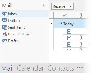
At runtime, when a user clicks any of these items, corresponding accordion subitems are automatically activated in the bound AccordionControl.
Note
In this integration mode, do not manually specify items via the OfficeNavigationBar.Items or OfficeNavigationBar.ItemsSource property.
Integration With the NavBar Control
The Office Navigation Bar control can integrate with a NavBarControl.
Note
If a NavBarControl has the NavigationPane View applied, turn its Compact mode off. Otherwise, the Office Navigation Bar becomes invisible. To turn this mode off, use the NavBarControl.Compact property.
When you assign a NavBarControl to the OfficeNavigationBar.NavigationClient, the NavBarControl’s groups are obtained and presented as items in the Office Navigation Bar. At runtime, when a user clicks any of these items, a corresponding group is automatically activated in the bound NavBarControl. Note that group activation is only noticeable when the NavBarControl is painted using the NavigationPane or SideBar View.
Note
In this integration mode, do not manually specify items via the Items or ItemsSource property.
When the Navigation Pane style is applied to the NavBarControl, the group selector is automatically hidden from the NavBarControl after it is bound to the OfficeNavigationBar.
Peek Form
The OfficeNavigationBar control can display a popup Peek Form for its items to display custom content for end users. By default, the Peek Form is displayed when hovering over items.
You can specify the Peek Form template within the specified item of an integrated control:
- For an integrated AccordionControl: use the accordion root item’s AccordionItem.PeekFormTemplate property to specify the Peek Form template for this item.
- For an integrated NavBarControl: use the navbar group’s NavBarGroup.PeekFormTemplate property to specify the Peek Form template for this group.