How to: Bind the Grid to a Collection of Columns
- 5 minutes to read
This topic describes how to define columns in a View Model and display them in the GridControl.
Assign ViewModel Columns to the GridControl
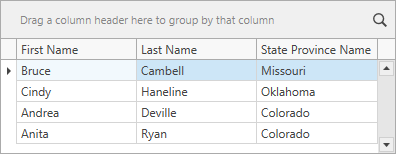
This scenario demonstrates how to display information from an employee data model in the GridControl.
Create a class that describes a grid column:
Specify a collection of columns in the ViewModel:
public class ViewModel : ViewModelBase { public ViewModel() { // ... Columns = new ObservableCollection<Column>() { new Column(nameof(Employee.FirstName)), new Column(nameof(Employee.LastName)), new Column(nameof(Employee.StateProvinceName)) }; } // ... public ObservableCollection<Column> Columns { get; } }If you want the GridControl to reflect changes made in the Columns collection, this collection should implement the INotifyCollectionChanged interface.
The GridControl generates columns based on column templates. Add a default column template.
Use the DependencyObjectExtensions.DataContext attached property when you bind the GridControl to column properties. This attached property synchronizes data updates of bound properties to enhance grid performance:
<Window.Resources>
    <DataTemplate x:Key="DefaultColumnTemplate">
        <dxg:GridColumn FieldName="{Binding Path=(dxci:DependencyObjectExtensions.DataContext).FieldName, RelativeSource={RelativeSource Self}}"/>
    </DataTemplate>
</Window.Resources>
Assign the column collection to the DataControlBase.ColumnsSource property. Set the DataControlBase.ColumnGeneratorTemplate property to a template that generates columns:
<dxg:GridControl ...
                 ColumnsSource="{Binding Columns}"
                 ColumnGeneratorTemplate="{StaticResource DefaultColumnTemplate}"/>
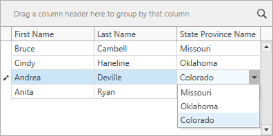
Add a Lookup Column
If you want to specify extra column types (for example, to display a list of states in a column’s combo box), follow the steps below:
Add an enumeration that lists column types:
Create a class that describes a lookup column:
public class Column : BindableBase { public Column(SettingsType settings, string fieldname) { Settings = settings; FieldName = fieldname; } public SettingsType Settings { get; } public string FieldName { get; } } public class LookupColumn : Column { public LookupColumn(SettingsType settings, string fieldname, IList source): base(settings, fieldname) { Source = source; } public IList Source { get; } }Add a lookup column to the ViewModel’s Columns collection and specify the lookup’s data source:
public class ViewModel : ViewModelBase { public ViewModel() { // ... States = Source.Select(x => x.StateProvinceName).Distinct().ToList(); Columns = new ObservableCollection<Column>() { new Column(SettingsType.Default, nameof(Employee.FirstName)), new Column(SettingsType.Default, nameof(Employee.LastName)), new LookupColumn(SettingsType.Lookup, nameof(Employee.StateProvinceName), States) }; } // ... public ObservableCollection<Column> Columns { get; } public List<string> States { get; } }Create a template that generates lookup columns:
<DataTemplate x:Key="LookupColumnTemplate">
    <dxg:GridColumn FieldName="{Binding Path=(dxci:DependencyObjectExtensions.DataContext).FieldName, RelativeSource={RelativeSource Self}}">
        <dxg:GridColumn.EditSettings>
            <dxe:ComboBoxEditSettings ItemsSource="{Binding Source}"/>
        </dxg:GridColumn.EditSettings>
    </dxg:GridColumn>
</DataTemplate>
Add a Template Selector to Choose among Multiple Templates
Your application now contains the DefaultColumnTemplate and LookupColumnTemplate. To choose a template based on the column type, create a template selector and assign it to the DataControlBase.ColumnGeneratorTemplateSelector property:
using System.Windows;
using System.Windows.Controls;

namespace ColumnsSample {
    public class ColumnTemplateSelector : DataTemplateSelector {
        public DataTemplate DefaultColumnTemplate { get; set; }
        public DataTemplate LookupColumnTemplate { get; set; }

        public override DataTemplate SelectTemplate(object item, DependencyObject container) {
            Column column = item as Column;
            if(column == null) return null;
            switch(column.Settings) {
                case SettingsType.Default:
                    return DefaultColumnTemplate;
                case SettingsType.Lookup:
                    return LookupColumnTemplate;
            }
            return null;
        }
    }
}
<Window.Resources>
    <!-- ... -->
    <local:ColumnTemplateSelector x:Key="ColumnTemplateSelector"
                                  DefaultColumnTemplate ="{StaticResource DefaultColumnTemplate}"
                                  LookupColumnTemplate ="{StaticResource LookupColumnTemplate}"/>
</Window.Resources>
<dxg:GridControl ItemsSource="{Binding Source}"
                 ColumnsSource="{Binding Columns}"
                 ColumnGeneratorTemplateSelector="{StaticResource ColumnTemplateSelector}"/>
Specify Column Settings
You can use the DataControlBase.ColumnGeneratorStyle property to create a style that specifies column settings. The GridControl applies these settings to all columns generated from templates:
<dxg:GridControl.ColumnGeneratorStyle>
    <Style TargetType="dxg:GridColumn">
        <Setter Property="FilterPopupMode" Value="CheckedList" />
        <Setter Property="Width" Value="Auto" />
        <Setter Property="ReadOnly" Value="True" />
        <Setter Property="HorizontalHeaderContentAlignment" Value="Center" />
        <Setter Property="HeaderStyle">
            <Setter.Value>
                <Style TargetType="dxg:BaseGridHeader">
                    <Setter Property="FontWeight" Value="SemiBold" />
                </Style>
            </Setter.Value>
        </Setter>
    </Style>
</dxg:GridControl.ColumnGeneratorStyle>
You can also use multiple data annotation attributes to define validation rules and format options:
public class Employee {
    [ReadOnly(true)]
    public string FirstName { get; set; }
    [MinLength(3)]
    public string LastName { get; set; }
    public string StateProvinceName { get; set; }
}