Free Xamarin.Forms UI Controls
- 5 minutes to read
All DevExpress Xamarin.Forms UI controls for mobile development (iOS and Android) are available free-of-charge. Visit our Free Xamarin UI Controls page to reserve your free copy of these controls. Note that official support services are not included in this offer. Xamarin.Forms Controls with Support are part of the Universal Subscription.
The Xamarin.Forms UI suite includes the following controls: Charts, Data Grid, Scheduler, Data Editors, Popup, Data Form, Collection View, Tabs, and Drawer.
- Videos
- Watch training videos on the DevExpress YouTube channel.
- Demos
Use the following links to download a demo application and see DevExpress Xamarin.Forms UI controls in action:
- Blog
- Follow the Xamarin & MAUI Team blog for the latest updates on how we port the existing suite of Xamarin.Forms UI controls to the .NET MAUI platform.
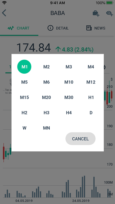
Charts
|
|
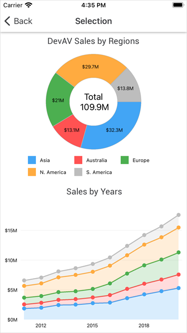
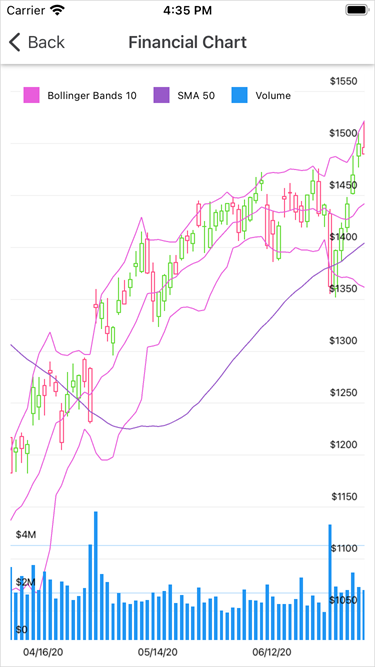
The PieChartView and ChartView are powerful visualization views that allow you to display data as bars, points, lines, areas, and other forms. The views support various Pie and Cartesian series types that manage data appearance on a chart.
Refer to the following section for step-by-step lessons that explain how to configure chart views: Getting Started.
You can also review and download sample projects available on GitHub.
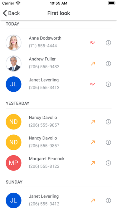
Data Grid
|
|
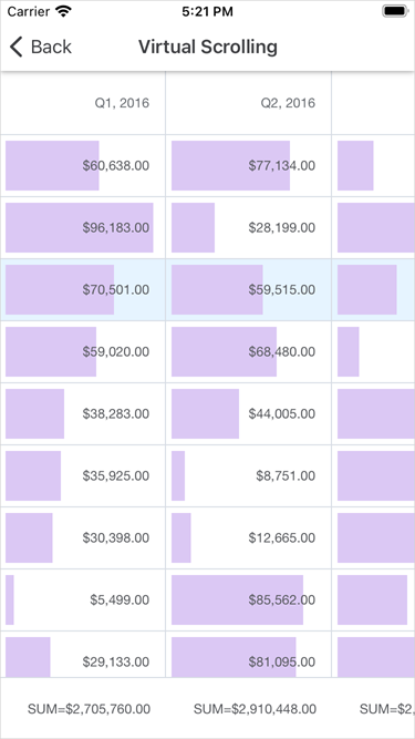
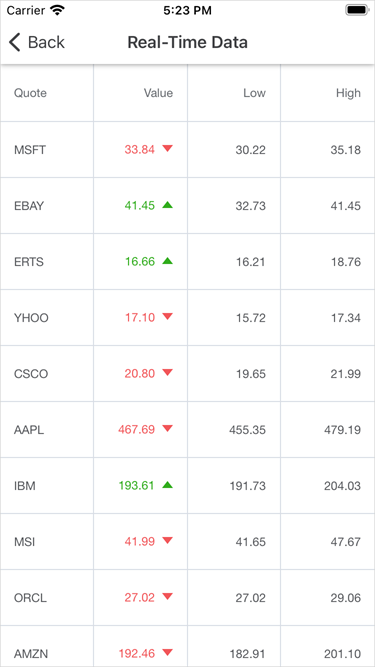
The DataGridView is a data-aware control designed to display and manage data in a tabular format. Its features include:
- Auto Generated Columns
- Multi-Row Column Layout
- Auto Row Height
- Pull To Refresh
- Load More
- Row Drag and Drop
- Multi-Column Sorting
- Grouping (API)
- Filtering (API)
- Data Summaries (API)
- Data Editing
- Input Validation
- Fixed Columns
- Swipe Actions
- Appearance Customization
- Template Support
- Theme Support
Refer to the following sections for step-by-step lessons that explain how to configure and use the grid:
You can also review and download sample projects available on GitHub.
Scheduler
|
|
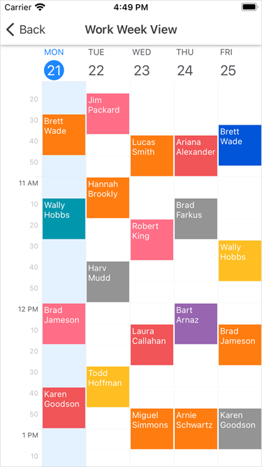
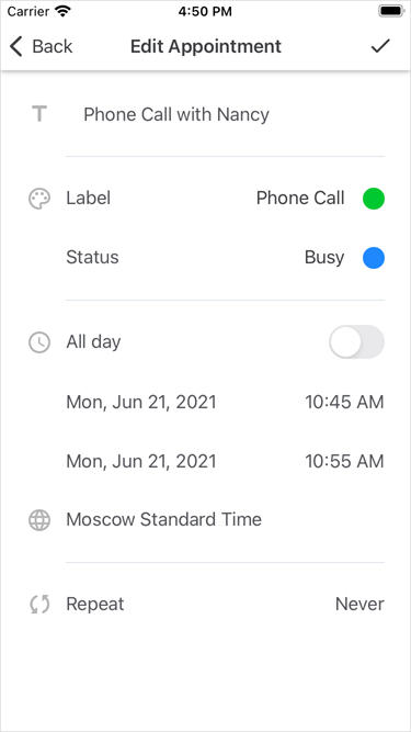
A scheduler view displays appointments (regular and recurrent planned events) and allows users to manage them. The following scheduler views are available:
Refer to the following sections for step-by-step lessons that explain how to configure scheduler views:
You can also review and download sample projects available on GitHub.
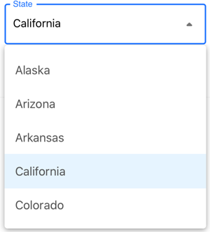
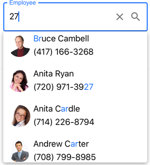
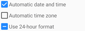
Data Editors and Controls
| TextEdit |
| MultilineEdit |
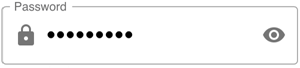
| PasswordEdit |
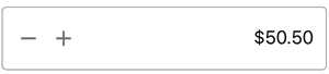
| NumericEdit |
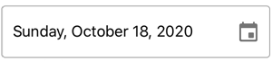
| DateEdit |
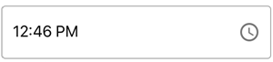
| TimeEdit |
| ComboBoxEdit |
| AutoCompleteEdit |
| CheckEdit |
| SimpleButton |

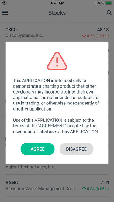
Popup
DXPopup is a popup view that overlays the rest of the application content. You can attach it to any view on the screen or display it as a separate dialog.
|
|
CollectionView
DXCollectionView is a view that displays a list of data.
The view includes the most popular features used to display and manage data items:
- Vertical and Horizontal Layout
- Data Item and Group Header Templates
- Data Sorting, Filtering, and Grouping
- Single and Multiple Item Selection
- Pull to Refresh
- Load More
- Swipe Actions
- Item Drag and Drop
Refer to the following sections for step-by-step instructions on how to use the CollectionView:
You can also review and download sample projects available on GitHub.
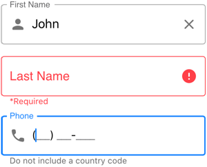
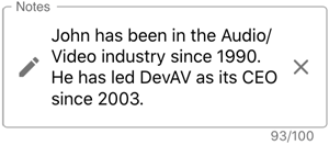
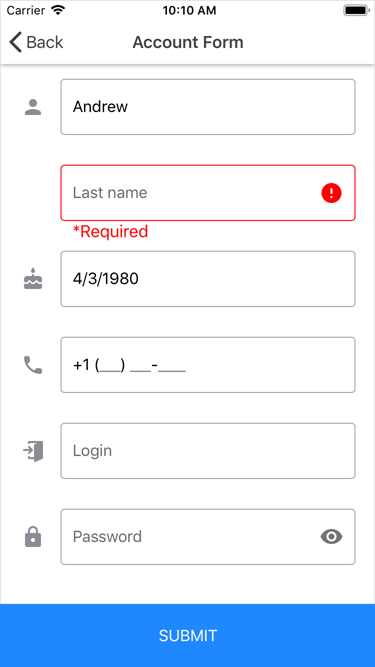
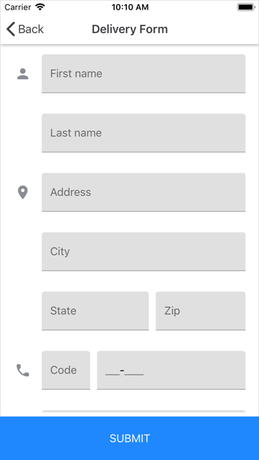
Data Form
The DataFormView component allows you to generate edit forms for any data object.
|
|
Refer to the following sections for step-by-step instructions on how to configure the data form:
You can also review and download sample projects available on GitHub.
Navigation
|
|
Navigation pages and views allow you to implement lateral navigation in your applications.
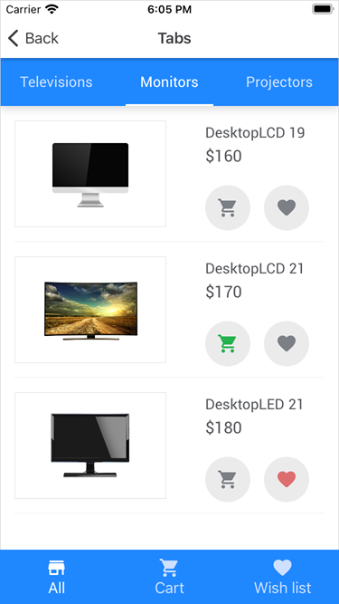
Tab View, Tab Page
The TabView and TabPage allow you to organize content into groups and enable navigation between groups. These controls include the following features:
- Data Binding
Tabs can be generated from the bound data source based on the specified templates. - Appearance Customization
Each control has settings to configure its visual elements. - Theme Support
You can apply the Light and Dark built-in themes to controls.
Refer to the following sections for step-by-step lessons that explain how to configure these controls:
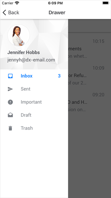
Drawer View, Drawer Page
The DrawerView and DrawerPage allow you to add a drawer to your application - a UI pane that shows the application’s main navigation menu. These controls include the following features:
- Appearance Customization
Each control has settings to configure its visual elements. - Drawer Position
You can anchor the drawer to any side of the screen (left, right, top, or bottom). - Drawer Behavior
Each control has an option that specifies how the drawer appears on the screen. - Theme Support
You can apply the Light and Dark built-in themes to controls.
Refer to the following sections for step-by-step lessons that explain how to configure these controls:
You can also review and download sample projects available on GitHub.