Select Items
- 5 minutes to read
DXCollectionView supports single and multiple item selection from UI (on tap) and code. Set the SelectionMode property to one of the following values to specify which selection is enabled:
- None - Items cannot be selected (default).
- Single - Only a single item can be selected.
- Multiple - More than one item can be selected.
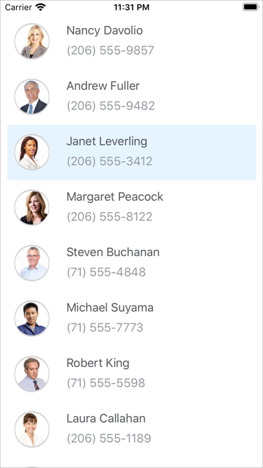
Single Selection
When the SelectionMode property is set to Single, a single item can be selected in the CollectionView.
When a user selects (taps) an item, the SelectedItem property is set to an object that specifies the item from the data source that corresponds to the item selected in the list. When a user taps the selected item again, the selection is cleared and the SelectedItem property is set to null.
To select an item programmatically, assign the data source’s item object to the view model’s property and bind the SelectedItem property to it.
For example, define the following properties in the ViewModel class to select the third item in the list:
- Contacts - a collection of Contact objects. Bind DXCollectionView.ItemsSource to this property.
- SelectedContact - the third item of the Contacts collection. Bind DXCollectionView.SelectedItem to this property.
public class ViewModel : INotifyPropertyChanged {
    public List<Contact> Contacts { get; }

    Contact selectedContact;
    public Contact SelectedContact {
        get { return selectedContact; }
        set {
            if (selectedContact != value) {
                selectedContact = value;
            }
        }
    }

    public ViewModel() {
        Contacts = new List<Contact>() {
            // Specify the contact list here.
            // ...
        };
        SelectedContact = Contacts[2];
    }

    // ...
}
<ContentPage ...>
    <ContentPage.BindingContext>
        <local:ViewModel/>
    </ContentPage.BindingContext>
    <dxcv:DXCollectionView ItemsSource="{Binding Contacts}"
                           SelectionMode="Single"
                           SelectedItem="{Binding SelectedContact}">
    </dxcv:DXCollectionView>
</ContentPage>
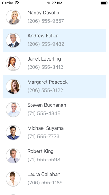
Multiple Selection
When the SelectionMode property is set to Multiple, multiple items can be selected in the CollectionView.
When a user selects (taps) items, the SelectedItems property is set to a collection of objects that specify items from the data source that correspond to items selected in the list.
To select multiple items programmatically, assign a collection of the data source’s item objects to the view model’s property and bind the SelectedItems property to it.
For example, define the following properties in the ViewModel class to select the second and fourth items in the list:
- Contacts - a collection of Contact objects. Bind DXCollectionView.ItemsSource to this property.
- SelectedContacts - the second and fourth items of the Contacts collection. Bind DXCollectionView.SelectedItems to this property.
public class ViewModel : INotifyPropertyChanged {
    public List<Contact> Contacts { get; }

    List<Contact> selectedContacts;
    public List<Contact> SelectedContacts {
        get { return selectedContacts; }
        set {
            if (selectedContacts != value){
                selectedContacts = value;
            }
        }
    }

    public ViewModel() {
        Contacts = new List<Contact>() {
            // Specify the contact list here.
            // ...
        };
        SelectedContacts = new List<Contact> { Contacts[1], Contacts[3] };
    }

    // ...
}
<ContentPage ...>
    <ContentPage.BindingContext>
        <local:ViewModel/>
    </ContentPage.BindingContext>
    <dxcv:DXCollectionView ItemsSource="{Binding Contacts}"
                           SelectionMode="Multiple"
                           SelectedItems="{Binding SelectedContacts}">
    </dxcv:DXCollectionView>
</ContentPage>
Clear Selection
To clear selection in the CollectionView, set its SelectedItem (if SelectionMode is set to Single) or SelectedItems (if SelectionMode is set Multiple) property to null.
collectionView.SelectedItems = null;
Selection Event
The SelectionChanged occurs when the selection is changed from the UI (a user taps an item) or code (the SelectedItem or SelectedItems property value is changed).
Use this event’s arguments to obtain the following information:
SelectedItems - a list of items (objects that specify items in the data source) that was selected.
DeselectedItems - a list of items (objects that specify items in the data source) that was unselected.
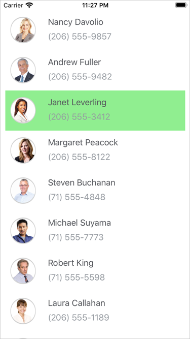
Selected Item Customization
You can use the Xamarin.Forms Visual State Manager or DXCollectionView.SelectedItemTemplate to change the appearance of the DXCollectionView‘s selected item.
Background Color
Use the Visual State Manager to change the background color of the selected item:
- Create a Style object and set its TargetType property to the type of the ItemTemplate‘s root element (Grid, in the example below).
- Add the Setter tags to the VisualStateManager.VisualStateGroups attached bindable property.
- Add the CommonStates VisualStateGroup object to the VisualStateManager.VisualStateGroups collection (use VisualStateGroupList tags as the VisualStateGroups property is of the VisualStateGroupList type).
- Add the Selected VisualState object to the VisualStateGroup.States collection (States is a content property - you do not need property tags in the markup). Define BackgroundColor for the selected item.
<ContentPage ...>
    <ContentPage.Resources>
        <Style TargetType="Grid">
            <Setter Property="VisualStateManager.VisualStateGroups">
                <VisualStateGroupList>
                    <VisualStateGroup x:Name="CommonStates">
                        <VisualState x:Name="Normal" />
                        <VisualState x:Name="Selected">
                            <VisualState.Setters>
                                <Setter Property="BackgroundColor"
                                        Value="LightGreen" />
                            </VisualState.Setters>
                        </VisualState>
                    </VisualStateGroup>
                </VisualStateGroupList>
            </Setter>
        </Style>
    </ContentPage.Resources>
    <dxcv:DXCollectionView ItemsSource="{Binding Contacts}"
                           SelectionMode="Single">
        <dxcv:DXCollectionView.ItemTemplate>
            <DataTemplate>
                <Grid Padding="10">
                    <!--...-->
                </Grid>
            </DataTemplate>
        </dxcv:DXCollectionView.ItemTemplate>
    </dxcv:DXCollectionView>
</ContentPage>
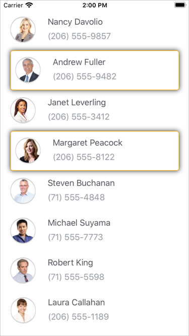
Template
Use the SelectedItemTemplate property to customize the selected item’s appearance. Bind the template’s elements to properties of a data object that specifies an item in the data source to which the ItemsSource property is bound. In the example below, the CollectionView is bound to the collection of Contact objects with the Name, Photo, and Phone properties.
<dxcv:DXCollectionView ItemsSource="{Binding Contacts}"
                       SelectionMode="Multiple">
    <dxcv:DXCollectionView.ItemTemplate>
        <!-- Define the item template here.-->
    </dxcv:DXCollectionView.ItemTemplate>

    <dxcv:DXCollectionView.SelectedItemTemplate>
        <DataTemplate>
            <Frame Margin="10, 1" Padding="0" BorderColor="Orange" HasShadow="True">
                <Grid Padding="10">
                    <Grid.ColumnDefinitions>
                        <ColumnDefinition Width="50"/>
                        <ColumnDefinition Width="*"/>
                    </Grid.ColumnDefinitions>
                    <Frame Grid.Column="0"
                           HasShadow="False"
                           BackgroundColor="LightGray"
                           VerticalOptions="Center"
                           HorizontalOptions="Center"
                           CornerRadius="25"
                           WidthRequest="50"
                           HeightRequest="50"
                           Padding="1">
                        <Frame BackgroundColor="White"
                               Padding="0"
                               HeightRequest="48"
                               WidthRequest="48"
                               VerticalOptions="Center"
                               HorizontalOptions="Center"
                               HasShadow="False"
                               IsClippedToBounds="True"
                               CornerRadius="24">
                            <Image Source="{Binding Photo}">
                                <Image.VerticalOptions>
                                    <OnPlatform x:TypeArguments="LayoutOptions"
                                                Android="FillAndExpand"
                                                iOS="EndAndExpand"/>
                                </Image.VerticalOptions>
                            </Image>
                        </Frame>
                    </Frame>
                    <StackLayout Grid.Column="1"
                                 Padding="18,1,18,7"
                                 Orientation="Vertical">
                        <Label Text="{Binding Name}"
                               Margin="0,2"
                               TextColor="#55575c"/>
                        <Label Text="{Binding Phone}"
                               TextColor="#959aa0"/>
                    </StackLayout>
                </Grid>
            </Frame>
        </DataTemplate>
    </dxcv:DXCollectionView.SelectedItemTemplate>
</dxcv:DXCollectionView>