.NET MAUI Data Editors Custom Appearance
- 2 minutes to read
You can customize the edit box appearance for all data editors.
Edit Box Types
All data editors support two box types (the BoxMode property):
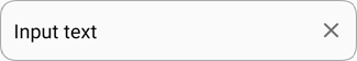
- Outlined - a border around the entire editor box with rounded corners.
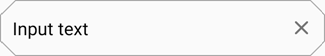
- Filled - a border at the bottom edge of the editor box, the box background is filled with the default color, and top corners are rounded.
You can configure the following appearance settings for each type of editor box:
Outlined:
Filled:
Borders
You can specify color and thickness of edit box borders.
Editor State / Properties | Outlined Editor | Filled Editor |
|---|---|---|
Unfocused: |
|
|
|
| |
|
| |
Error: |
|
|


To specify input text color, use the TextColor property.
Corners
You can adjust edit box corners - all corners of an Outlined text editor, and top corners of a Filled editor (bottom corners are always square). Use the CornerRadius property to change the radius of editor corners:
Pass a single double value to the CornerRadius structure to set the same radius for all editor corners:
Pass four double values (TopLeft, TopRight, BottomLeft and BottomRight, in this order) to specify each corner radius separately:

The CornerMode property specifies whether the editor corners are cut or rounded. In cut corner mode, the parameters above affect corner bevel size.
Property | Outlined Editor | Filled Editor |
|---|---|---|
Default |
|
|
CornerRadius = 15 |
|
|
CornerRadius = 15 |
|
|


Background
Use BackgroundColor and DisabledBackgroundColor properties to set the edit box fill color in the corresponding state.
Property | Outlined Editor | Filled Editor |
|---|---|---|
Default |
|
|
BackgroundColor = PeachPuff |
|
|
DisabledBackgroundColor = PeachPuff |
|
|


Labels and Icons
You can specify and configure a floating label above an editor (LabelText), assistive labels below the editor (HelpText|ErrorText), and affixed labels within the editor (Prefix|Suffix).

You can also display and customize common icons that work in any editor type, as well as editor-specific icons.