Conditional Formatting
- 3 minutes to read
Use conditional formatting to highlight a Card dashboard item’s visual elements (like Title, Subtitle, different values) and change the card’s background.
Note
Cards that use a legacy layout do not support conditional formatting.
Supported Format Rules
You can use measure or dimension values to calculate a format rule. You can also use delta values to calculate a Card dashboard item’s format rules.
Format rules that can be applied to different data item types are as follows:
Data Type | Supported Format Conditions |
|---|---|
numeric | |
string | Value with the condition type set to Equal To, Not Equal To or Text that Contains |
date-time |
A Date Occurring for dimensions with the continuous date-time group interval |
Refer to the following topic for more information about format rule types: Conditional Formatting Basics
Create and Edit a Format Rule
You can create and edit format rules in the Conditional Formatting section that is located in the following places:
The dashboard item’s Options menu
Refer to the following topic for information on how to create and edit format rules: Conditional Formatting in Web Dashboard
Card-Specific Format Condition Settings
For a Card dashboard item, you can apply conditional formatting to the card’s visual elements (like Title, Subtitle, different values) and change the card’s background.
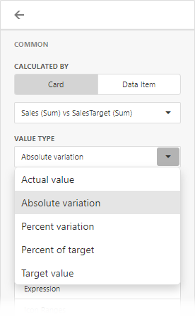
Available settings in the Common section depend on the selected Calculated by option:
The Card option specifies a data item container (a card) by whose values the format rule is calculated. The Value Type option specifies the card’s measurement according to which a condition is calculated.
If the Card dashboard item contains multiple values in data item containers (cards), make sure you apply a format rule to the active card to see changes. Click
 in the dashboard item caption to switch between cards. The expression format rule ignores the specified card and is applied to all cards regardless of the specified value.
- For the Data Item option you can choose a hidden measure or series dimension. The rule applies to all cards in a Card item.
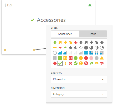
To apply the selected appearance to the Title, Subtitle, values, and other card layout elements, use the drop-down Apply to list. The All elements value applies the format rule to all card elements.
You can add an icon to the custom layout element or configure the style of its display text. The image below displays the value format rule that adds the green check icon to the Category dimension layout element:
If you select a background color, it is applied to the entire card and the Apply to value is not in effect.
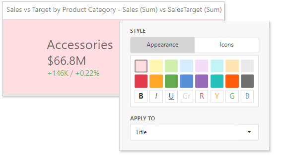
Some predefined background styles contain a font color. This font color applies to all the card elements regardless of the drop-down list settings (all/particular element).