Create a Data-Aware Item using an External Visualization Widget
- 7 minutes to read
Important
All custom items are based on the Web Dashboard’s customization using independent modules called extensions. Learn about extension concepts by referring to the Extensions Overview topic.
This tutorial shows you how to create a more “real-world” custom item that uses an external visualization widget. In this example, it is the dxFunnel widget that can show values across multiple stages in a process. This widget supports data binding, master filtering, and coloring.
Before you begin, open the project created from the template and perform the steps below:
- Provide a Toolbox Icon
- Create the Custom Item’s Script File
- Specify the Custom Item’s Settings
- Implement the Custom Item’s Rendering
- Register the Custom Item as an Extension
- Run the Project to See the Result
Provide a Toolbox Icon
Specify an SVG icon to appear in the Custom Items Toolbox group. On the BeforeRender event (the window’s load event before the render method for HTML JS control), register the required icon using the ResourceManager.registerIcon method:
function onBeforeRender(sender) {
    // ...
    var FUNNELCHART_ITEM_ICON = '<svg id="funnelChartItemIcon" viewBox="0 0 24 24"><path stroke="#ffffff" fill="#f442ae" d="M12 2 L2 22 L22 22 Z" /></svg>';
    DevExpress.Dashboard.ResourceManager.registerIcon(FUNNELCHART_ITEM_ICON);
};
The icon’s identifier (funnelChartItemIcon) is used later in this tutorial to initialize a custom item.
Create the Custom Item’s Script File
In your project, add the DataAwareItem.js file to the Custom_Items folder. Specify the script file URL in the <body> section to include scripts after the control is rendered:
 <asp:Content ID="Content1" ContentPlaceHolderID="MainContent" runat="server">
    <script type="text/javascript">
        function onBeforeRender(sender) {
            //...
        }
    </script>
    <dx:ASPxDashboard ID="ASPxDashboard1" runat="server" Width="100%" Height="100%">
        <ClientSideEvents BeforeRender="onBeforeRender" />
    </dx:ASPxDashboard>
    <script src="Custom_Items/FunnelChartItem.js"></script>
</asp:Content>
Specify the Custom Item’s Settings
In the DataAwareItem.js file, specify the custom item’s metadata (ICustomItemMetaData) by adding following options:
- The bindings option allows you to configure a set of dimensions/measures used to bind a custom item to data. The Funnel Chart dashboard item has one measure and one dimension in the Binding menu. Data to be displayed is obtained later using the iterateData method.
- The interactivity option allows you to configure the Interactivity menu. The child filter property is set to true and allows end-users to enable Master Filtering.
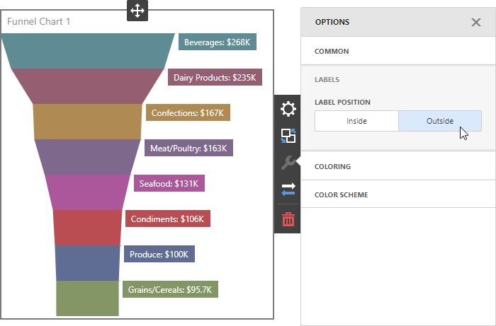
- The properties option specifies custom properties that can be used by an end-user to configure specific settings. For the Funnel Chart item, end-users can change a label’s position.
- The icon option allows you to pass the icon’s identifier specified in the first step (funnelChartItemIcon).
- The title option specifies the default custom item name.
var funnelChartItemMetaData = {
    bindings: [{
        propertyName: 'measureValue',
        dataItemType: 'Measure',
        displayName: 'Value'
    }, {
        propertyName: 'dimensionValue',
        dataItemType: 'Dimension',
        displayName: 'Argument',
        enableColoring: true,
        enableInteractivity: true
    }],
    interactivity: {
        filter: true
    },
    properties: [{
        propertyName: 'labelPositionProperty',
        editor: DevExpress.Dashboard.Metadata.editorTemplates.buttonGroup,
        displayName: 'Label Position',
        sectionName: 'Labels',
        values: {
            Inside: 'Inside',
            Outside: 'Outside'
        },
        defaultVal: 'Inside'
    }],

    icon: 'funnelChartItemIcon',
    title: 'Funnel Chart',
    index: 2
};
Implement the Custom Item’s Rendering
The CustomItemViewer class allows you to implement a visual representation of the custom item. You need to override the renderContent method to visualize dimension names as HTML content.
Create methods that allow you to display measure and dimension values from a data source and implement logic for a custom property:
- The _getDataSource method returns data that is displayed in the custom item. Use the getDisplayText method to get dimension / measure names and the iterateData method to generate data rows for the custom item. The iterateData method accepts a function as a parameter and allows you to iterate through aggregated data and obtain required values (dimension or measure values, display texts, colors, etc.). The FunnelD3 item has one dimension whose values can be colored (the bindings | enableColoring option in the previous step). When an end-user binds the custom item to the data field and enables coloring, the iterateData method is called for each row in the aggregated data.
- The _getDxFunnelWidgetSettings method is used to return widget’s settings when you render custom item’s content.
Override the following methods to support Master-Filtering and change the Funnel Chart’s content size when you scale the dashboard:
- The setSelection(values), clearSelection, and setMasterFilter methods are used to describe a custom item’s behavior when you filter data by selecting an item’s data rows.
- The setSize(width, height) method allows you to scale the custom item when you change the item’s size. This method should specify the correct widget size at runtime when the actual size is not known beforehand (svg-widgets).
var funnelChartItemViewer = (function (_base) {
    __extends(funnelChartItemViewer, _base);

    function funnelChartItemViewer(model, $container, options) {
        _base.call(this, model, $container, options);

        this.dxFunnelWidget = null;
        this.dxFunnelWidgetSettings = undefined;
    }

    funnelChartItemViewer.prototype._getDataSource = function () {
        var clientData = [];
        if (this.getBindingValue('measureValue').length > 0) {
            this.iterateData(function (dataRow) {
                clientData.push({
                    measureValue: dataRow.getValue('measureValue')[0],
                    dimensionValue: dataRow.getValue('dimensionValue')[0] || '',
                    dimensionDisplayText: dataRow.getDisplayText('dimensionValue')[0],
                    measureDisplayText: dataRow.getDisplayText('measureValue')[0],
                    dimensionColor: dataRow.getColor('dimensionValue')[0],
                    clientDataRow: dataRow
                });
            });
        }
        return clientData;
    };

    funnelChartItemViewer.prototype._getDxFunnelWidgetSettings = function () {
        var _this = this;
        return {
            dataSource: _this._getDataSource(),
            argumentField: "dimensionValue",
            valueField: "measureValue",
            colorField: "dimensionColor",
            selectionMode: "multiple",
            label: {
                customizeText: function (e) {
                    return e.item.data.dimensionDisplayText + ': ' + e.item.data.measureDisplayText;
                },
                position: _this.getPropertyValue('labelPositionProperty').toLowerCase()
            },
            onItemClick: function (e) {
                _this.setMasterFilter(e.item.data.clientDataRow);
            }
        };
    };

    funnelChartItemViewer.prototype.setSelection = function () {
        var _this = this;
        this.dxFunnelWidget.getAllItems().forEach(function (item) {
            item.select(_this.isSelected(item.data.clientDataRow));
        });
    };

    funnelChartItemViewer.prototype.clearSelection = function () {
        this.dxFunnelWidget.clearSelection();
    };

    funnelChartItemViewer.prototype.setSize = function (width, height) {
        _base.prototype.setSize.call(this, width, height);
        this.dxFunnelWidget.render();
    };

    funnelChartItemViewer.prototype.renderContent = function ($element, changeExisting) {
        if (!changeExisting) {
            $element.html('');
            var $div = $('<div/>');
            $element.append($div);
            this.dxFunnelWidget = new DevExpress.viz.dxFunnel($div, this._getDxFunnelWidgetSettings());
        } else {
            this.dxFunnelWidget.option(this._getDxFunnelWidgetSettings());
        }
    };

    return funnelChartItemViewer;
}(DevExpress.Dashboard.CustomItemViewer));
Register the Custom Item as an Extension
Create the funnelChartItem function that implements the ICustomItemExtension interface. This function is used to register the created custom item as the Web Dashboard’s extension.
function funnelChartItem(dashboardControl) {
    return {
        name: "funnelChartCustomItem",
        metaData: funnelChartItemMetaData,

        createViewerItem: function (model, $element, content) {
            return new funnelChartItemViewer(model, $element, content);
        }
    }
};
Go to the page containing the Web Dashboard code and pass the created function as the DashboardControl.registerExtension method’s parameter:
function onBeforeRender(sender) {
    // ...
    DevExpress.Dashboard.ResourceManager.registerIcon(FUNNELCHART_ITEM_ICON);
    dashboardControl.registerExtension(funnelChartItem(dashboardControl));
};
Run the Project to See the Result
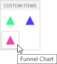
Run the project and click the Funnel Chart Toolbox item to add the custom item to the dashboard:
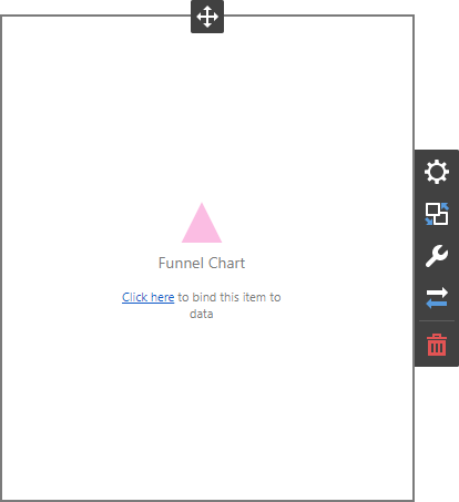
This adds the empty item to the dashboard.
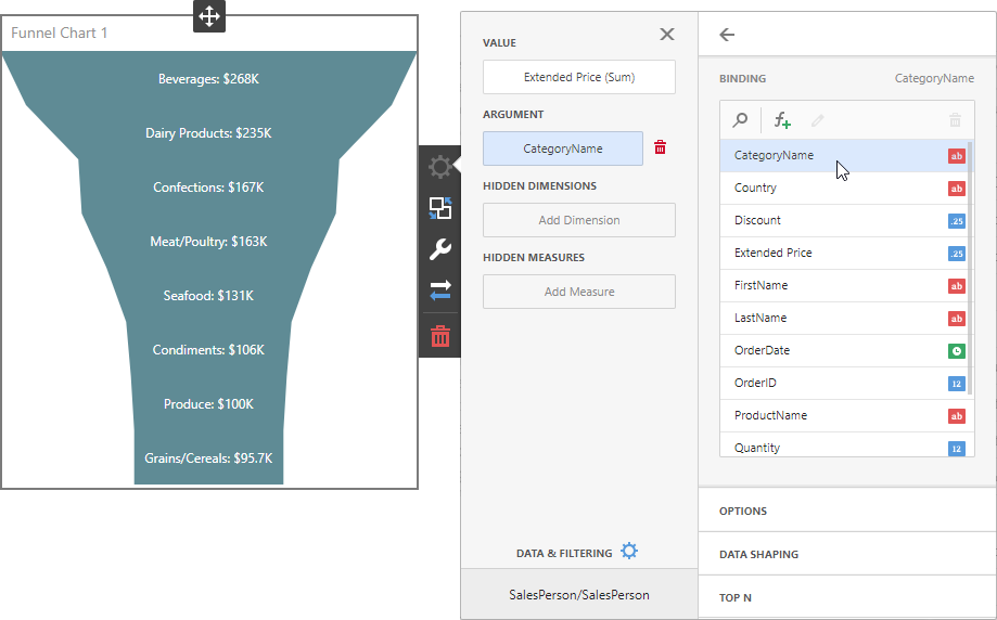
Invoke the Binding menu, click Set Value in the Value section and select the required field. Then, click Set Argument to provide argument values:
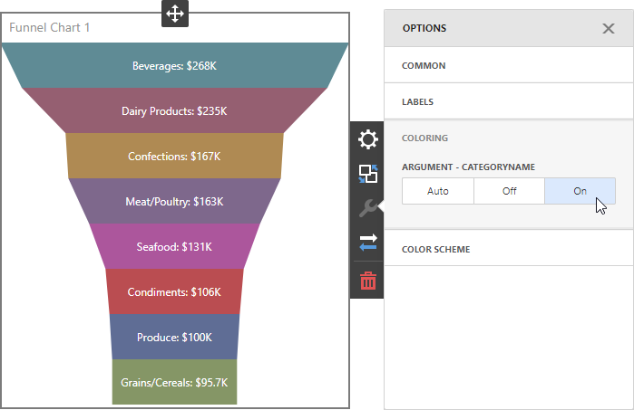
Use Options | Coloring to enable coloring:
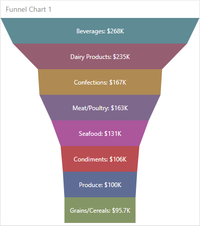
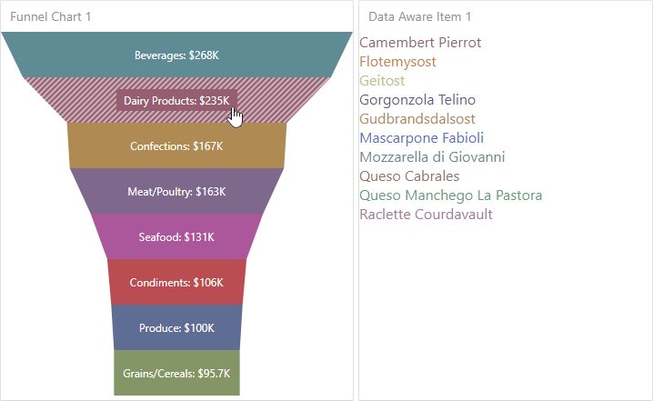
Add another dashboard item (for instance, the previously created Data-Aware Item) and bind it to data. Enable master filtering in the Funnel Chart and select any element to see the result:
You can change the labels position using the Options | Labels | Label Position custom option.