Mobile Layout
- 4 minutes to read
This topic describes the Web Dashboard’s mobile layout that enables you to display dashboards on mobile phones. The MobileLayoutExtension extension allows you to use a mobile layout for mobile browsers when the Web Dashboard operates in the ‘Viewer’ and ‘ViewerOnly’ modes.
Go to the Mobile-Ready Dashboard Layout demo to see this functionality in action.
Overview
The Web Dashboard control has the following requirements to work correctly on the mobile phones:
Make sure that all required client libraries are added to the web page.
The browser requires a special tag to properly render its content in a mobile browser. Without a viewport meta tag, mobile devices render pages at typical desktop screen widths, and then scale the pages to fit the mobile screens. Setting the viewport enables you to control the width and scaling of the viewport. Include the viewport <meta> tag in your HTML file inside the <head> block as shown below:
<meta name="viewport" content="width=device-width, initial-scale=1.0, maximum-scale=1.0, user-scalable=no" />The content attribute defines the following options:
- The page width is set to fit the width of the device’s screen (which varies depending on the device).
- Users are prevented from zooming and scaling the web page.
You can disable a mobile layout functionality for your Web Dashboard application. Call the unregisterExtension(extensionNames) method and pass the extension’s unique name as a parameter:
dashboardControl.unregisterExtension('mobile-layout');
Note
You can export only dashboard items when the Web Dashboard displays dashboards on mobile phones.
Mobile Layout’s Views
Web Dashboard in the mobile layout consists of the following views:
View | Description | Image |
|---|---|---|
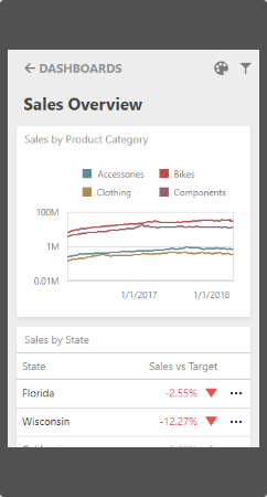
List View | The List view displays all dashboard items used in the current dashboard. The item’s interactivity is disabled. Filter elements are not displayed in the List view (see Dashboard Items Behavior). | Show image
|
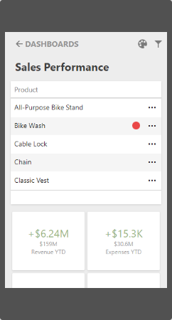
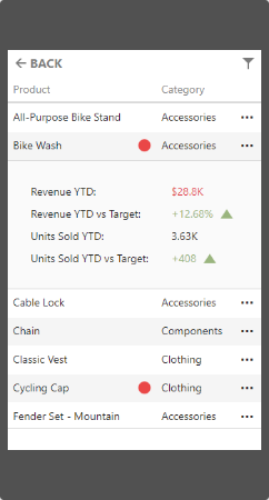
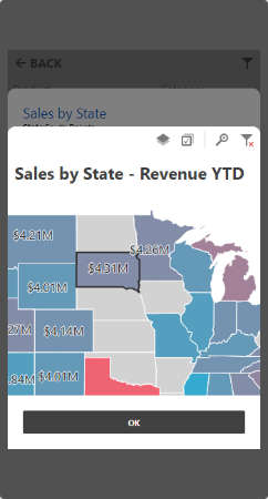
Item View | The Item view displays the selected item. Interactivity is supported. Filter elements are not displayed in the Item view (see Dashboard Items Behavior). | Show image
|
Filter Panel | The Filter panel displays filters that are applied to the entire dashboard / dashboard items. Click the Filter button (the | Show images
|
 icon) in the List view / Item view to see the filters applied to the entire dashboard / dashboard item, respectively. Click the required filter in the Filter panel to open the corresponding filter element and filter data.
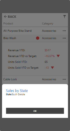
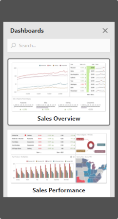
You can register the dashboard panel extension to display a list of available dashboards in a mobile layout and have a capability to switch between them. The Dashboards button is displayed at the top of the control after you register the extension.
Mobile Layout’s Mode
The Mobile layout is automatically enabled on mobile phones. You can use the MobileLayoutEnabled property of the corresponding technology/framework to change the mobile layout’s mode:
Technology / Framework | Property |
|---|---|
ASP.NET Web Forms | |
ASP.NET MVC | |
ASP.NET Core | |
HTML JavaScript Control |
See MobileLayoutMode / MobileLayoutMode enumerations to get values that specify a mobile layout mode for the Web Dashboard.
The code below shows how to change the mobile layout’s mode for different technologies/frameworks:
<dx:ASPxDashboard ID="ASPxDashboard1" runat="server" MobileLayoutEnabled="Always" WorkingMode="Viewer">
</dx:ASPxDashboard>
Dashboard Items Behavior
The items listed below are displayed with the following specifics when used in the mobile layout:
- Grid
- The Grid always adjusts columns automatically to the minimum width required to completely display its content (the ColumnWidthMode is set to AutoFitToContents).
- Grid hides columns to adapt the content to the screen or container size. Click the ellipsis button in the Grid’s row to display hidden data inside the adaptive detail row.
- The default column fit of the sparkline and bars is two times tighter then in a desktop version.
- Column resizing is disabled.
- Cards
- Cards in the mobile layout are always arranged automatically (the ContentArrangementMode property is set to Auto).
- Filter Elements
- Filter elements are displayed only in the Filter panel and are hidden in the List and Item views.