Mobile Layout in ASP.NET Core
- 4 minutes to read
You can enable mobile layout for mobile browsers when the Web Dashboard operates in ‘Viewer’ and ‘ViewerOnly’ modes.
Requirements
For the mobile layout to work correctly in the Web Dashboard control, do the following:
Add the Client libraries to the web page.
Include the viewport meta tag in the HTML file.
The browser requires a special tag to render its content in a mobile browser. Without a viewport meta tag, mobile devices render pages at typical desktop screen widths and then scale the pages to fit the screen. Set the viewport to specify the width and scaling of the viewport.
To do This, include the viewport meta tag in your HTML file inside the
<head>block as shown below:<meta name="viewport" content="width=device-width, initial-scale=1.0, maximum-scale=1.0, user-scalable=no" />The
contentattribute specifies the following properties:- The
width=device-widthproperty specifies that the page width is set to fit the width of the device’s screen. - The
user-scalable=noproperty specifies that zoom in and zoom out actions are not allowed on the page. - The
initial-scaleandmaximum-scaleproperties specify the initial and maximal scale on the page.
- The
Mobile Layout’s Views
The Web Dashboard in a mobile layout consists of the following views:
View | Description | Image |
|---|---|---|
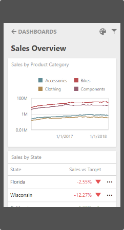
List View | The List view displays all dashboard items in the current dashboard. The item’s interactivity is disabled. Filter elements are not displayed in the List view (see Dashboard Items Behavior). | Show image
|
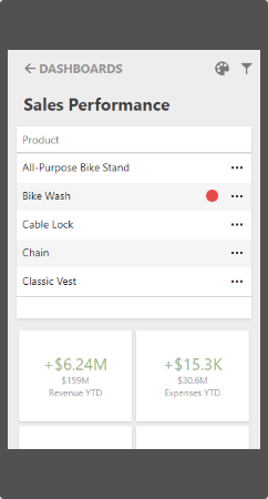
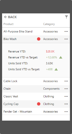
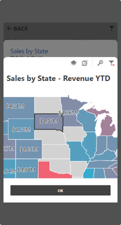
Item View | The Item view displays the selected item. Interactivity is supported. Filter elements are not displayed in the Item view (see Dashboard Items Behavior). | Show image
|
Filter Panel | The Filter panel displays filters that are applied to the dashboard/dashboard items. Click the Filter button (the | Show images
|
 icon) in the List View to display all filters in the current dashboard. Click the Filter button in the Item view to see the filters applied to the dashboard item. Click the filter in the Filter panel to open the corresponding filter element and filter data.
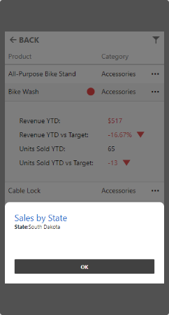
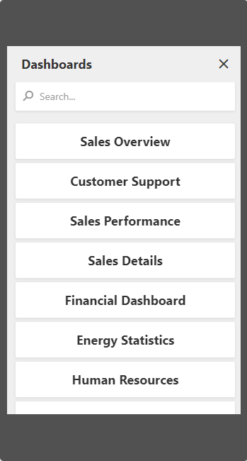
You can register the dashboard panel extension to display a list of available dashboards in mobile layout and to switch between dashboards. After you register the extension, the Dashboards button is displayed at the top of the control.
Mobile Layout’s Mode
The MobileLayoutExtension extension allows you to use a mobile layout. This layout is automatically enabled on mobile phones. You can use the DashboardMobileLayoutOptionBuilder.MobileLayoutEnabled property to explicitly specify when to enable the mobile layout.
See the MobileLayoutMode enumeration to get values that specify mobile layout mode for the Web Dashboard.
The code below shows how to use the mobile layout for mobile phones and desktop applications:
@(Html.DevExpress().Dashboard("clientDashboardDesigner1")
    .Width("100%")
    .Height("100%")
    .WorkingMode(WorkingMode.Viewer)
    .Extensions(e => e.MobileLayout(x => x.MobileLayoutEnabled(MobileLayoutMode.Always)))
)
You can disable the mobile layout functionality for your Web Dashboard application if you unregister the extension. Call the DashboardControl.unregisterExtension method and pass the extension’s unique name as a parameter:
dashboardControl.unregisterExtension('mobileLayout');
The mobile layout is automatically detected when the dashboard is loaded. If you use the browser’s Device Emulator in DevTools and switch the emulated device, reload the webpage (F5) to apply the mobile layout correctly.
Dashboard Items Behavior
The Web Dashboard in mobile layout displays the items listed below with the following specifics:
- Grid
- The Grid adjusts columns automatically to the minimum width required to display its content (the ColumnWidthMode is set to
AutoFitToContents). - Grid hides columns to adapt the content to the screen or container size. Click the ellipsis button in the Grid’s row to display hidden data inside the adaptive detail row.
- The default column fit of the sparkline and bars is two times tighter than in a desktop version.
- Column resizing is disabled.
- The Grid adjusts columns automatically to the minimum width required to display its content (the ColumnWidthMode is set to
- Cards
- Cards in the mobile layout are arranged automatically (the ContentArrangementMode property is set to
Auto).
- Cards in the mobile layout are arranged automatically (the ContentArrangementMode property is set to
- Filter Elements
- Filter elements are displayed in the Filter panel and hidden in the List and Item views.
Export
You can export only dashboard items and cannot export the entire dashboard when the Web Dashboard displays dashboards on mobile phones.