Dashboard Item Caption
- 7 minutes to read
Each dashboard item has a caption that is displayed at the top of this item. The caption can contain static text, svg images, and command buttons. These elements are called toolbar items:
- Caption Overview
- Customization
- Example 1: Add a Toolbar Item
- Example 2: Change a Toolbar Item
- Example 3: Remove a Toolbar Item
Caption Overview
You can control the dashboard item caption’s visibility.
- When the caption is on, it is always displayed at the top of the dashboard item. Some command buttons are displayed when you hover the mouse pointer over them.
- When the caption is off, it is not visible by default. Some command buttons are displayed in a floating panel when you hover the mouse pointer over them. On touch-based devices, you need to do extra click to show the caption elements when the caption is hidden.
Go to the dashboard item Options menu and use the Show Caption option to control the caption visibility:
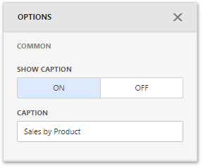
Use the DashboardItem.showCaption property to control the caption visibility in code.
Note
The Range Filter dashboard item’s caption is not visible by default.
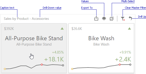
The dashboard item caption consists of the following elements:
- A static item is visible only if the caption is enabled (for example, the item caption, the data reducing icon).
- An action item is displayed only when the mouse pointer hovers over the dashboard item caption (for instance, the Export To and Values buttons).
- A state item is displayed only in specific dashboards states (for example, the Drill Up and Clear Master Filter buttons).
- A navigation item allows you to navigate through different dashboard screens (for example, Dashboards and Back buttons in mobile layout).
The table below lists the information and buttons that can be displayed in the dashboard item caption.
Static items |
| Data Reducing icon | Shows that visible data is limited. |
Text | Drill-Down Text | Shows a value or values from the current drill-down hierarchy. See Drill-Down for more details. | |
Text | Caption Text | Shows a static text in the caption. Use the DashboardItem.name property to set a caption text. | |
Action items |
| Maximize button | Expands any dashboard item into the whole dashboard size to examine data in greater detail. Refer to Dashboard Items Layout for more information. |
| Restore button | Restores the expanded item to its initial state. | |
| Export to button | Invokes the export menu for a dashboard item. To learn how to export individual dashboard items, see Exporting. | |
| Inspect Data button | Invokes the Data Inspector that contains two grids that display raw and aggregated data for the current dashboard item. | |
| Values button | Invokes a drop-down menu that allows you to switch between provided values (in the pie, card, gauge and maps dashboard items). To learn more, see the Providing Data topic for the corresponding dashboard item. | |
| Multi-Select button | Allows you to filter data by selecting multiple elements in dashboard items. | |
| Select Date Time Period menu / button | Allows you to select date-time periods for the RangeFilter and DateFilter items. | |
| Filters button | Displays filters affecting the current dashboard item or entire dashboard. This button is only available in mobile layout. | |
State items |
| Clear Master Filter button | Allows you to reset filtering when a dashboard item acts as the Master Filter. To learn more, see Master Filtering. |
| Drill Up button | Allows you to return to the previous detail level when this item’s drill-down capability is enabled. | |
| Clear Selection button | Allows you to clear the selection inside an item. | |
| Initial Extent button | Restores the default size and position of the Map dashboard items. | |
Navigation items | Dashboards | Dashboards button | Displays a list of available dashboards. |
| Back button | Returns to the dashboard items list. |
Customization
The Web Dashboard allows customizing the dashboard item’s caption and dashboard title. For instance, you can add custom command buttons, create additional menus, add static texts, etc. Use the DashboardItemCaptionToolbarOptions class to get access to a specific toolbar item’s collection in the dashboard item caption (like command buttons or static text). The ViewerToolbarItem object represents a toolbar item.
Use the following members to customize the dashboard item’s caption:
Event | Description |
|---|---|
Allows you to customize a dashboard item’s caption (for instance, add custom buttons, menus, etc.). | |
Specifies the JavaScript function (or its name) executed before the dashboard item caption toolbar is updated. | |
Gets or sets a function used in JavaScript frameworks that is executed when the ASPxClientDashboard.ItemCaptionToolbarUpdated event is raised. | |
Specifies a handler for the event occurring before the dashboard item caption toolbar is updated. |
Predefined Colors
You can use predefined colors for toolbar icons to make the icons consistent with the entire dashboard application. For example, you can use the predefined color for a new toolbar button. In this case, the button’s color depends on the selected Web Dashboard theme.
The table below lists the available predefined color classes:
| Predefined Color | Description |
|---|---|
| dx-dashboard-icon | The theme’s primary color. |
| dx-dashboard-contrast-icon | The theme’s additional color. |
| dx-dashboard-accent-icon | The theme’s accent color. |
| dx-dashboard-green-icon | A green hue based on the theme. |
| dx-dashboard-red-icon | A red hue based on the theme. |
| dx-dashboard-yellow-icon | A yellow hue based on the theme. |
Use the class="colorName" attribute in the icon’s svg definition to specify the icon’s color. If you want to change an icon’s color when it is hovered, add the style="fill: currentColor" attribute to the svg definition.
The code snippet below defines an icon that changes its color depending on the theme’s primary color and when you hover over it:
<svg id="baseCircle" class="dx-dashboard-icon" style="fill: currentColor" viewBox="0 0 24 24" width="24" height="24"><circle cx="12" cy="12" r="11" /></svg>
Example 1: Add a Toolbar Item
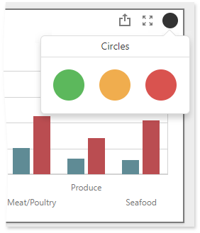
The following example shows how to add a toolbar item to the dashboard item caption. The code snippet below creates a custom button with a popup menu for the Chart dashboard item. The ItemCaptionToolbarUpdated event is used to customize the dashboard item caption. The button belongs to the actionItems collection and is displayed only when the mouse pointer hovers over the dashboard item caption. The popup menu contains three icon elements.
The image below shows the result:
extensions: {
  "viewer-api": {
      onItemCaptionToolbarUpdated: function (e) {
        if (e.itemName === "chartDashboardItem1") {
          e.options.actionItems.push({
            type: "menu",
            icon: "baseCircle",
            menu: {
              type: "icons",
              items: ["greenCircle","yellowCircle","redCircle"],
              selectionMode: "none",
              title: "Circles",
              itemClick: function (itemData, itemElement, index) {
                alert(itemData.toString());
              }
          });
        }
      }
    }
  }
}
Example 2: Change a Toolbar Item
The following example shows how to change the specific toolbar item. The code snippet below changes the Chart’s caption:
extensions: {
    'viewer-api': {
         onItemCaptionToolbarUpdated: function (e) {
            if (e.itemName === "chartDashboardItem1") {
                var caption = e.options.staticItems.filter(function(item) {
                    return item.name === 'item-caption'
                });
                if(caption.length > 0) {
                    caption[0].text = 'Sales';
                }
            }
        }
    }
}
Example 3: Remove a Toolbar Item
The following example shows how to delete a specific element from the toolbar items collection. The code snippet below removes the dashboard item caption:
extensions: {
    'viewer-api': {
         onItemCaptionToolbarUpdated: function (e) {
            if (e.itemName === "chartDashboardItem1") {
                e.options.staticItems = e.options.staticItems.filter(function(item) {
                    return item.name !== 'item-caption'
                });
            }
        }
    }
}
See Client-Side API Overview to learn more about available client-side customization capabilities.
Refer to the Array documentation for information on how to manage the collection of toolbar items.