Filter Elements Overview
- 2 minutes to read
The Web Dashboard allows you to create three types of filter elements that provide the capability to filter other dashboard items.
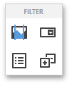
To add the required filter element to the dashboard, use corresponding buttons into the Filter section of the Toolbox.
Combo Box
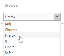
The Combo Box dashboard item allows end users to select a value(s) from the drop-down list.
You can switch the combo box type in the Combo Box’s Options menu. The table below demonstrates the available Combo Box’s types.
Standard | Checked |
|---|---|
The Standard type allows end users to select only a single value.
| The Checked type allows end users to select multiple values in the invoked drop-down list.
|
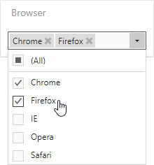
The Combo Box’s dropdown contains an ‘All’ item that allows end users to select/deselect all items in the Combo Box. To hide this item, disable the Show ‘All’ Value option in the Combo Box’s Options menu.
The ComboBoxItem class represents the Combo Box in code. Use the ComboBoxItem.comboBoxType property to specify the type.
List Box
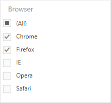
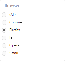
The List Box dashboard item allows end users to select a value(s) from the list.
You can switch the list box type in the List Box’s Options menu. The table below demonstrates the available List Box’s types.
Checked | Radio |
|---|---|
The Checked type allows end users to select multiple values in the list box.
| The Radio type allows end users to select a single value in the radio group.
|
The ListBoxItem class represents the List Box in code. Use the ListBoxItem.listBoxType property to specify the type.
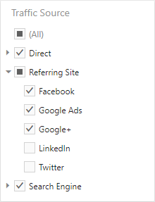
Tree View
The Tree View dashboard item displays values hierarchically and allows end users to expand/collapse nodes.
The TreeViewItem class represents the Tree View in code.
You can manage whether tree view nodes are expanded or collapsed using the Auto Expand option in the Tree View’s Options menu.
In code, use the TreeViewItem.autoExpandNodes property.