Filter Elements Overview (Web)
- 4 minutes to read
The Web Dashboard allows you to use specific filter elements to filter other dashboard items:
To add the required filter element to the dashboard, use corresponding buttons in the Filter section of the Toolbox:

Combo Box
The Combo Box dashboard item (ComboBoxItem) allows end users to select a value(s) from the drop-down list.
You can configure a Combo Box in the Combo Box’s Options menu. Available properties depend on Neutral Filter Mode: if you disable Neutral Filter Mode, the Show ‘All’ Value option appears instead of Allow Empty Filter.
Use the Type option (comboBoxType) to switch the Combo Box type. The list below shows the available types and their specifics:
- Standard
The Standard type allows end users to select only a single value.

When Neutral Filter Mode is enabled, the Allow Empty Filter option is available for this Combo Box type. This option allows users to clear filter(s) to display all data and enables the Clear Master Filter button that resets the filter.
When Neutral Filter Mode is disabled, the Show ‘All’ Value option is available for this Combo Box type instead. When this property is enabled, the Combo Box dropdown contains an ‘All’ item that allows end users to select/deselect all items at once.
- Checked
The Checked type allows end users to select multiple values in the invoked drop-down list.
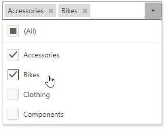
The behavior of the (All) element depends on Neutral Filter Mode.
The Enable Search option allows a user to search for specific values in a filter element.
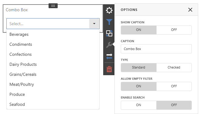
The following image displays options for a standard Combo Box when Neutral Filter Mode is enabled:
List Box
The List Box dashboard item (ListBoxItem) allows end users to select a value(s) from the list.
You can configure a List Box in the List Box’s Options menu. Available properties depend on Neutral Filter Mode: if you disable Neutral Filter Mode, the Show ‘All’ Value option appears instead of Allow Empty Filter.
Use the Type option (listBoxType) to switch the List Box type. See the list below for available types and their specifics:
- Checked
The Checked type allows end users to select multiple values in the list box:

The behavior of the (All) element depends on Neutral Filter Mode.
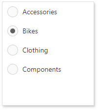
- Radio
The Radio type allows end users to select a single value in the radio group:
When Neutral Filter Mode is enabled, the Allow Empty Filter option is available for this List Box type. This option allows users to clear filters to display all data and enables the Clear Master Filter button that resets the filter.
When Neutral Filter Mode is disabled, the Show ‘All’ Value option is available for this List Box type instead. When this property is enabled, the List Box contains an ‘All’ item that allows end users to select/deselect all items at once.
The Enable Search option allows a user to search for specific values in a filter element.
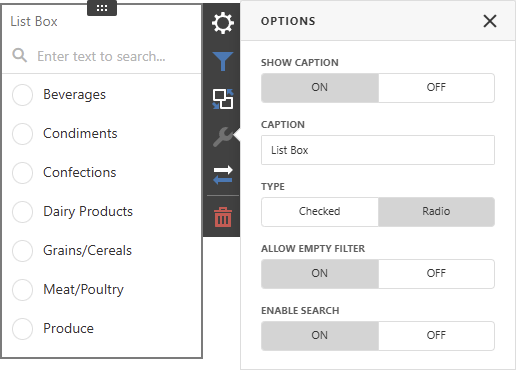
The following image displays options for a radio List Box with Neutral Filter Mode and search enabled:
Tree View
The Tree View dashboard item (TreeViewItem) displays values hierarchically and allows end users to expand/collapse nodes.

The behavior of the (All) element depends on Neutral Filter Mode.
The Tree View dashboard item does not support self-reference or parent-child hierarchies. The number of dimensions added to the Tree View item determines the number of levels in the hierarchy. Each level contains unique values from the corresponding level dimension. Values in each level are grouped by values in the previous dimension.
You can manage whether tree view nodes are expanded or collapsed using the Auto Expand option in the Tree View’s Options menu. In code, use the autoExpandNodes property.
Date Filter
The Date Filter dashboard item allows you to filter dashboard data based on the selected data range. This range can be relative (Last 3 Months), use fixed dates (01-01-2018), or presets (Month-to-date). You can also filter dates before or after a specified date.

The DateFilter item displays a set of intervals that can be used as quick filters:

End-users can click the button to invoke the Date Picker:

See Date Filter for more information.
Range Filter
For information about a Range Filter, see the following help article: Range Filter.