Themes and Styles
- 6 minutes to read
Supported Themes
The Web Forms Dashboard control and MVC Dashboard extension allow you to apply and customize themes based on the DevExtreme Generic and Generic Compact themes.
Each theme consists of stylesheets that are applied when you use one of the color constants:
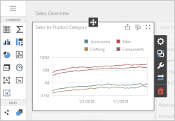
| Image | Theme | Color Constant (Generic) | Color Constant (Generic Compact) |
|---|---|---|---|
 |
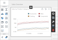
Light | ColorSchemeLight | ColorSchemeLightCompact |
 |
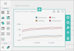
Dark | ColorSchemeDark | ColorSchemeDarkCompact |
 |
Carmine | ColorSchemeCarmine | ColorSchemeCarmineCompact |
 |
Soft Blue | ColorSchemeSoftBlue | ColorSchemeSoftBlueCompact |
 |
Green Mist | ColorSchemeGreenMist | ColorSchemeGreenMistCompact |
 |
Dark Moon | ColorSchemeDarkMoon | ColorSchemeDarkMoonCompact |
 |
Dark Violet | ColorSchemeDarkViolet | ColorSchemeDarkVioletCompact |
Note
A compact theme allows you to fit more elements within a web page. Note that compact themes affect only the following items::
The look of Light and Dark themes varies depending on Dashboard version:
- v19.1 and earlier: Light and Dark themes add custom colors to the corresponding DevExtreme themes and their compact counterparts. For example, the custom selection color was blue.
- v19.2 and later: Light and Dark themes use only the colors listed in the corresponding DevExtreme themes. To revert to the appearance available in previous versions, apply Light Blue and Dark Blue themes instead (or their compact counterparts):
| Image | Theme | Color Constant (Generic) | Color Constant (Generic Compact) |
|---|---|---|---|
 |
Light Blue | ColorSchemeLightBlue | ColorSchemeLightBlueCompact |
 |
Dark Blue | ColorSchemeDarkBlue | ColorSchemeDarkBlueCompact |
Apply a Built-in Theme
Use the ASPxWebClientUIControl.ColorScheme property on page load to specify a theme:
using DevExpress.DashboardWeb;
//...

    public partial class WebForm1 : System.Web.UI.Page {
        protected void Page_Load(object sender, EventArgs e) {
            ASPxDashboard1.ColorScheme = ASPxDashboard.ColorSchemeDark;
        }
    }
The same code in ASP.NET markup:
<dx:ASPxDashboard ID="ASPxDashboard1" runat="server" ColorScheme="ColorSchemeDark"></dx:ASPxDashboard>
Customize Themes
Use the DevExpress Dashboard CLI to create a custom Dashboard theme based on a DevExtreme theme created with the ThemeBuilder.
The DevExpress Dashboard CLI is a command line tool based on Node.js. It is used with the DevExtreme ThemeBuilder to create a custom theme for the Web Dashboard.
Create a Custom Theme
- Make sure you have Node.js and npm installed on your machine.
- Open the ThemeBuilder. Create a custom theme based on Generic themes. For instance, you can use the Light theme as a base and change its accent color from blue (#337ab7) to yellow (#fdb400).
Set the color scheme name (for example, “light-yellow”) and export the metadata as dx.generic.light-yellow.json.
Tip
Refer to the ThemeBuilder article for more information about the DevExtreme ThemeBuilder tool.
- Copy the downloaded JSON file (dx.generic.light-yellow.json) to an empty folder.
Edit dx.generic.light-yellow.json and add the dashboardItems property to override the accent colors at the dashboard level:
{
    "items": [
        {
            "key": "@base-accent",
            "value": "#fdb400"
        }
    ],
    "dashboardItems": [
        {
            "key": "@dashboard-item-selected-bg",
            "value": "rgba(#fdb400, 0.2)"
        },
        {
            "key": "@dashboard-item-hover-bg",
            "value": "rgba(#fdb400, 0.1)"
        }
    ],
    "baseTheme": "generic.light",
    "outputColorScheme": "light-yellow",
    "makeSwatch": false,
    "version": "19.1.5"
}
Refer to the Color Constants section to see a list of available color constants you can use to customize the Web Dashboard’s colors.
In the created folder (step 4), execute the command that installs the
devexpress-dashboard-clipackage and builds the CSS files for your custom theme:npx devexpress-dashboard-cli build-theme --input-file dx.generic.light-yellow.jsonThis generates the following CSS files you need to use to apply a custom theme:
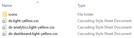
- dx.light-yellow.css
- dx-analytics.light-yellow.css
- dx-dashboard.light-yellow.css
- dx.light-yellow.min.css
- dx-analytics.light-yellow.min.css
- dx-dashboard.light-yellow.min.css
Color Constants
The Web Dashboard uses color constants to paint the control’s elements. The colors of the color constants listed in the table below can be customized. Changes to specific dashboard elements’ colors do not affect the basic DevExtreme colors.
| Color Constant | Description |
|---|---|
| @dashboard-surface-bg | The background color of the dashboard surface. |
| @dashboard-item-selected-bg | The background color of the selected element in a dashboard item. |
| @dashboard-item-hover-bg | The background color applied to elements in a dashboard item when you hover over them. |
| @dashboard-overlay-shader-bg | The shading background color. |
| @dashboard-border-color | A more contrast border color. |
| @dashboard-border-sub-color | A less contrast border color. |
| @dashboard-shadow | The color of the shadow used for the control’s elements (for example, when you hover over icons in the Toolbox). |
| @dashboard-shadow-border-color | The color of the border that appears with the shadow. |
| @dashboard-tab-hover-bg | The background color of the inactive hovered tab page’s header. |
| @dashboard-tab-inactive-bg | The background color of the inactive tab page. |
| @dashboard-info-toast-bg | The background color of the information notification toast. |
| @dashboard-info-toast-color | The text color of the information notification toast. |
| @dashboard-item-menu-bg | The background color of the dashboard item menu. |
| @dashboard-item-menu-icon-color | The primary color of the dashboard item menu’s icons. |
| @dashboard-item-menu-icon-sub-color | The additional color of the dashboard item menu’s icons. |
| @dashboard-item-menu-remove-icon-color | The color of the dashboard item menu’s Delete icon. |
| @dashboard-item-menu-separator-color | The color of the dashboard item menu’s separator. |
| @dashboard-item-menu-item-border-color | The border color of a dashboard item. The border appears when you hover or select a dashboard item in the [Designer]> (xref:119283#designer-and-viewer-modes) mode. |
| @dashboard-item-binding-menu-bg | The background color of the dashboard item’s Binding menu. |
| @dashboard-item-binding-menu-filter-section-bg | The background color of the Binding menu’s Filter section. |
| @dashboard-menu-bg | The dashboard menu‘s background color. |
| @dashboard-menu-color | The dashboard menu’s basic color. |
| @dashboard-menu-header-bg | The background color of the dashboard menu’s header. |
| @dashboard-menu-header-color | The primary color of the dashboard menu’s header. |
| @dashboard-menu-icon-color | The color of the dashboard menu’s icons (for example, the X icon used to close the menu). |
| @dashboard-menu-selected-bg | The background color of the selected element in the dashboard’s menu. |
| @dashboard-menu-selected-color | The color of the selected dashboard menu’s element. |
| @dashboard-menu-hover-bg | The background color applied to elements in a dashboard menu when you hover over them. |
| @dashboard-menu-hover-color | The primary color applied to elements in a dashboard menu when you hover over them. |
| @dashboard-toolbar-color | The text color of the dashboard item caption and dashboard title. |
Apply a Custom Theme
A custom theme’s icons should be in the same folder as the theme’s CSS files. For npm, the icons folder is node_modules/devextreme/dist/css. In other cases, the folder is in the same directory as the predefined themes. Copy the icons folder to the directory that contains your theme.
To apply a custom theme, do the following:
Create the Content | custom-themes folder in the project and put the generated CSS files in the created folder.
Register the theme in the Global.asax file:
using DevExpress.Web; using DevExpress.DashboardWeb; //... protected void Application_Start() { //... CustomColorSchemes .Configure("light-yellow") .AddDevExtremeStyle(@"Content/custom-themes/dx.light-yellow.min.css") .AddAnalyticsStyle(@"Content/custom-themes/dx-analytics.light-yellow.min.css") .AddDashboardStyle(@"Content/custom-themes/dx-dashboard.light-yellow.min.css"); }Use the ASPxWebClientUIControl.ColorScheme property to apply the custom theme to the Web Dashboard:
protected void Page_Load(object sender, EventArgs e) { // ... ASPxDashboard1.ColorScheme = "light-yellow"; }The same code in ASP.NET markup:
<dx:ASPxDashboard ID="ASPxDashboard1" runat="server" ColorScheme="light-yellow"></dx:ASPxDashboard>
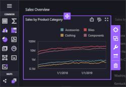
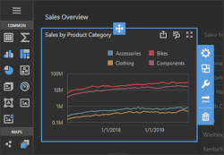
The image below shows the Web Dashboard with the custom Light Yellow theme: