Coloring
- 3 minutes to read
The DevExpress Dashboard allows you to paint dashboard item elements such as chart series points or pie segments.
Supported Dashboard Items
You can paint the following dashboard items:
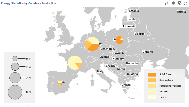
- Chart
- Scatter Chart
- Pie
- Pie Map
- Range Filter
- Treemap
Color Palettes
The following predefined palettes are available in the DevExpress Dashboard:
- Default
The default palette used to color dashboard item elements.
- Bright
A palette with bright color accents. Optimized for users with deuteranopia and protanopia.
- High Contrast
A palette with high visual contrast. Suitable for grayscale rendering, monochrome vision, and users with deuteranopia, protanopia, and tritanopia.
- Warm Gradient
A Yellow-Orange-Brown palette. Optimized for grayscale rendering and users with deuteranopia, protanopia, and tritanopia.
- Sunset
A palette based on warm sunset tones. Intended for visualizing values between two extremes. Optimized for users with deuteranopia and protanopia.
- Vibrant
A palette with vivid color contrast. Optimized for users with deuteranopia and protanopia.
Specify a Dashboard Palette
You can change a dashboard palette in the Color Scheme dialog in the WinForms and Web Dashboard Designers:
- WinForms Dashboard Designer
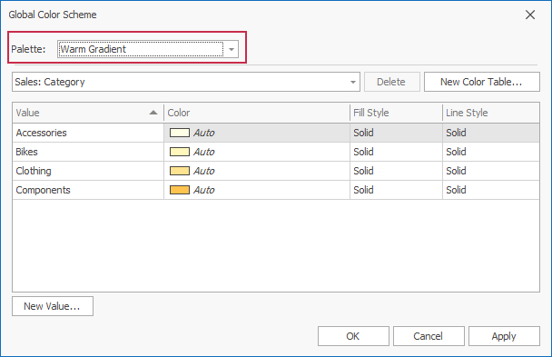
- Web Dashboard Designer
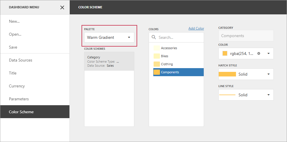
The selected palette applies to the entire dashboard and uses consistent colors and styles for identical values across dashboard items. Use a Local Color Scheme to specify colors and styles for individual items.
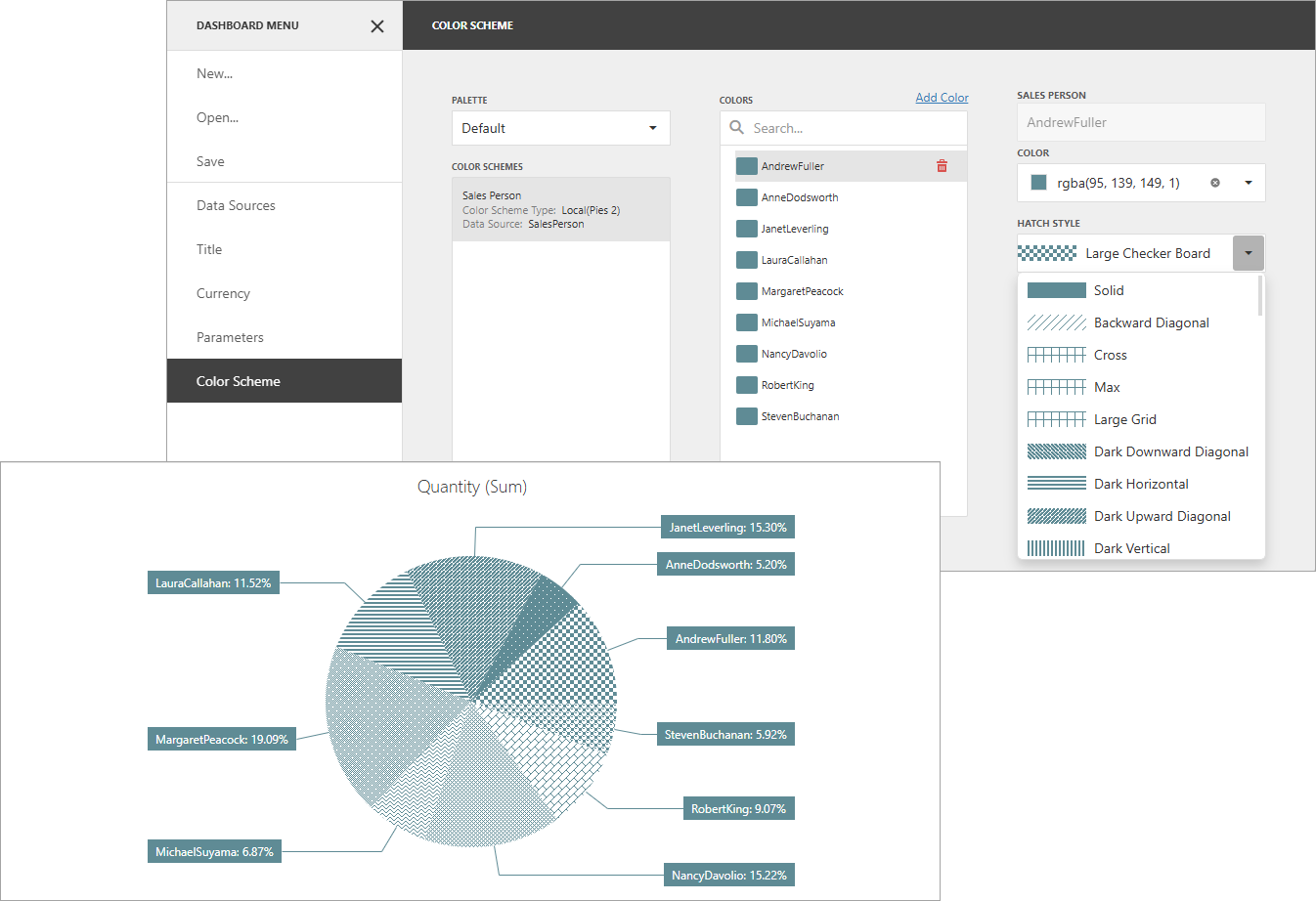
Hatch and Line Styles
For each color, you can also specify a hatch pattern and line style to distinguish data serieswithout relying on color:
- Line Styles
Use line styles for Chart and Range Filter dashboard items with line series.
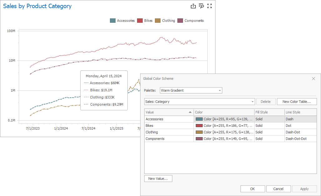
- Fill Style
Use a solid or hatch fill style for Chart dashboard items with bar and bubble series, Range Filter dashboard items with bar series, Pie, Scatter Chart, and Pie Map dashboard items.
Note
Hatch and line styles apply only to the dashboard items and series types listed above.
Color Scheme Overview
The dashboard supports two ways to color dashboard item elements:
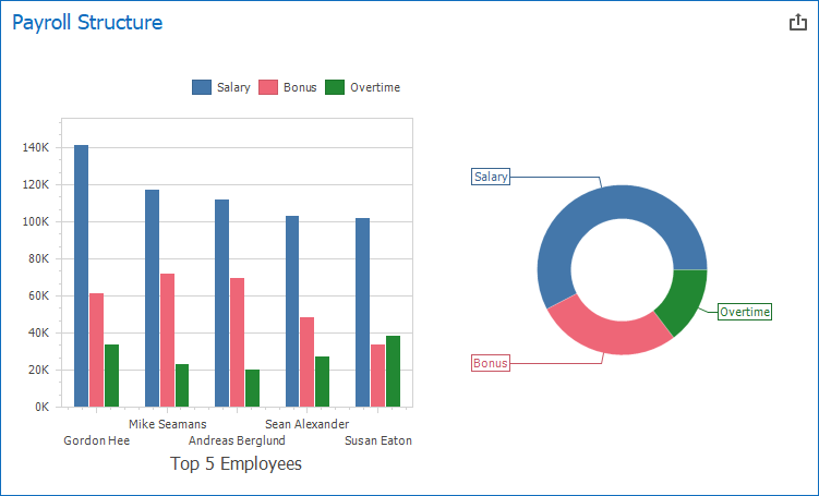
- Global Color Scheme
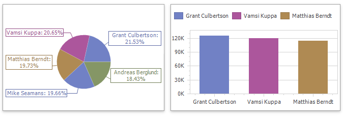
A Global Color Scheme uses consistent colors and styles for identical values across the dashboard. The image below shows a dashboard with Pie and Chart items. Pie segments and chart series points for the Wisconsin, Oregon, and Idaho dimension values use the same colors from the palette.

For a global color scheme, the dashboard reserves automatically generated colors for specific values regardless of the filter state.
- Local Color Scheme
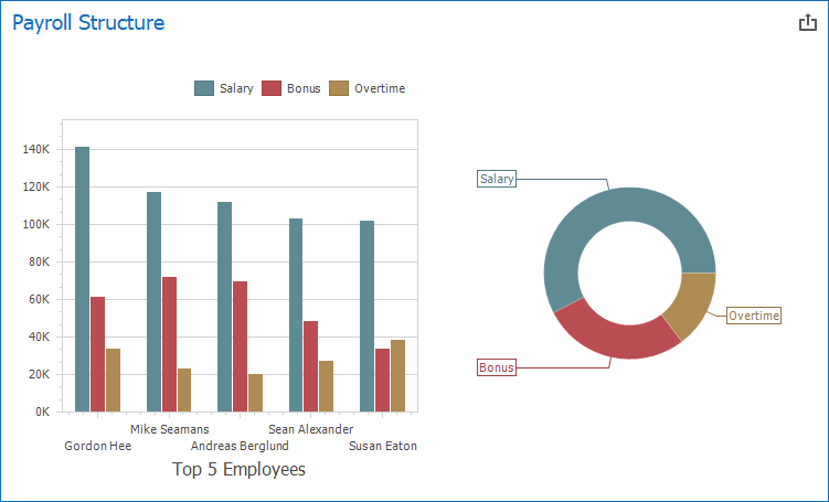
A Local Color Scheme uses an independent set of colors and styles for each dashboard item. The image below shows Pie segments that use colors from a local color scheme. These colors do not affect the Chart item, which uses a global scheme.

For a local color scheme, the dashboard reassigns palette colors when the filter state is changed.
Color Measures and Dimensions
You can use predefined color modes to paint individual dimensions or all measures in a dashboard item.
The following color settings are available:
| Web Color Mode Option | WinForms Color Mode Option | Description |
|---|---|---|
| Auto | Default | Enables or disables coloring depending on the dashboard item’s type. For example, for TreeMap arguments and Chart series, Default means On/Hue. For Chart arguments, Default means Off/None. |
| On | Hue | Elements use different colors. |
| Off | None | Elements use the same color. |
Documentation
Refer to the following help topics for additional information on how to configure color variation in the WinForms Designer or on the web: