Icon Ranges
- 4 minutes to read
Icon Ranges allow you to use predefined or custom sets of icons to apply conditional formatting to different ranges of values.
- Create a Format Rule in the WinForms Designer
- Create a Format Rule in the Web Dashboard
- Create a Format Rule in Code
Create a Format Rule in the WinForms Designer
To format values according the required condition, click the data item menu button, select Add Format Rule | Icon Ranges and choose the required icon set.

This invokes the Range Set dialog containing the set of value ranges and corresponding icons. The Grid dashboard item on the right displays the default formatting applied using the predefined set of 3 icons.

This dialog allows you to change the following options specific to Icon Ranges.
- The Format Style combo box allows you to change the icon set used to apply formatting.
The Use % ranges check box specifies whether the percent or absolute scale is used to generate ranges.
Note
Note that this option is not available for date-time dimensions.
To change the icon displayed for values corresponding to the specified range, click the button next to the required icon and select a new icon.

Select No Style to disable the indication for the required range.
You can change range boundaries by specifying the required values.

Note
Note that a new value should fall into a range between corresponding values of the previous and next range.
To change the comparison logic for the required range, click the comparison sign and select the required option.

The greater or equal sign includes the smallest value of the current interval while the greater sigh excludes the smallest value from the current interval and includes it in the next interval.
- Use the Add and Delete buttons to add new ranges or delete the selected range respectively. Note that new range is added below the selected range.
- Use the Reverse button to reverse the order of style settings corresponding to different ranges.
Create a Format Rule in the Web Dashboard
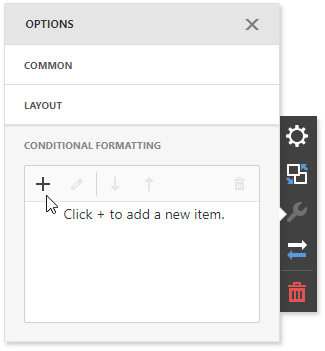
In the Conditional Formatting section, click the plus button to add a new format rule:
Select the data item you want to format and set the condition type to Icon Ranges:
Select the required icon set:
This invokes the Icon Ranges dialog containing the set of value ranges and corresponding icons. The Grid dashboard item on the right displays the default formatting applied using the predefined set of 3 icons.
Create a Format Rule in Code
Range conditions (Icon Ranges and Color Ranges) allow you to apply formatting using a predefined set of value ranges and corresponding style settings. You can use a predefined set of colors/icons to apply formatting or use custom ranges and corresponding icons/colors.
- To use a predefined set of colors/icons, pass the required FormatConditionRangeSetPredefinedType enumeration value to the FormatConditionRangeSet constructor and assign the resulting FormatConditionRangeSet object to the DashboardItemFormatRule.Condition property.
To use a predefined set of colors/icons and custom range boundaries, do the following.
- Pass the required FormatConditionRangeSetPredefinedType enumeration value to the FormatConditionRangeSet constructor or call the corresponding FormatConditionRangeSet.Generate method overload.
- Specify the type of range boundaries using the FormatConditionRangeBase.ValueType property and assign the required boundary values using the FormatConditionRangeBase.SetValues property.
- If necessary, change the comparison logic using the FormatConditionRangeBase.SetValueComparison property.
To use custom range boundaries and the required style specified for each range, do the following.
- Specify whether an absolute or percent scale is used to define range boundaries using the FormatConditionRangeBase.ValueType property.
- Create the required number of RangeInfo objects that are the ranges containing boundary values (the RangeInfo.Value property), the comparison logic (RangeInfo.ValueComparison) and style settings applied to range values (RangeInfo.StyleSettings).
- Add initialized RangeInfo objects to the FormatConditionRangeBase.RangeSet collection.
Assign the resulting FormatConditionRangeSet object to the DashboardItemFormatRule.Condition property.
The following example shows how to apply conditional formatting to Grid cells: