DxTextEditSettings.ShowValidationIcon Property
Specifies whether an editor shows validation icons.
Namespace: DevExpress.Blazor
Assembly: DevExpress.Blazor.v23.1.dll
NuGet Package: DevExpress.Blazor
Declaration
[DefaultValue(null)]
[Parameter]
public bool? ShowValidationIcon { get; set; }
Property Value
| Type | Default | Description |
|---|---|---|
| Nullable<Boolean> | null |
|
Remarks
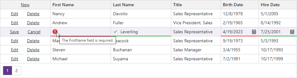
The Grid component allows you to validate input data based on data annotation attributes defined in a model and display error messages. Once validation is completed, the component marks editors with colored outlines: green indicates valid values, red — invalid values. Automatically generated cell editors additionally display the following validation icons:
 (for validation errors)
 (indicates successful validation)
An icon’s title displays the corresponding error message.
Set the column editor’s ShowValidationIcon property to false to hide validation icons:
<DxGrid @ref="Grid"
        Data="DataSource"
        PageSize="6"
        KeyFieldName="EmployeeId"
        EditMode="GridEditMode.EditRow"
        EditorRenderMode="GridEditorRenderMode.Integrated">
    <Columns>
        <DxGridCommandColumn Width="160px" />
        <DxGridDataColumn FieldName="FirstName" >
            <EditSettings>
                <DxTextBoxSettings ShowValidationIcon="false" />
            </EditSettings>
        </DxGridDataColumn>
        <DxGridDataColumn FieldName="LastName" >
            <EditSettings>
                <DxTextBoxSettings ShowValidationIcon="false" />
            </EditSettings>
        </DxGridDataColumn>
        <DxGridDataColumn FieldName="Title" />
        <DxGridDataColumn FieldName="BirthDate" />
        <DxGridDataColumn FieldName="HireDate" />
    </Columns>
</DxGrid>

@code {
    IEnumerable<EditableEmployee> DataSource { get; set; }
    IGrid Grid { get; set; }
    protected override async Task OnInitializedAsync() {
        DataSource = await NwindDataService.GetEmployeesEditableAsync();
    }
  // ...
}
To enable or disable validation icons at runtime, use the ITextEditSettings.ShowValidationIcon property instead.