DxSchedulerViewNavigatorToolbarItem Class
The drop-down item that allows you to to switch between views.
Namespace: DevExpress.Blazor
Assembly: DevExpress.Blazor.v25.1.dll
NuGet Package: DevExpress.Blazor
Declaration
public class DxSchedulerViewNavigatorToolbarItem :
    SchedulerToolbarItemBase
Remarks
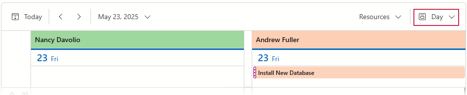
If you configured more than one view, the Scheduler component displays the View Navigator button. This button invokes a drop-down window with available views.
The DxSchedulerTodayToolbarItem partly supports toolbar item functionality. Refer to the following list for more information on available options: API Reference.
Note that View Navigator items begin a new group by default and set their alignment to Right, unlike standard toolbar items.
| Property | Toolbar Item Default Value | View Navigator Default Value |
|---|---|---|
| Alignment | ToolbarItemAlignment.Left |
ToolbarItemAlignment.Right |
| BeginGroup | false |
true |
The following example creates a group that includes Resource and View Navigator buttons:
 <DxScheduler @bind-StartDate="@StartDate"
              DataStorage="@DataStorage"
              GroupType="SchedulerGroupType.Resource">
     <Views>
         <DxSchedulerDayView DayCount="2" ShowWorkTimeOnly="true" />
         <DxSchedulerWorkWeekView />
     </Views>
     <ToolbarItems>
         <DxSchedulerTodayToolbarItem />
         <DxSchedulerResourceNavigatorToolbarItem />
         <DxSchedulerViewNavigatorToolbarItem BeginGroup="false" />
     </ToolbarItems>
 </DxScheduler>
Inheritance
Object
ComponentBase
DxComponentBase
DevExpress.Blazor.Base.DxAsyncDisposableComponent
DxSettingsComponent
DxToolbarItemBase
DxToolbarItem
DevExpress.Blazor.Scheduler.Internal.SchedulerToolbarItemBase
DxSchedulerViewNavigatorToolbarItem
See Also