DxSchedulerResourceNavigatorToolbarItem Class
The drop-down item that allows you to display or hide resources.
Namespace: DevExpress.Blazor
Assembly: DevExpress.Blazor.v25.1.dll
NuGet Package: DevExpress.Blazor
Declaration
public class DxSchedulerResourceNavigatorToolbarItem :
    SchedulerToolbarItemBase
Remarks
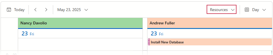
The Scheduler components displays the Resource Navigator toolbar item if you set up resources in your component. This button allows you to invoke a drop-down menu with resource groups. Use this menu to toggle the visibility of resource groups.
The DxSchedulerResourceNavigatorToolbarItem partly supports toolbar item functionality. Refer to the following list for more information on available options: API Reference.
Note that Resource Navigator items change a few default property values compared to standard toolbar items:
| Property | Toolbar Item Default Value | Resource Navigator Default Value |
|---|---|---|
| Alignment | ToolbarItemAlignment.Left |
ToolbarItemAlignment.Right |
| BeginGroup | false |
true |
| Tooltip | "" |
Scheduler_ResourcesButton |
The following example disables the Recource Navigator button:
<DxScheduler @bind-StartDate="@StartDate"
             DataStorage="DataStorage"
             GroupType="SchedulerGroupType.Resource">
    <Views>
        <DxSchedulerDayView DayCount="2" ShowWorkTimeOnly="true" />
        <DxSchedulerWorkWeekView />
    </Views>
    <ToolbarItems>
        <DxSchedulerTodayToolbarItem />
        <DxSchedulerResourceNavigatorToolbarItem Enabled="false" />
        <DxSchedulerViewNavigatorToolbarItem />
    </ToolbarItems>
</DxScheduler>