DxInputDataEditorBase<T>.ShowValidationIcon Property
Specifies whether an editor shows validation icons.
Namespace: DevExpress.Blazor.Base
Assembly: DevExpress.Blazor.v22.2.dll
NuGet Package: DevExpress.Blazor
Declaration
[Parameter]
public bool? ShowValidationIcon { get; set; }
Property Value
| Type | Description |
|---|---|
| Nullable<Boolean> |
|
Remarks
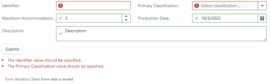
DevExpress input editors support data validation. You can add editors to Blazor’s standard EditForm. This form validates user input based on data annotation attributes defined in a model. When a user enters invalid data into an editor, the editor gets a red outline. You can also use the ShowValidationIcon global option or the editor’s ShowValidationIcon property to specify whether the editor should display validation icons - error  or success
  .
.
@using System.ComponentModel.DataAnnotations*

<EditForm Model="@starship"
          OnValidSubmit="@HandleValidSubmit"
          OnInvalidSubmit="@HandleInvalidSubmit"
          Context="EditFormContext">
    <DataAnnotationsValidator/>
    <DxFormLayout>
        <DxFormLayoutItem Caption="Identifier:" ColSpanMd="6">
            <DxTextBox @bind-Text="@starship.Identifier"
                       ShowValidationIcon="true"/>
        </DxFormLayoutItem>
        <DxFormLayoutItem Caption="Primary Classification:" ColSpanMd="6">
            <DxComboBox NullText="Select classification ..."
                        ClearButtonDisplayMode="DataEditorClearButtonDisplayMode.Auto"
                        Data="classifications"
                        @bind-Value="@starship.Classification"
                        ShowValidationIcon="true"/>
        </DxFormLayoutItem>
        ...
      </DxFormLayout>
</EditForm>