Popup Control
- 2 minutes to read
The Bootstrap Popup Control (BootstrapPopupControl) provides the ability to create and use popup windows in your web application. Popup windows are temporarily overlapping windows that appear separately from an application’s main window and are used to display quick reference information.

This topic lists the features that are unique to the Bootstrap Popup Control.
Control Features
- Automatically invoke a popup window on page load, without requiring any user action (for example, a button click).
- Clicking, right-clicking or hot-tracking an HTML element (for example, a button) invokes a popup window.
- Select from three end-user actions to close the popup window. These actions include: clicking outside the window, moving the mouse pointer away from the element that was previously hot-tracked to make the window visible, and clicking the window’s “close” button.
- The time delay before showing or hiding a popup window can be customized. Note that a time delay is only in effect when hot-tracking an HTML element invokes a popup window.
- Specify how a popup window is aligned relative to the HTML source element. You can align a popup window’s horizontal (or vertical) border to any horizontal (or vertical) border of an HTML element, or center it. You can specify the horizontal and vertical offsets in pixels if these alignment options are insufficient.
- Customizable header and footer content. Headers and footers in the popup window allow you to display a glyph and caption text (or a hyperlink). Note that you can also use templates for more flexible header and footer content customization.
Client-Side Features
- The control’s client-side equivalent is represented by the BootstrapClientPopupControl object.
- Client-side events allow you to respond to changes in a popup window’s visibility state.
- You can use client-side API to show and hide popup windows, specify their position relative to other HTML elements and change their content.
Example
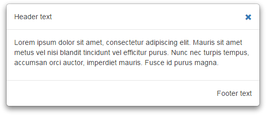
This example demonstrates the basic functionality of the Popup Control.
- Initialize a new instance of the BootstrapPopupControl class.
- Populate the
BootstrapLayoutItem.ContentCollectionarray with required content controls.
The image below shows the result:

<div id="default-popup-control-1" class="popup-target popup-target-sm"></div>
<dx:BootstrapPopupControl runat="server" ShowOnPageLoad="true" PopupElementCssSelector="#default-popup-control-1"
    PopupHorizontalAlign="Center" PopupVerticalAlign="Middle" Width="500px" CloseAction="CloseButton">
    <ContentCollection>
        <dx:ContentControl>
            ...
        </dx:ContentControl>
    </ContentCollection>
</dx:BootstrapPopupControl>
See Also