ASPxMenu Class
A menu control.
Namespace: DevExpress.Web
Assembly: DevExpress.Web.v23.2.dll
NuGet Package: DevExpress.Web
Declaration
Remarks
The ASPxMenu allows you to display a menu in your web application. You can use the menu control in combination with a site map data source control (for instance, the ASPxSiteMapDataSource) to navigate a web site.
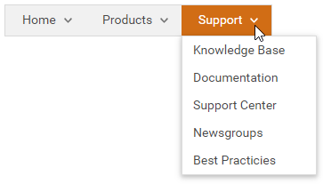
Create a Menu
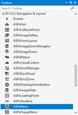
Design Time
The ASPxMenu control is available on the DX.23.2: Navigation & Layout toolbox tab in the Microsoft Visual Studio IDE.
Drag the control onto a form and customize the control’s settings, or paste the control markup in the page’s source code.
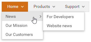
<dx:ASPxMenu ID="mMain" runat="server" AllowSelectItem="True" ShowPopOutImages="True">
    <Items>
        <dx:MenuItem Text="Home">
            <Items>
                <dx:MenuItem Text="News">
                    <Items>
                        <dx:MenuItem Text="For Developers">
                        </dx:MenuItem>
                        <dx:MenuItem Text="Website news">
                        </dx:MenuItem>
                    </Items>
                </dx:MenuItem>
                <dx:MenuItem Text="Our Mission">
                </dx:MenuItem>
                <dx:MenuItem Text="Our Customers">
                </dx:MenuItem>
            </Items>
        </dx:MenuItem>
        ...
    </Items>
</dx:ASPxMenu>
Run Time
protected void Page_Load(object sender, EventArgs e) {
ASPxMenu ASPxMenu1 = new ASPxMenu()
{
    ID = "ASPxMenu1",
    ItemAutoWidth = false,
    AllowSelectItem = true
};
ASPxMenu1.Items.Add(
    new DevExpress.Web.MenuItem() {
        Text = "Home",
        Items = {
            new DevExpress.Web.MenuItem() {Text = "News"},
            new DevExpress.Web.MenuItem() {Text = "Our Mission"},
            new DevExpress.Web.MenuItem() {Text = "Our Customers"}
        }
    });
ASPxMenu1.Items.Add(new DevExpress.Web.MenuItem() { Text = "Products" });
...
form1.Controls.Add(ASPxMenu1);
}
Note
DevExpress controls require that you register special modules, handlers, and options in the Web.config file. You can change this file or switch to the Design tab in the Microsoft Visual Studio IDE to automatically update the Web.config file. Note that this information is automatically registered if you use the DevExpress Template Gallery to create a project.
Client-Side API
The ASPxMenu‘s client-side API is implemented with JavaScript language and exposed by the ASPxClientMenu object.
Availability | Available by default. |
Client object type | |
Access name | |
Events |
Tree Structure
The ASPxMenu control can contain the following menu items types:
root menu items - a menu item located at the menu’s top level (level 0).
child menu item - a menu item that has a parent menu item.
The menu stores its root items in the ASPxMenuBase.Items collection. Child menu items are stored in the parent menu item’s MenuItem.Items collection.
The submenu items appear and disappear when an end user clicks outside the menu or according to the ASPxMenuBase.AppearAfter and ASPxMenuBase.DisappearAfter settings.
<dx:ASPxMenu ID="mMain" runat="server" AllowSelectItem="True" ShowPopOutImages="True">
    <Items>
        <dx:MenuItem Text="Home">
            <Items>
                <dx:MenuItem Text="News">
                    <Items>
                        <dx:MenuItem Text="For Developers">
                        </dx:MenuItem>
                        <dx:MenuItem Text="Website news">
                        </dx:MenuItem>
                    </Items>
                </dx:MenuItem>
                <dx:MenuItem Text="Our Mission">
                </dx:MenuItem>
                <dx:MenuItem Text="Our Customers">
                </dx:MenuItem>
            </Items>
        </dx:MenuItem>
    ...
    </Items>
</dx:ASPxMenu>
Data Binding
You can bind the menu control’s items to hierarchal data sources - ASPxHierarchicalDataWebControl.DataSourceID, ASPxDataWebControlBase.DataSource. Use ASPxMenuBase.ItemDataBound event to dynamically map menu items’ properties to the required data fields.
    <dx:ASPxMenu ID="ASPxMenu1" runat="server"
    DataSourceID="ASPxSiteMapDataSource1" OnItemDataBound="ASPxMenu1_ItemDataBound"
    EncodeHtml="False" AllowSelectItem="True" Orientation="Vertical" />
Scrolling
The menu control allows you to scroll items in sub menus if item heights exceed the browser window’s height.
Property | Description |
|---|---|
Specifies whether submenu scrolling is enabled in the menu. | |
Specifies whether submenu scrolling is enabled in an individual menu item. | |
ScrollDownButtonImage, ScrollUpButtonImage, ScrollButtonStyle | Style settings |
<dx:ASPxMenu ID="menu" runat="server" DataSourceID="menuDataSource" Orientation="Horizontal"
  AllowSelectItem="True" EnableViewState="False" ShowPopOutImages="True" EnableSubMenuScrolling="True" ...>
</dx:ASPxMenu>
Toolbar Mode
Set the ShowAsToolbar property to true to enable toolbar mode for the menu. It reduces the space between menu items, so that the menu looks like a toolbar.
<dx:ASPxMenu ID="ASPxMenu1" runat="server" ShowAsToolbar="true" ShowPopOutImages="true">
    <Items>
    ...
    </Items>
</dx:ASPxMenu>
Adaptivity
The menu allows you to build adaptive page layouts (Enabled) The control can automatically resize or hide its items when the browser window is resized.
Appearance Customization
Appearance | Description |
|---|---|
Item’s link style | |
Item’s link mode | |
Item’s Visibility and Order | |
Item’s style | ASPxMenuBase.ItemStyle, ASPxMenuBase.SubMenuItemStyle and ASPxMenuBase.SubMenuStyle |
Templates
You can use user-defined templates to customize the menu items:
at the menu control level (ASPxMenuBase.ItemTemplate, ASPxMenuBase.SubMenuTemplate).
at an individual menu item level (MenuItem.Template, MenuItem.SubMenuTemplate).