Panes Appearance
This document describes the ways in which the appearance of panes can be customized. Before reading this text, you may wish to review the basics of using panes in the ASP.NET Chart Control. To learn how additional panes can be created, refer to Adding Panes.
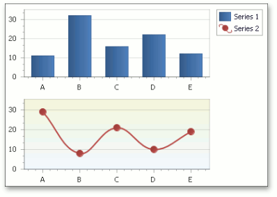
You can individually customize the appearance of panes, with no regard whether or not a pane is the default or an additional. To do this, you can use the properties described below.
- To show or hide the pane in the chart’s diagram, while maintaining it in the panes’ collection, use the XYDiagramPaneBase.Visible property.
- To rename the pane, use the ChartElementNamed.Name property.
To define the pane’s background, use the XYDiagramPaneBase.BackColor, XYDiagramPaneBase.FillStyle and XYDiagramPaneBase.BackImage properties.
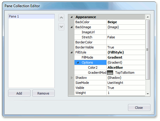
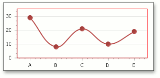
To define the look of the pane’s borders, use the XYDiagramPaneBase.BorderVisible and XYDiagramPaneBase.BorderColor properties. For example, the following chart shows the pane’s border color set to Red.
To customize the pane’s shadow, use the XYDiagramPaneBase.Shadow property.
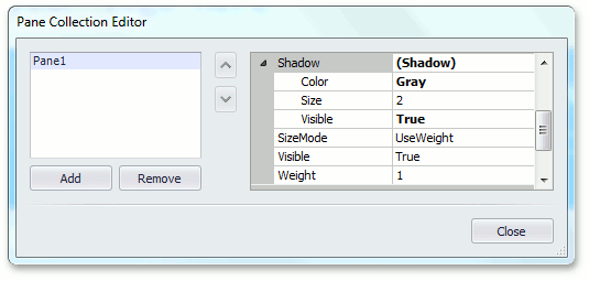
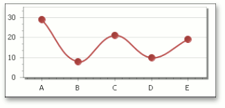
The image below shows the chart with the gray pane’s shadow.