Responsive Web Application Template
- 4 minutes to read
The Responsive Web Application template allows you to create an adaptive layout in your application. The template includes several adaptive web pages based on DevExpress ASP.NET AJAX Web Forms controls.
Refer to the following points to find more information about DevExpress ASP.NET templates.
- Online demo: Responsive Web Application Template
- Online video: Build Responsive ASP.NET Websites with DevExpress
- Blog post: ASP.NET - New Responsive Project Template
- Documentation: Template Gallery
Getting Started
Follow the steps below to create an application based on the Responsive Web Application template.
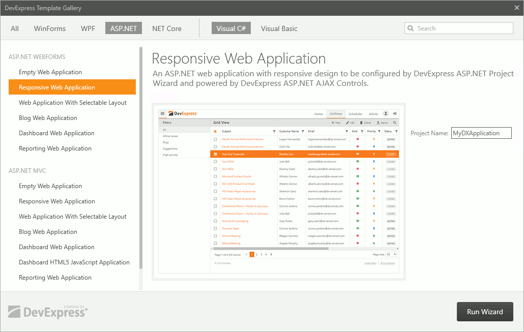
Launch the DevExpress Template Gallery, select the Responsive Web Application template, and click Run Wizard.
Specify the application’s base color and font settings in the Project Wizard.
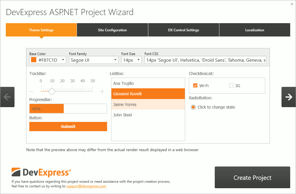
- Click Create Project to close the wizard and create the project.
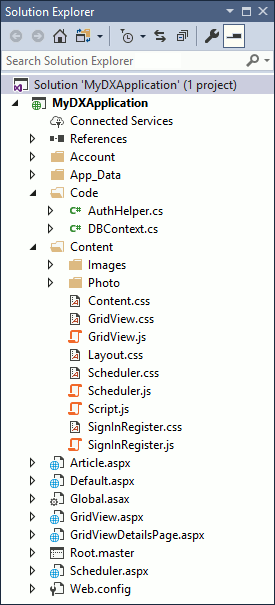
Project Structure
The wizard creates the project with the following structure.
- The Account folder contains Login/Register forms.
- The App_Data folder contains formatted text articles and an xml file for the main menu (ApplicationMenuDataSource.sitemap).
The Code folder contains the following files.
- The AuthHelper.cs file provides authentication API for Login/Register forms.
- The DBContenxt.cs file provides sample data for a grid and scheduler.
The Content folder contains the following folders and files.
- The Images folder contains project images and icons.
- The Content.css file provides styles required for formatted text articles.
- The Layout.css file provides styles required for the project’s layout.
- The Script.js file provides client code for the navigation UI and layout.
- The Root.master file provides markup and code-behind for the navigation UI and layout.
Add a Custom Page to The Project
See the online example that demonstrates the Responsive Web Application template-based application with two custom pages: Form Layout and Map.
To add custom pages to the project, do the following:
Add new items (Web Forms with Master Page) to your project.
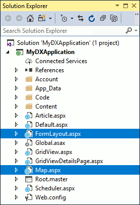
Add sitemap nodes to the App_Data/ApplicationMenuDataSource.sitemap file.
<?xml version="1.0" encoding="utf-8"?>
<siteMap xmlns="http://schemas.microsoft.com/AspNet/SiteMap-File-1.0">
  <siteMapNode url="javascript:void(0);">
    <siteMapNode url="Default.aspx" title="Home">
    </siteMapNode>
    ...
    <siteMapNode url="FormLayout.aspx" title="FormLayout">
    </siteMapNode>
    <siteMapNode url="Map.aspx" title="Map">
    </siteMapNode>
  </siteMapNode>
</siteMap>
The image below shows the result.

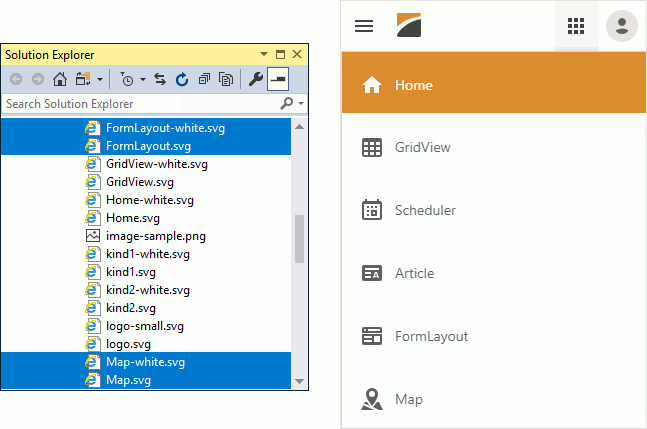
Add icons for the new menu items to the Images folder. The icons are displayed when the menu is collapsed to a vertical side-menu.
Note that icon names should duplicate the corresponding node’s title value. For example, for a node with title=”Map”, corresponding icon names are “Map.svg” and “Map-white.svg”.
Create a Layout For Custom Pages
The newly created web form with a master page contains the following code.
<asp:Content ID="Content1" ContentPlaceHolderID="Head" runat="server">
</asp:Content>
<asp:Content ID="Content2" ContentPlaceHolderID="LeftPanelContent" runat="server">
</asp:Content>
<asp:Content ID="Content3" ContentPlaceHolderID="RightPanelContent" runat="server">
</asp:Content>
<asp:Content ID="Content4" ContentPlaceHolderID="PageToolbar" runat="server">
</asp:Content>
<asp:Content ID="Content5" ContentPlaceHolderID="PageContent" runat="server">
</asp:Content>
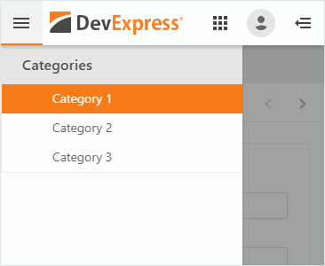
The LeftPanelContent section holds the content that occupies the left navigation pane.
//FormLayout.aspx
<asp:Content ID="Content2" ContentPlaceHolderID="LeftPanelContent" runat="server">
    <h3 class="leftpanel-section section-caption">Categories</h3>
    <dx:ASPxNavBar ...>
        <Groups>
            <dx:NavBarGroup>
                <Items>
                    <dx:NavBarItem Text="Category 1" Selected="true" Name="Category1" NavigateUrl="FormLayout.aspx" />
                    <dx:NavBarItem Text="Category 2" Name="Category2" NavigateUrl="FormLayout.aspx?2" />
                    <dx:NavBarItem Text="Category 3" Name="Category3" NavigateUrl="FormLayout.aspx?3" />
                </Items>
            </dx:NavBarGroup>
        </Groups>
    </dx:ASPxNavBar>
</asp:Content>
The image below shows the result.
The PageContent section holds the main content that occupies most of the screen space.
You can provide a page with a Simple or Autofit layout.
In the Simple layout, the content is placed inside the PageContent container.
This approach is used in the Home, GridView, Article, and FormLayout pages.
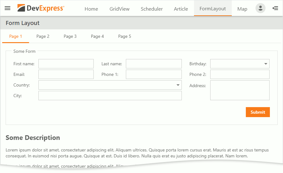
//FormLayout.aspx
<asp:Content ID="Content5" ContentPlaceHolderID="PageContent" runat="server">
    <dx:ASPxPageControl ID="pageControl" Width="100%" runat="server" ActiveTabIndex="0" EnableHierarchyRecreation="True"
        EnableTabScrolling="true">
        ...
    </dx:ASPxPageControl>
</asp:Content>
The image below shows the result.
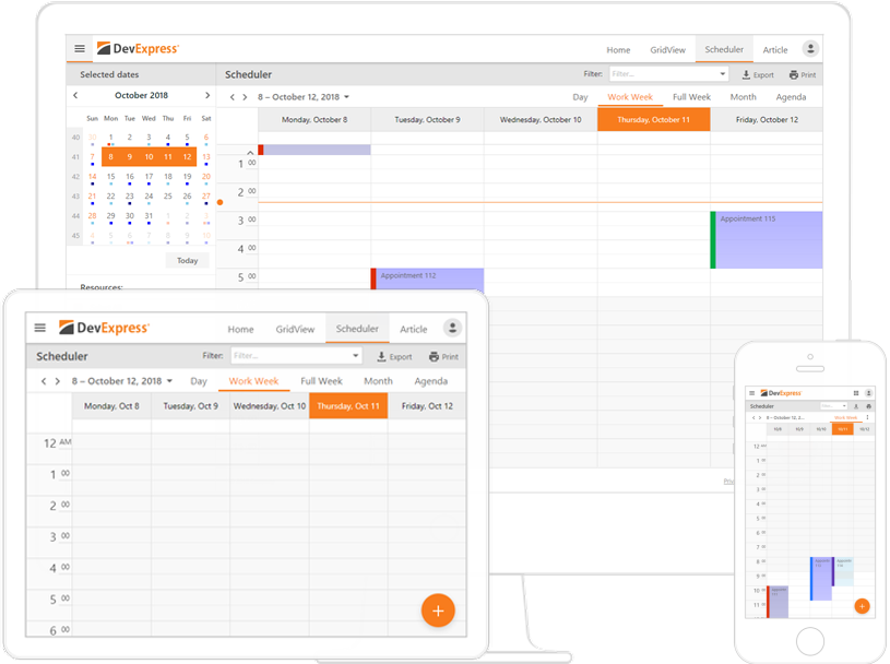
In the Autofit layout, the content is placed inside the PageContent container and adjusted to the container’s full height and width using adjustment delegates.
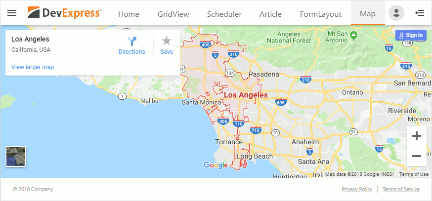
This approach is used in the Scheduler and Map pages.
//Map.aspx
<asp:Content ID="Content5" ContentPlaceHolderID="PageContent" runat="server">
    <iframe
        id="mapControl" width="100%" height="450" src="https://www.google.com/maps/..." frameborder="0" style="border: 0; vertical-align: text-bottom;" allowfullscreen></iframe>

    <script type="text/javascript">
        onMapControlInit(); // AdjustControl
    </script>
</asp:Content>
The adjustment delegates are client functions that are called each time the browser window is resized.
//Map.js
function adjustMapContainer() {
    var mapControl = document.getElementById('mapControl');

    // calculate the available height's value for the map control
    var footerWrapperHeight = document.getElementById('footerWrapper').offsetHeight;
    var height = window.innerHeight - footerWrapperHeight - headerPanel.GetHeight();

    // assign the map control's height
    mapControl.height = height;
}

function onMapControlInit(s, e) {
    AddAdjustmentDelegate(adjustMapContainer); // the adjustment delegate is invoked each time the map control container is resized (browser window is resized, left-side menu is expanded/collapsed, etc.)
}
The image below shows the result.