Responsive Web Application
- 3 minutes to read
The Web Application template with a Responsive layout allows you to create an adaptive layout that includes several web pages based on DevExpress ASP.NET AJAX Web Forms controls.

Create an Application
Follow the steps below to create a responsive web application.
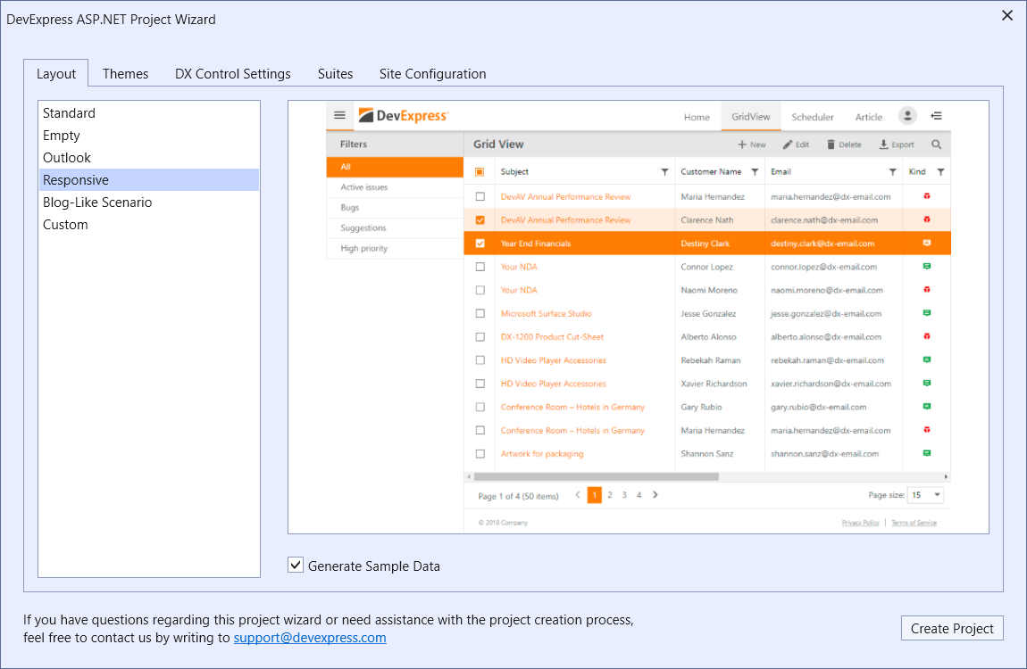
Run DevExpress Web App Template Gallery, select the Web Application template, and click Run Wizard.

In the DevExpress ASP.NET Project Wizard, select Layout → Responsive, customize project settings, and click Create Project.
Add a Custom Page to The Project
Follow the steps below to add custom pages (FormLayout.aspx and Map.aspx):
Add two new Web Form with Master Page items to your project.
Right-click on the application name in the Solution Explorer section and select Add → New Item → Web Form with Master Page.

Add sitemap nodes to the App_Data/ApplicationMenuDataSource.sitemap file.
<?xml version="1.0" encoding="utf-8"?>
<siteMap xmlns="http://schemas.microsoft.com/AspNet/SiteMap-File-1.0">
  <siteMapNode url="javascript:void(0);">
    <siteMapNode url="Default.aspx" title="Home">
    </siteMapNode>
    <!--...-->
    <siteMapNode url="FormLayout.aspx" title="FormLayout">
    </siteMapNode>
    <siteMapNode url="Map.aspx" title="Map">
    </siteMapNode>
  </siteMapNode>
</siteMap>
The image below shows the result.

Add icons for the new menu items to the Images folder. The web application displays the icons when you collapse the menu to a vertical side menu.
Icon names should duplicate the corresponding node’s title value. For example, for the node with title=”Map”, the icon names are “Map.svg” and “Map-white.svg”.

Create a Layout for Custom Pages
The newly created Form Layout web form contains the following code:
<asp:Content ID="Content1" ContentPlaceHolderID="Head" runat="server">
</asp:Content>
<asp:Content ID="Content2" ContentPlaceHolderID="LeftPanelContent" runat="server">
</asp:Content>
<asp:Content ID="Content3" ContentPlaceHolderID="RightPanelContent" runat="server">
</asp:Content>
<asp:Content ID="Content4" ContentPlaceHolderID="PageToolbar" runat="server">
</asp:Content>
<asp:Content ID="Content5" ContentPlaceHolderID="PageContent" runat="server">
</asp:Content>
The LeftPanelContent section holds content that occupies the left navigation pane.
Add the following code to this section:
<asp:Content ID="Content2" ContentPlaceHolderID="LeftPanelContent" runat="server">
    <h3 class="leftpanel-section section-caption">Categories</h3>
    <dx:ASPxNavBar ...>
        <Groups>
            <dx:NavBarGroup>
                <Items>
                    <dx:NavBarItem Text="Category 1" Selected="true" Name="Category1" NavigateUrl="FormLayout.aspx" />
                    <dx:NavBarItem Text="Category 2" Name="Category2" NavigateUrl="FormLayout.aspx?2" />
                    <dx:NavBarItem Text="Category 3" Name="Category3" NavigateUrl="FormLayout.aspx?3" />
                </Items>
            </dx:NavBarGroup>
        </Groups>
    </dx:ASPxNavBar>
</asp:Content>
The image below shows the result.

The PageContent section holds the main content that occupies most of the screen space. You can create a page with a Simple or Autofit layout.
In the Simple layout, the content is placed inside the PageContent container. You can see the same approach in the Home, GridView, Article, and FormLayout pages.
Add the following code to the FormLayout.aspx file:
<asp:Content ID="Content5" ContentPlaceHolderID="PageContent" runat="server">
    <dx:ASPxPageControl ID="pageControl" Width="100%" runat="server"
        ActiveTabIndex="0" EnableHierarchyRecreation="True" EnableTabScrolling="true">
        <!--...-->
    </dx:ASPxPageControl>
</asp:Content>
The image below shows the result.

In the Autofit layout, you can use adjustment delegates to fit content to the container. You can see the same approach in the Scheduler and Map pages.
Add the following code to the Map.aspx file:
<asp:Content ID="Content5" ContentPlaceHolderID="PageContent" runat="server">
    <iframe id="mapControl" width="100%" src="https://www.google.com/maps/..."></iframe>

    <script type="text/javascript">
        onMapControlInit(); // AdjustControl
    </script>
</asp:Content>
The adjustment delegates are client functions (Content → Script.js) that the project calls when you resize the browser window.
You can add the following code as a script to the Map.aspx file or add these functions to the Script.js:function adjustMapContainer() { var mapControl = document.getElementById('mapControl'); // Calculate the available height's value for the map control var footerWrapperHeight = document.getElementById('footerWrapper').offsetHeight; var height = window.innerHeight - footerWrapperHeight - headerPanel.GetHeight(); // Assign the map control's height mapControl.height = height; } function onMapControlInit(s, e) { AddAdjustmentDelegate(adjustMapContainer); // The adjustment delegate is invoked each time you change the map control container (for instance, resize the browser window, expand/collapse the side menu, and so on) }The image below shows the result.

See Also
- Blog post: ASP.NET - New Responsive Project Template
- Documentation: Template Gallery