Introduction to Gauges
- 2 minutes to read
This topic provides a brief overview of the gauges component.
Gauges Overview
The gauge component includes an extensive range of circular, linear and digital gauges, and static gauges used to imitate state indicators. This component comes into play when you need to imitate dashboards, dials, thermometers, LEDS, knobs and simple indicators. The gauges are based on scalable vector graphics technology. So, they can easily be zoomed in and out without any loss in quality.
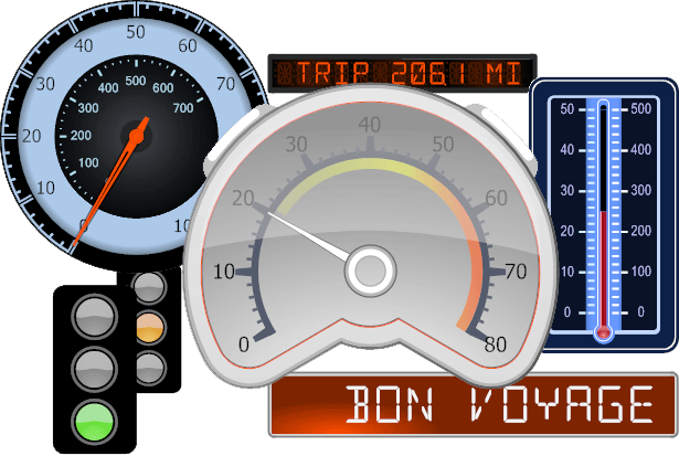
The main control of the gauge component that you start to work with is the Gauge Control, represented by the ASPxGaugeControl class. This is the gauge container. It can display one or multiple gauges of the same or different types at the same time (circular, linear and digital gauges and state indicators).
Circular Gauges
Circular gauges have a circular, semi-circular or any round scale. They are appropriate for creating speedometers, tachometers, stopwatches, clocks, etc.
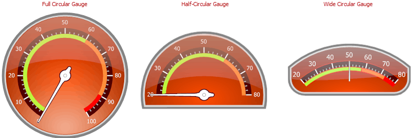
See Circular Gauges, to learn more.
Linear Gauges
These are horizontally or vertically oriented bars with scales, appropriate for creating thermometers and progress displays.
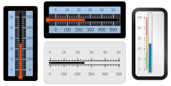
See Linear Gauges to learn more.
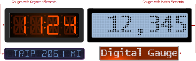
Digital Gauges
These gauges display text or numbers like LEDS do. Numbers can be painted using a 7 or 14 segment display style, and text can be painted using the 14 segment display style.
See Digital Gauges to learn more.
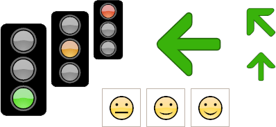
State Indicators
State indicators can be used to imitate static devices or simple indicators that have a fixed set of states.
See State Indicator Gauges to learn more.