Conditional Formatting Types
- 2 minutes to read
- Color Scale Format Condition
- Highlight Format Condition
- Icon Set Format Condition
- Top/Bottom Format Condition
Color Scale Format Condition
The CardViewFormatConditionColorScale format condition applies a format using a two-color or three-color scale. Cells are shaded with gradations of two or three predefined colors that correspond to minimum, middle, and maximum thresholds. If the GridFormatConditionColorScale.Format property is set to Custom, the color scale is specified by using the GridFormatConditionColorScale.MinimumColor, GridFormatConditionColorScale.MiddleColor (optional), and GridFormatConditionColorScale.MaximumColor properties.
An example of two-color scale formatting is shown below.
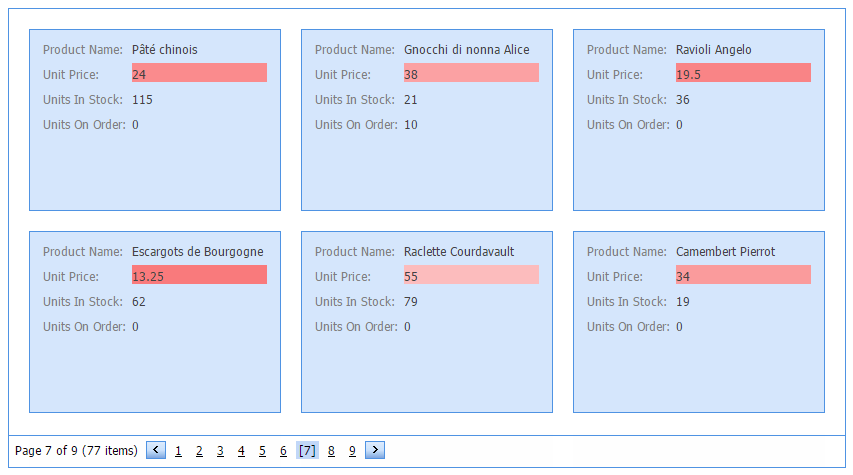
<FormatConditions>
    <dx:CardViewFormatConditionColorScale Format="WhiteRed" FieldName="UnitPrice" />
</FormatConditions>
Highlight Format Condition
The CardViewFormatConditionHighlight format condition applies a format to cells based on the specified rule (GridFormatConditionHighlight.Rule). For example, highlight cells with a unit price over $10 and less than $20. You can use the GridFormatConditionExpressionBase.Format property to apply one of the predefined style formats (Italic Text, Red Bold Text, Green Fill, Yellow Text with Yellow Fill, etc.), or specify custom appearance settings.
An example of custom highlight formatting is shown below.
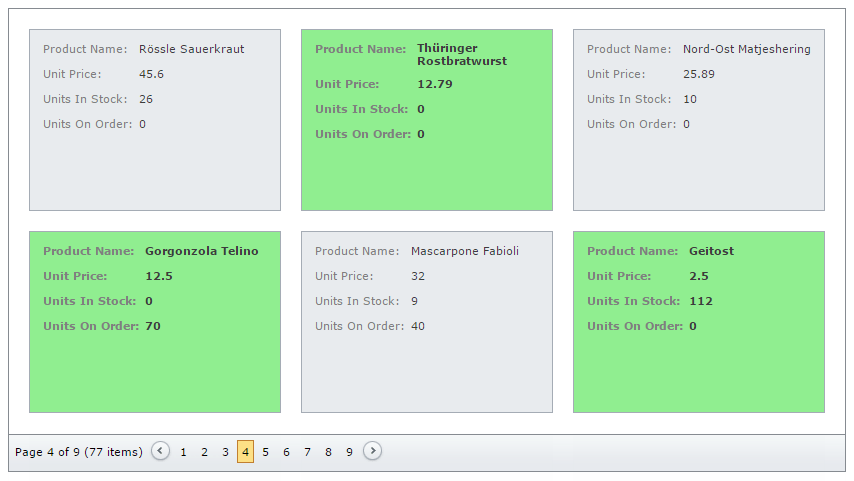
CardViewFormatConditionHighlight Format2 = new CardViewFormatConditionHighlight();
Format2.Format = GridConditionHighlightFormat.Custom;
Format2.CardStyle.BackColor = Color.LightGreen;
Format2.CardStyle.Font.Bold = true;
Format2.ApplyToCard = true;
Format2.Rule = GridConditionRule.Expression;
Format2.Expression = "[UnitPrice] < 15";
Format2.FieldName = "UnitPrice";
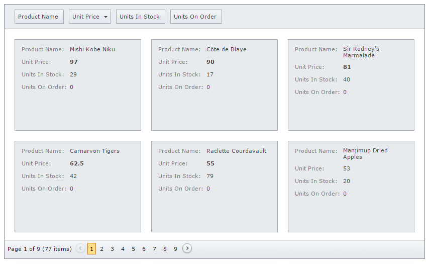
Icon Set Format Condition
The CardViewFormatConditionIconSet format condition applies a format to cells using an icon set. By default, the format is applied to all cells of data fields specified by the GridFormatConditionBase.FieldName property. Use the GridFormatConditionIndicatorBase.MinimumValue and GridFormatConditionIndicatorBase.MaximumValue properties to define a range of cells the format will be applied to.
An example of the icon set formatting is shown below.
CardViewFormatConditionIconSet Format4 = new CardViewFormatConditionIconSet();
Format4.FieldName = "UnitPrice";
Format4.Format = GridConditionIconSetFormat.Arrows3Colored;
Format4.MinimumValue = 0;
Format4.MaximumValue = 20;
ASPxCardView1.FormatConditions.Add(Format4);
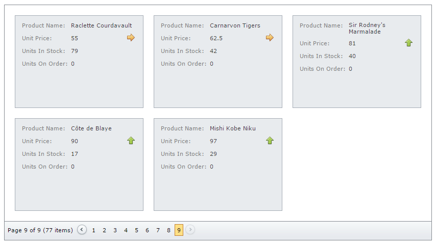
Top/Bottom Format Condition
The CardViewFormatConditionTopBottom format condition applies a format if a value is in the range of the highest or lowest column values. You can use the GridFormatConditionExpressionBase.Format property to apply one of the predefined style formats or to provide a custom appearance. The GridFormatConditionTopBottom.Rule property specifies the format condition rule applied to cells of data fields specified by the GridFormatConditionBase.FieldName property. If the Rule property is set to BottomItems, BottomPercent, TopItems, or TopPercent values, use the GridFormatConditionTopBottom.Threshold property to specify additional condition information, i.e., the number of items or the percentage.
An example of Top/Bottom formatting is shown below.
CardViewFormatConditionTopBottom Format3 = new CardViewFormatConditionTopBottom();
Format3.FieldName = "UnitPrice";
Format3.Format = GridConditionHighlightFormat.BoldText;
Format3.Rule = GridTopBottomRule.TopItems;
Format3.Threshold = 5;
ASPxCardView1.FormatConditions.Add(Format3);