Indicator
An Indicator is a visual element that shows the current fixed state of a State Indicator control. You can use the StateIndicator.StateIndex property to specify this state.
When the current state index is changed, a State Indicator automatically displays another image that corresponds to the current state.
The appearance of a State Indicator depends on the current image, enumerated by the StateIndicatorShapeType type. You can access this type from the StateIndicator.States collection.
The following images show different state indicator shape types:
| Traffic Lights | Lamp |
|---|---|
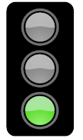 |
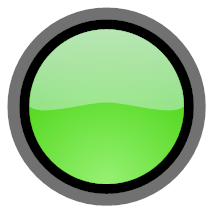 |
| Arrow | Currency USD |
 |
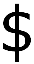 |
| Flag USA | Smile |
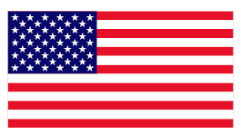 |
 |
The table below lists the main properties that affect element behavior and appearance.
| Characteristics | Members |
|---|---|
| Data | StateIndicator.StateIndex,StateIndicator.State,StateIndicator.States |
| Appearance | BaseLeafPrimitive.Shader |
| Size | StateIndicator.Center,StateIndicator.Size |
| Layout | BaseLeafPrimitive.ZOrder |