Access Detail View Property Editor Settings Using a Controller
- 2 minutes to read
This lesson explains how to access editors in a Detail View and change their settings.
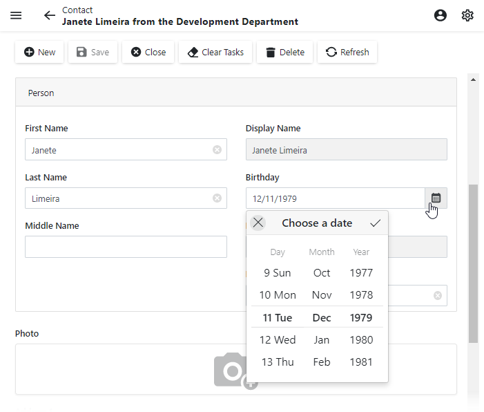
In this lesson, you will implement the following scenario: the Birthday property editor displays a scrollable date picker in its drop-down window.
Note
Before you proceed, take a moment to review the following lessons:
- Inherit from the Business Class Library Class (XPO/EF core)
- Add a Simple Action
Step-by-Step Instructions
Add a View Controller called “DateEditCalendarController“ to the MySolution.Module.Blazor project. Derive the controller from the ObjectViewController<ViewType, ObjectType> as shown below:
using DevExpress.ExpressApp;
using DevExpress.ExpressApp.Blazor.Editors;
using DevExpress.ExpressApp.Blazor.Editors.Adapters;
using MySolution.Module.BusinessObjects;
using System;
// ...

public partial class DateEditCalendarController : ObjectViewController<DetailView, Contact> {
    public DateEditCalendarController() {
        InitializeComponent();
    }
    // ...
}
Override the OnActivated method. Use the DetailViewExtensions.CustomizeViewItemControl method to access the Birthday property editor settings:
namespace MySolution.Module.Blazor.Controllers {
    public partial class DateEditCalendarController : ObjectViewController<DetailView, Contact> {
        public DateEditCalendarController() {
            InitializeComponent();
        }
        protected override void OnActivated() {
            base.OnActivated();
            View.CustomizeViewItemControl<DateTimePropertyEditor>(this, SetCalendarView, nameof(Contact.Birthday));
        }
        private void SetCalendarView(DateTimePropertyEditor propertyEditor) {
            var dateEditAdapter = (DxDateEditAdapter)propertyEditor.Control;
            dateEditAdapter.ComponentModel.PickerDisplayMode = DevExpress.Blazor.DatePickerDisplayMode.ScrollPicker;
        }
    }
}
Run the application and open the Contact Detail View. The Birthday editor shows a scrollable date picker in its drop-down window.
Detailed Explanation
Access Editor Settings
The CustomizeViewItemControl<T>(DetailView, Controller, Action<T>, String[]) method provides access to the property editor.
The property editor exposes the Control property that returns the Component Adapter.
Use the Component Adapter‘s ComponentModel property to access the actual ASP.NET Core Blazor component properties.
Refer to the following topic for information on how the ASP.NET Core Blazor component is integrated in XAF: Implement a Property Editor Based on a Custom Component (Blazor).
ObjectViewController
In this lesson, the DateEditCalendarController derives the ObjectViewController<ViewType, ObjectType> base class. The base class has two generic parameters:
- The ViewType parameter specifies the ViewController.TargetViewType value.
- The ObjectType specifies the ViewController.TargetObjectType value.
You can use this class as the base class for a custom Controller to ensure that the custom Controller is activated for a specific View type and object type.