Conditional Appearance (Manage UI State)
- 7 minutes to read
The Conditional Appearance module allows you to configure a user interface dynamically. UI customizations are performed on the basis of predefined business rules. This topic provides an overview of the Conditional Appearance module, and describes ways to utilize its functionality in your applications.
Tip
You can find examples of this functionality in the MainDemo demo included with XAF. The demo illustrates various XAF features (including `Conditional Appearance module) and is located in the %PUBLIC%\Documents\DevExpress Demos 25.2\Components\XAF\MainDemo.NET.EFCore folder.
Add Conditional Appearance Module to an XAF Application
ConditionalAppearanceModule is a pre-defined platform-agnostic module project. To use it in your XAF application, add a reference to an application project or to any custom module you created.
- You can add modules to your application when you use the Template Kit to create a new XAF solution. Select modules in the Additional Modules section.
- To add an extra module in code, register it within the XafApplication.Modules or ModuleBase.RequiredModuleTypes list (an assembly reference alone is insufficient).
- You can call the AddConditionalAppearance<TBuilder>(IModuleBuilder<TBuilder>) method in your ASP.NET Core Blazor / WinForms application builder.
Target / Recommended Scenarios
- Color or highlight editors in List and Detail Views
- Change font options of editors in List and Detail Views
- Disable or make editors read-only in List and Detail Views
- Hide or remove Detail View editors or layout items
- Hide or remove object-dependent Actions in List and Detail View menus
These UI customizations are intended to be dynamic based on object properties or criteria to deliver conditional data formatting, dynamic form layouts, or user input flows. For scenarios where the Conditional Appearance module should not be used, see the Non-Target / Not-Recommended Scenarios section below.
Supported UI Elements
Cells in List View Editors
WinForms
ASP.NET Core Blazor
- DxGridListEditor
- DevExpress.ExpressApp.Blazor.Editors.Grid.GridListEditor
Detail View Property Editors & Items
- Property Editors in Detail View
- Static Text Item in Detail View
- Layout Items, Groups, and Tabs
- Editors of a reference property expanded into a view
Actions
- Business Object-dependent Actions in List and Detail Views
The Conditional Appearance Module supports the following customizations.
| Font Color | Font Style | Back Color | Enabled/Disabled | Visible/Invisible | |
|---|---|---|---|---|---|
| Cells in a List View | ✅ | ✅ | |||
| Edited Cells in a List View | ✅ | ||||
| Property Editors in a Detail View | ✅ | ✅ | ✅ | ✅ | ✅ |
| Static Text in a Detail View | ✅ | ✅ | ✅ | ✅ | |
| Layout Items | ✅ | ✅ | ✅ | ✅ | |
| Layout Groups and Tabbed Layout Groups | ✅ | ✅ | ✅ | ||
| Actions | ✅ | ✅ |
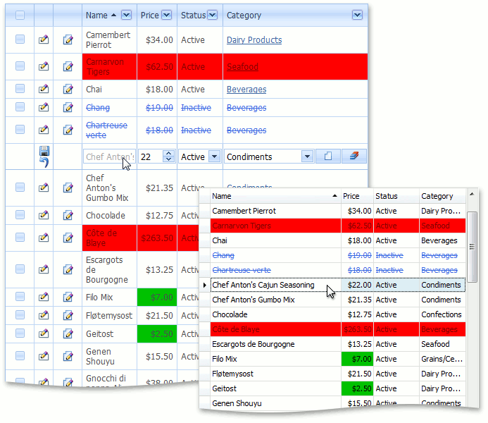
The following image illustrates various Conditional Appearance rules applied in List Views.
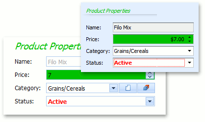
The following image illustrates various Conditional Appearance rules applied in Detail Views.
How To Use Conditional Appearance Rules
To effectively use this module in your applications, you only need to know how to define the conditional appearance rules that determine how a UI will be customized. A conditional appearance rule consists of the following parts.
A unique rule identifier.
ID - specifies the appearance rule’s identifier.
The UI elements that will be affected.
AppearanceItemType - specifies the target element’s type: a View Item (a property in a List View, Property Editor or Static Text), a Layout Item or an Action.
TargetItems - specifies the target item identifier, or a semicolon-separated target item identifiers list. You can use the “*” symbol to target all items. When customizing an Action, specify its ActionBase.Id value.
The appearance customization is specified by the following rule properties:
BackColor, FontColor, FontStyle, Enabled and Visibility.
The conditions under which an appearance rule is in effect are reflected by the following properties:
Context - specifies Views where a rule is applied. These Views include Detail Views, List Views, specific Detail and List Views, and any View of the target business class.
Criteria - specifies the criteria that must be satisfied by the target object.
Method - specifies the method that returns a Boolean value. When this method returns true, the rule is active; otherwise, the rule is inactive.
Priority - specifies the order in which rules are applied, when several rules affect the same UI element simultaneously.
Conditional appearance rules can be declared using one of the following three approaches:
- In code. Refer to the Declare Conditional Appearance Rules in Code topic for details.
- In the Model Editor. Refer to the Declare Conditional Appearance Rules in the Application Model topic for details.
- Dynamically. Refer to the AppearanceController.CollectAppearanceRules event description for details.
Non-Target / Not-Recommended Scenarios
Hide or Disable UI Elements to Secure Data
Appearance rules are applied at the UI level and have no effect on editors that do not support Conditional Appearance. We recommend that you use the Security System to secure (disable editing or hide) data on a per-user basis. However, you can use Conditional Appearance in scenarios that are not completely covered by the Security System (for example, disable/hide editors based on data that is not yet committed).
Show and Hide Actions Dynamically
Do not show/hide Actions dynamically, depending on the current object state - it produces a poor user experience and may cause errors. Instead, it is recommended that you manage the Action’s enabled state, which is a common practice in business applications. For instance, imagine a situation when a user tries to click an Action that is about to be hidden. In this situation, neighboring Actions automatically change their screen position, and it is possible that the end user might accidentally click the wrong Action. If you disable an Action instead of hide it, the screen positions of neighboring Actions will not change.
Show and Hide List View Columns
You may need to hide or show an entire column in a List View. This is an unnatural scenario for the Conditional Appearance module, since this module is designed to change the appearance settings of different UI elements under predefined conditions. However, you can hide or show a column if you specify a criteria that is not based on the current View’s objects. Thus, the criteria that you can specify is empty, similar to “1=1” or a Function Criteria Operator, neither of which require information on the current object. To hide or show a column, the Index property of the corresponding Views | List View | Columns | Column node is set to “-1” in the Application Model. This is performed once the List Editor’s control has been created, so if a column is hidden because the global criteria you are using in a rule returns true, the column will not be shown after this criteria returns false. In this instance, you should declare two appearance rules - one for hiding a column and the other for showing a column. The column’s visibility state will be refreshed only after the List Editor is recreated.
Note that you can specify a static method (see AppearanceAttribute.Method) that will always return true if it is difficult to write a criteria in the declaration of a rule (see IAppearanceRuleProperties.Criteria).
Manage Appearance of Nested ListView Actions and Columns Based on the Master Object
Conditional Appearance rules work in this scenario only if there is at least one record selected in a nested ListView. In other cases, hide Actions and columns using a custom View Controller, as described in the following topics: