Navigation System
- 7 minutes to read
This topic introduces the concept of the navigation system and describes its basic features. This post will cover the building blocks the navigation system includes, as well as how it operates on the inside. This document will go over how to define the navigation structure in your applications at design-time and to customize it in code. You will learn to change the navigation control style and to customize the navigation control. This topic will also introduce the concept of context navigation. A sample implementation of context navigation is however, out of the scope of this document and is described in the How to: Implement Custom Context Navigation topic.
Tip
You can find examples of this functionality in the MainDemo demo included with XAF. The demo illustrates various XAF features (including navigation system capabilities) and is located in the %PUBLIC%\Documents\DevExpress Demos 25.2\Components\XAF\MainDemo.NET.EFCore folder.
Navigation System Basics
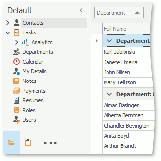
An XAF application’s UI consists of Views. Views are abstract entities used for data representation. XAF has two basic types of Views - the Detail Views that display a single object and its properties, and List Views that display object collections. A typical XAF application includes multiple Views for viewing and editing different object types. The navigation system allows users to switch between these Views as needed. The navigation control in a UI lists all available Views and allows users to activate a View.
The main parts of the navigation system are the navigation Action, navigation Action Containers, ShowNavigationItemController, and the navigation structure.
The navigation Action, navigation Action Containers, and
ShowNavigationItemController. Each built-in XAF Template that corresponds to the main Window contains the navigation Action Container. This Action Container is used to host the Navigation Action, matched by a UI element of the navigation control.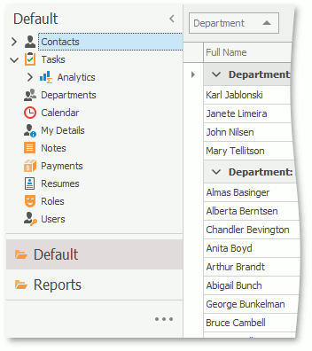
The
ShowNavigationItemControllerpopulates the navigation Action Container with navigation Actions.ShowNavigationItemControllerreads the navigation structure and the navigation control style settings from the Application Model and customizes the navigation control accordingly. This Controller also synchronizes the selected item in the navigation control with the active View.The navigation structure reflects the relationship between different Views. The Application Model’s IModelRootNavigationItems node defines the navigation structure. The
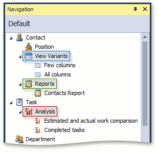
IModelRootNavigationItemsnode consists of IModelNavigationItem nodes. Each of theIModelNavigationItemnodes can have child nodes.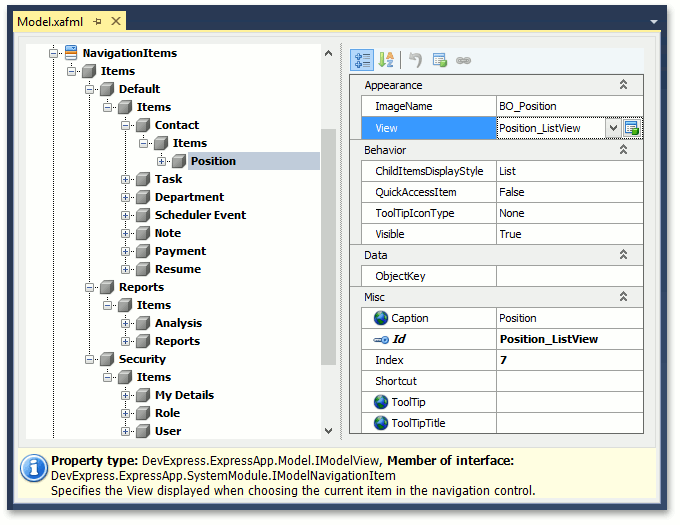
If a NavigationItem node has the IModelNavigationItem.View property set, the corresponding item in the navigation control corresponds to a View. Selecting such an item activates the View. If the
Viewproperty is not set, the corresponding item in the navigation control serves as a group that stores other items.
Define the Navigation Structure
You can define and customize the navigation structure at design time and in code.
- The Model Editor is meant for design-time customization of the navigation structure. Invoke the Model Editor, navigate to the NavigationItem node and customize it as required. This technique is detailed in the following tutorial: Add an Item to the Navigation Control.
In code, you can do one of the following to define and customize the navigation structure:
Apply the NavigationItemAttribute or DefaultClassOptionsAttribute to the required business classes. The
NavigationItemattribute adds a navigation item to the navigation control. The most frequently used constructor accepts one string parameter that specifies a first-level child node of the NavigationItems node. The constructor adds a NavigationItem node that corresponds to the List View of the business class to the specified node. TheDefaultClassOptionsattribute produces the same effect as theNavigationItemAttributebut adds certain extra attributes. Refer to the DefaultClassOptionsAttribute class description for details.Customize the Application Model’s NavigationItems node directly, in a custom Controller, for instance. This technique is described in the following help topic: Access the Application Model in Code.
Note
In Windows Forms applications with the Navigation Bar and Accordion style, you cannot use a group to navigate to a View, even if the View property is specified because groups serve only as containers for other navigation items.
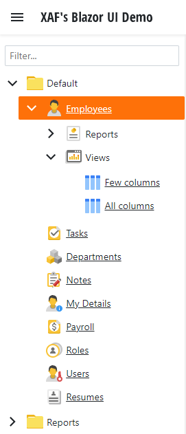
Control Styles in an ASP.NET Core Blazor Application
The following section illustrates the appearance of the navigation control in an ASP.NET Core Blazor application with different style settings.
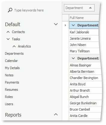
Accordion
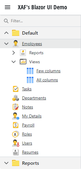
To apply this style to your Blazor application, set the IModelRootNavigationItems.NavigationStyle property to Accordion.
This is the default style used in XAF Blazor applications.
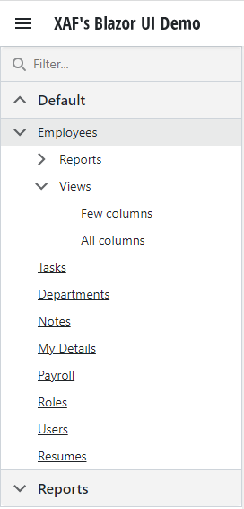
Tree List
To apply this style to your Blazor application, set the IModelRootNavigationItems.NavigationStyle property to TreeList.
Show Images
Default navigation items display icons. To hide icons, set the IModelRootNavigationItems.ShowImages property to False.
Control Styles in a WinForms Application
The following section illustrates the appearance of the navigation control in a WinForms application with different style settings.
Accordion
To apply this style to your WinForms application, set the IModelRootNavigationItems.NavigationStyle property to Accordion.
This is a default style for new XAF WinForms applications.
All nodes except nodes of the last nesting level correspond to the accordion’s group elements.
Navigation Bar with Large Icons
To apply this style to your WinForms application, do the following:
- Set the IModelRootNavigationItems.NavigationStyle property to
NavBar. - Set the IModelRootNavigationItems.DefaultChildItemsDisplayStyle property to
Large Icons.
First-level child nodes are displayed in the navigation pane as navigation groups, and second-level child nodes are displayed as a set of icons.
Navigation Bar with List
To apply this style to your WinForms application, do the following:
- Set the IModelRootNavigationItems.NavigationStyle property to
NavBar. - Set the IModelRootNavigationItems.DefaultChildItemsDisplayStyle property to
List.
First-level child nodes are displayed in the navigation pane as navigation groups. The content of each group is displayed as a TreeList.
Tree List
To apply this style to your WinForms application, set the IModelRootNavigationItems.NavigationStyle property to TreeList.
All nodes are displayed as a tree list.
Navigation Bar with Outlook Style
To apply this style to your WinForms application, do the following:
- Set the IModelRootNavigationItems.NavigationStyle property to
NavBar. - Set the IModelRootGroupsStyle.RootGroupsStyle property to
OutlookSimpleorOutlookAnimated. - Set the IModelOptionsWin.FormStyle property to
Ribbon. - Set the IModelOptionsWin.UIType property to
SingleWindowSDIorMultipleWindowSDI. - In the WinApplication.Designer.cs (WinApplication.Designer.vb) file, set the WinApplication.UseOldTemplates property to
false.
XAF displays each root navigation group as a NavigationBarItem in the Office Navigation Bar. When the IModelChoiceActionItemChildItemsDisplayStyle.ChildItemsDisplayStyle property is set to List for the current group and this group has second-level child nodes, XAF displays the group content as a TreeList. When the ChildItemsDisplayStyle property is set to LargeIcons for the current group, XAF displays the group content as NavBarItems. In this case, only the first-level nodes are displayed.
Note
If you need to customize the navigation control’s appearance further, you can do it in code. You can implement a custom Controller and customize the control as required. The following help topic contains an a navigation control customization example: How to: Access Navigation Control.
Keyboard Shortcuts in WinForms Applications
When you use the Multiple Document Interface in the application, hold down the Shift key and click a navigation item to invoke a new View in a separate window instead of a new tab.
You can use arrow keys to navigate a tree list control. Click a tree list region that is not occupied by navigation items to enter keyboard navigation mode. Use the up arrow and down arrow keys to navigate between items. To expand a group item, press ctrl+right arrow. To collapse a group item, press ctrl+left arrow.
Context Navigation
The navigation system supports context navigation. A module can track the item generation process in the navigation control. The module can add additional child navigation items to a created navigation item that meets specific criteria. The following built-in modules implement context navigation: Reports V2, and View Variants.
Context navigation is disabled for these modules. Use the following properties of the NavigationItems node to enable this feature:
- IModelNavigationItemsForReports.GenerateRelatedReportsGroup
- IModelNavigationItemsVariantSettings.GenerateRelatedViewVariantsGroup
Use the following properties of the NavigationItems node to customize context navigation group captions:
- IModelNavigationItemsForReports.RelatedReportsGroupCaption
- IModelNavigationItemsVariantSettings.RelatedViewVariantsGroupCaption
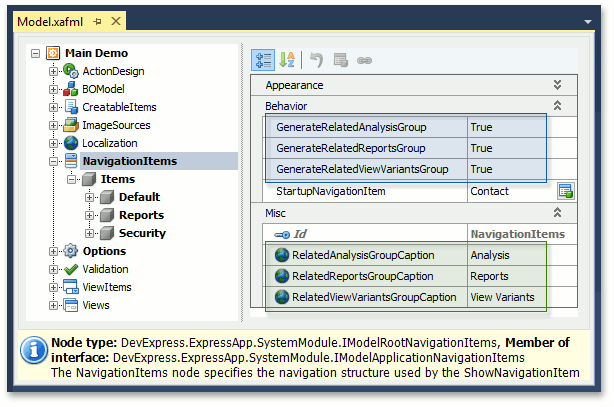
The ViewVariants module adds the View Variants navigation items for the Views that have predefined View variants. The Analysis and Report modules add navigation items for business classes associated with existing analysis/report objects.
You can also implement custom context navigation. To see an example, refer to the following help topic: How to: Implement Custom Context Navigation.